Heading 1
Heading 2
Heading 3
Heading 4
Heading 5
Heading 6
Lorem ipsum dolor sit amet, consectetur adipiscing elit, sed do eiusmod tempor incididunt ut labore et dolore magna aliqua. Ut enim ad minim veniam, quis nostrud exercitation ullamco laboris nisi ut aliquip ex ea commodo consequat. Duis aute irure dolor in reprehenderit in voluptate velit esse cillum dolore eu fugiat nulla pariatur.
Block quote
Ordered list
- Item 1
- Item 2
- Item 3
Unordered list
- Item A
- Item B
- Item C
Bold text
Emphasis
Superscript
Subscript
Crafting the Flight Email and Push Notification Journey at Booking.com
Booking.com is a leading tech travel company. It connects millions of travelers with memorable experiences, a range of transport options, and incredible places to stay, from homes to hotels and much more.
As part of the pre-booking team at Booking.com, I took on the challenge of designing an effective email and push notification strategy for the Flights product.
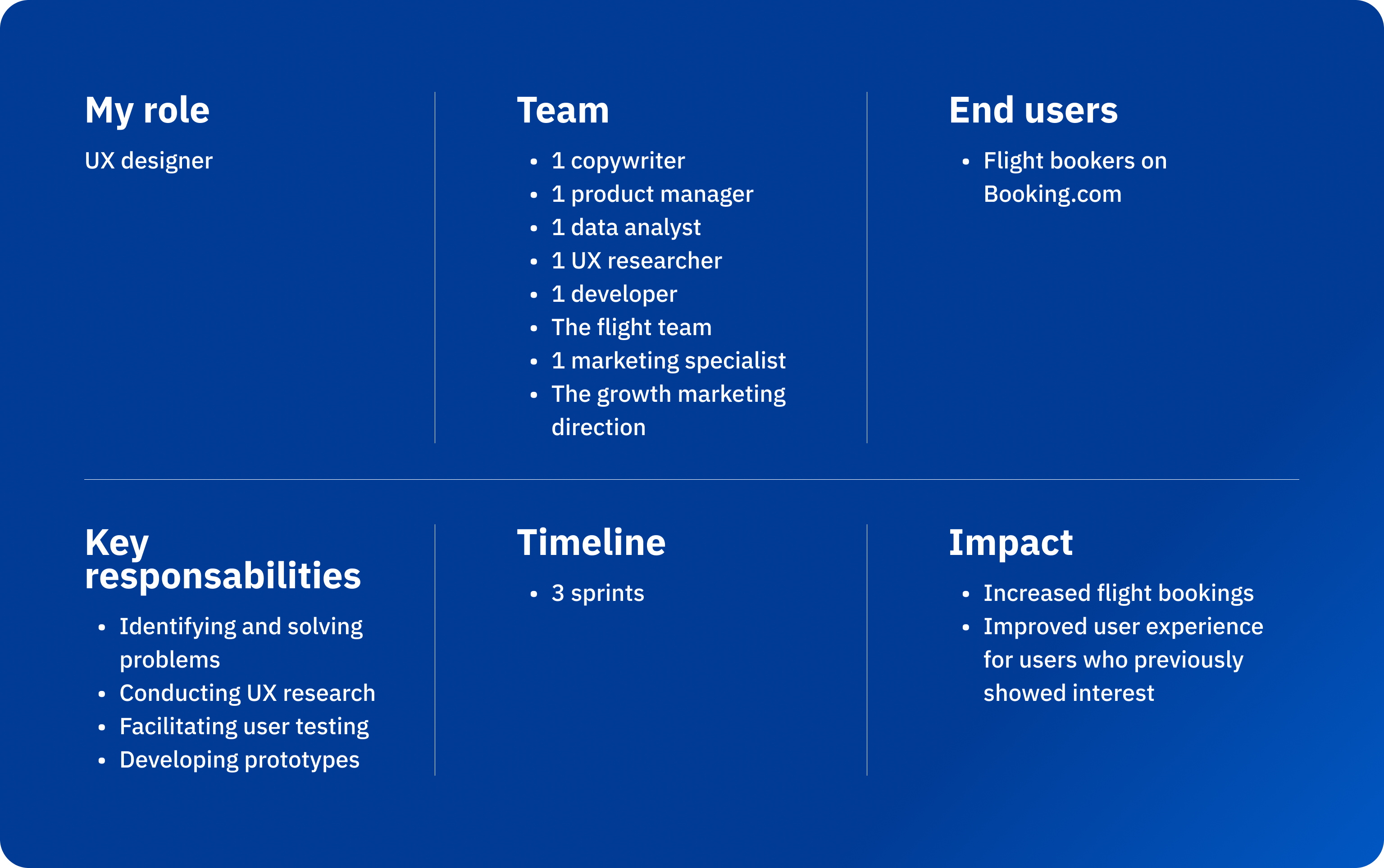
What was the challenge?
Flights, a growing product on Booking.com, showed great potential to increase user engagement. However, many users abandoned their flight search or selection process before booking.
Where were users dropping off?
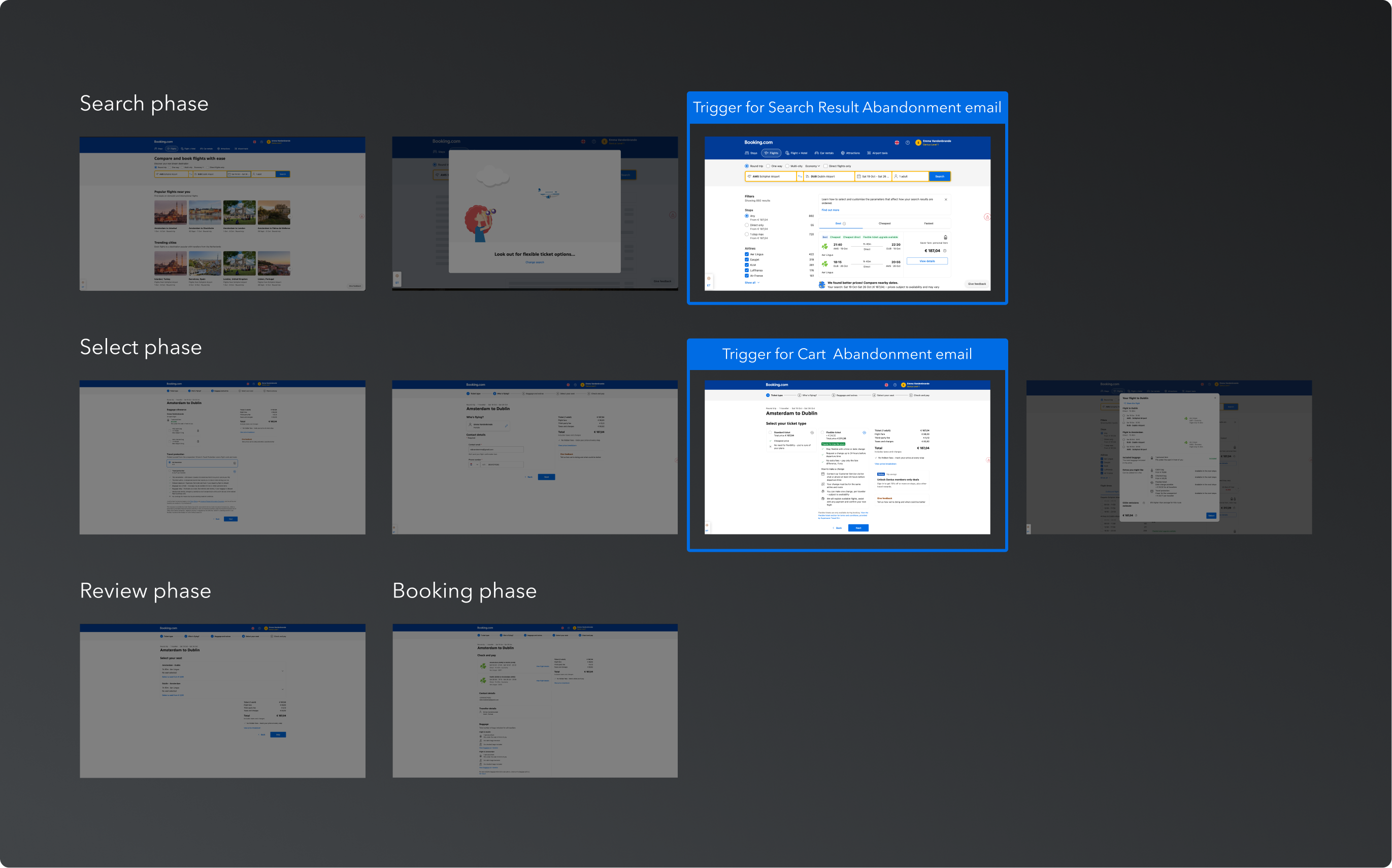
Despite initial interest, a certain number of users abandoned their journey during two key stages:
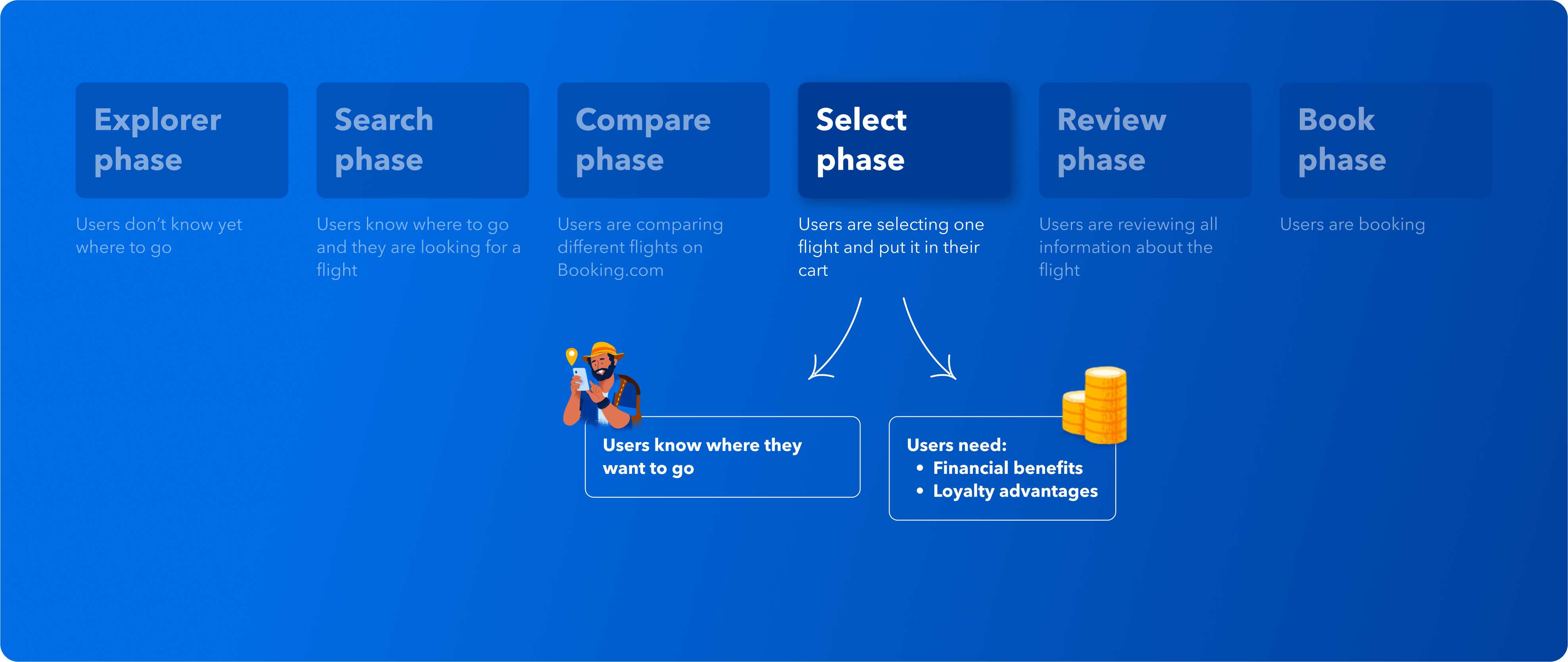
- Search phase – where users explore flight options.
- Select phase – where users finalize their choices.
Data pinpointed these two stages as key opportunities to minimize drop-offs and enhance conversions and UX research provided valuable insights into why users disengaged at these points.
How did we decide to solve the problem?
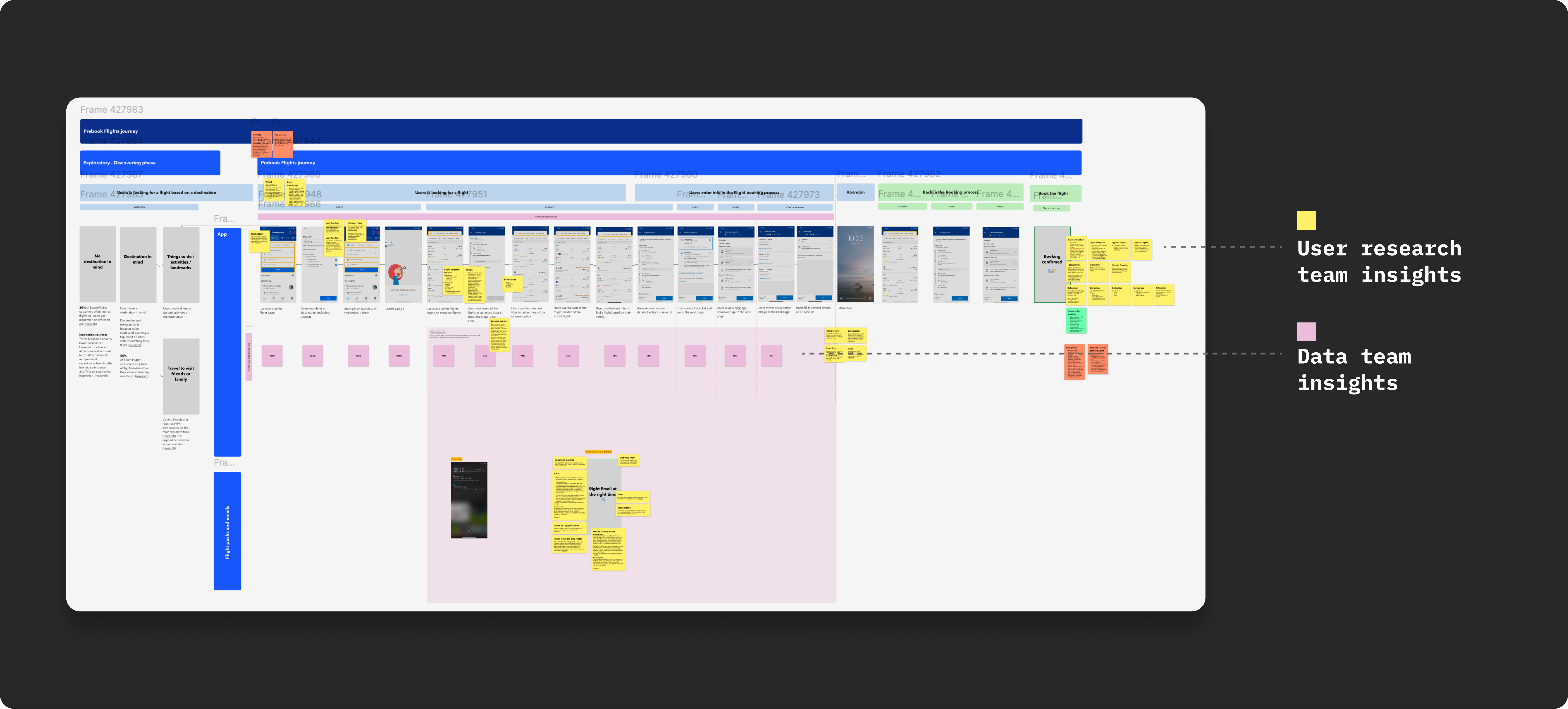
Mapping the entire flight journey
To tackle the issue, I began by mapping out the entire flight booking journey—from the moment users start considering booking a flight to the moment they complete the booking.
Integrating UX research insights into the journey
Using yellow sticky notes, I incorporated insights from the UX research team to highlight user behaviors, pain points, and specific moments in the journey that required attention.
Integrating data-driven insights
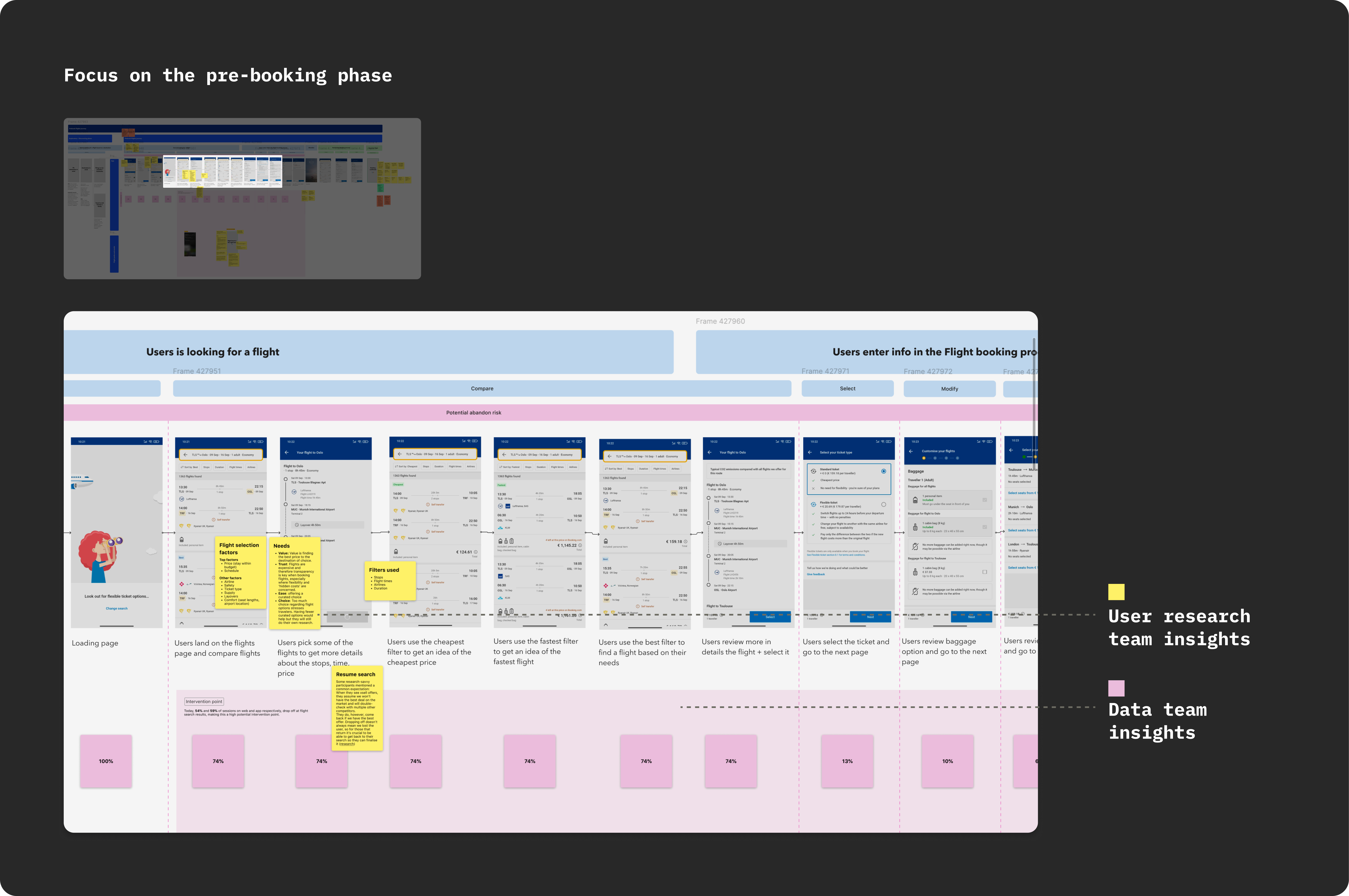
Leveraging insights from the data team, I identified the pre-booking phase (see fig.3 and fig 4) as the most critical, as it was where the highest rates of user drop-offs occurred (pink sticky notes).
Our hypothesis
Based on the journey mapping, UX research insights, and data analysis, we formulated the following hypothesis:
Sending targeted emails to users who abandoned their journey during the search results phase or the selection phase would effectively re-engage them, prompting them to resume the booking process and ultimately complete their booking.
Our design solutions
To validate this hypothesis, we developed two new email campaigns:
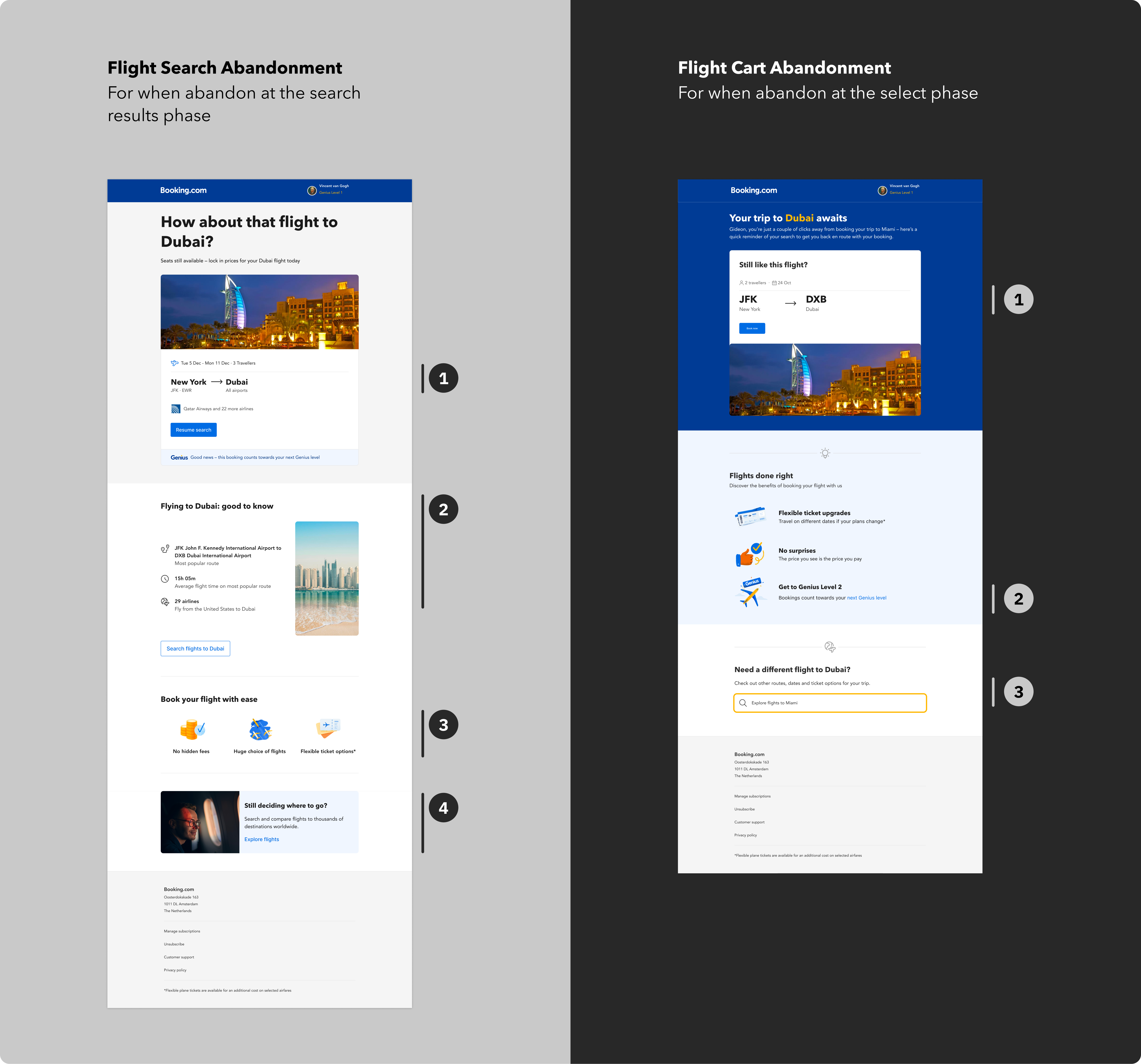
- Flight Cart Abandonment Email
- Flight Search Abandonment Email: Sent to users who abandoned during the search results phase
These emails were designed to re-engage users at their specific drop-off points and encourage them to continue their booking journey.
How did we prioritize?
With 2 new email campaigns to craft, we needed to decide which to prioritize first.
We chose to start with the Flight Search Abandonment Email, targeting users who abandoned their journey on the search results page. This decision was based on data showing that this phase had the highest drop-off rates. By addressing this group first, we aimed to re-engage the largest segment of users early in their booking journey.
Next, we focused on the Flight Cart Abandonment Email, targeting users who abandoned closer to completing their booking. Although this group represented fewer users, addressing this stage was crucial for converting those who were further along in the booking funnel.
How did we define a successful email?
To measure the effectiveness of each email, we selected the following key metrics:
- Primary metric:
- Flight transactions: The number of completed flight bookings.
- Flight transactions: The number of completed flight bookings.
- Secondary metrics:
- Flights homepage views: Visits to the flights homepage.
- Flights search: Initiated flight searches.
- Flights search results page views: Visits to the search results page.
- Unsubscribes: To monitor potential negative impact on user experience.
A/B testing setup
To validate the impact of our emails, we conducted A/B tests with the following configuration:
- Control group (Base): No email sent (50%).
- Variant 1: Flight Cart Abandonment Email (50%).
This setup allowed us to directly compare user behavior between those who received the email and those who did not, ensuring robust insights into the email’s effectiveness.
My UX strategy
When defining an UX strategy, I aim to define, with the Marketing Specialist, 2 to 3 key intents for every design. This approach ensures clarity, focus, and alignment with both user needs and project goals. For the flight email project, I identified the following intents:
1️⃣ Primary intent
Capture users' attention by providing a quick and effortless way to resume their flight search.
In the email, this is reflected with a clear and prominent call-to-action (CTA) that stands out in the email hierarchy.
2️⃣ Secondary intent
Create a sense of urgency without being pushy. Since users are in the lower funnel and close to making a decision, we need to encourage them to complete their booking with us.
In the email, this requires using the right tone in the copy to motivate action.
3️⃣ Tertiary intent
Highlight immediate benefits that offer users that extra incentive to finalize their booking.
In the email, this involves showcasing our unique selling propositions (USPs) along with the advantages of the Genius loyalty program from Booking.com
Consistent journey
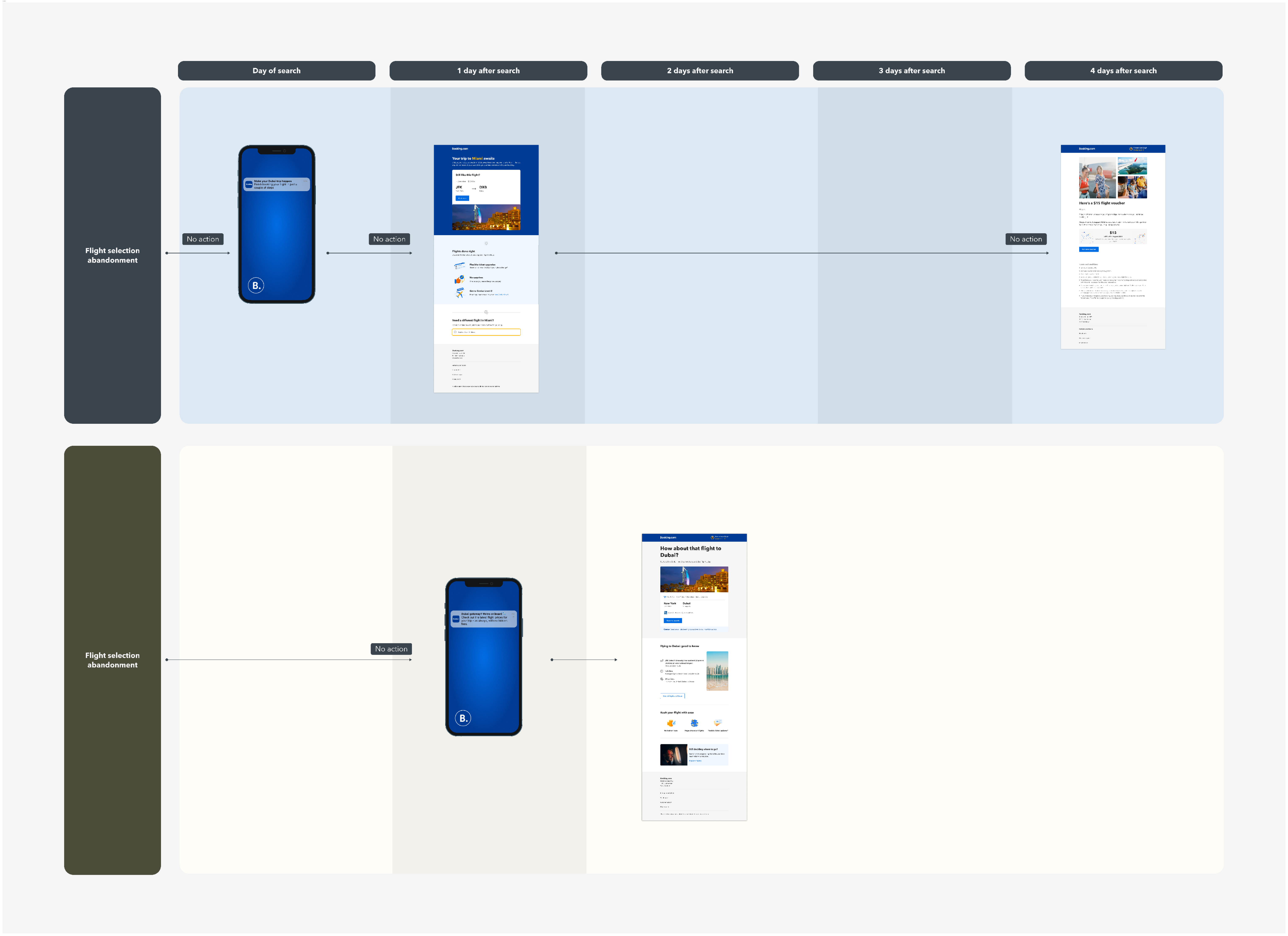
In addition to the 3 intents, I ensured consistency across other touchpoints in the flight journey, including the app and the flight pages on the website.
How Flight Search Abandonment and Cart Abandonment emails differ?
Since users are in distinct mindsets and have specific needs at these two points in their journey, I made targeted adjustments to each email to better address their specific needs.
Each user's needs are reflected in the email. Here’s how the two types of abandonment emails differ:
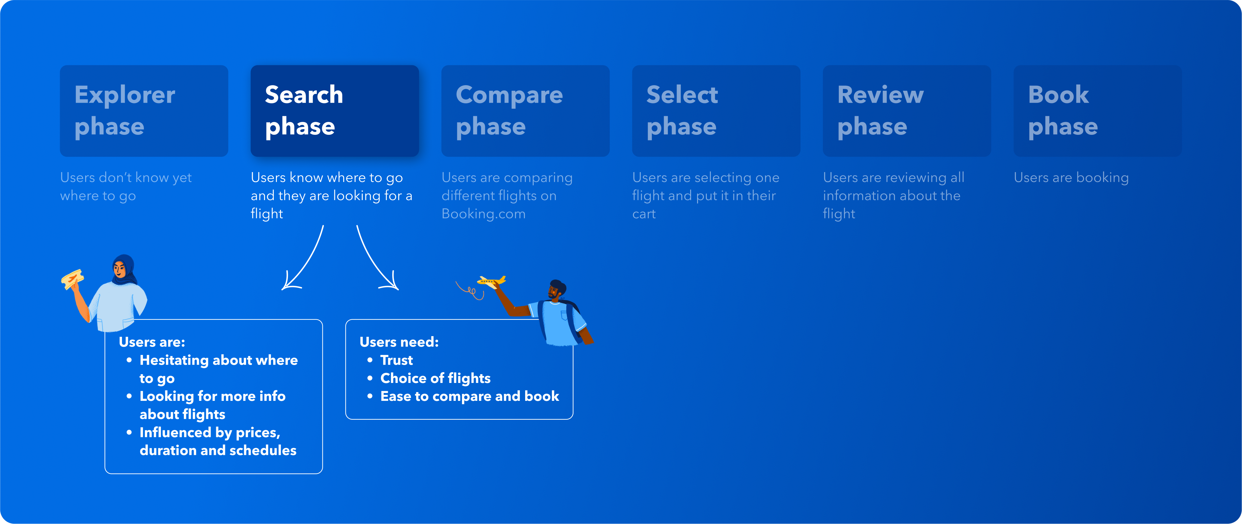
Flight Search Abandonment Email:
- City focus: this email centers on cities, acknowledging that users may still be undecided about their departure and destination airports.
- Informative content: it provides more details about the flight to their destination, helping users understand the average travel time and the best routes available.
- Transparency and variety: the email emphasizes that Booking.com has no hidden fees, offers a wide variety of flights, and provides flexible options
Flight Cart Abandonment Email:
- Straightforward approach: this email assumes users are familiar with the next steps, so we removed distractions, such as destination information.
- Airport focus: the emphasis is on the airport rather than the city, as users are already aware of where they are going.
- Highlighting Unique Selling Propositions (USPs): key benefits are clearly presented to encourage users to complete their booking.
- Focus on the city, as users might be still exploring destinations
- Detailed information about the destination to help users find the perfect flight
- USPs to help and reassure users
- More prominent banner to explore alternative flights
- Focus on the IATA code instead users are more sure about where to go
- Financial benefits to provide users with confidence and reassurance
- Discrete banner to explore alternative flights
What was my design process?
The design process for both emails followed the same approach, consisting of a design exploration phase, several rounds of UX reviews, a user testing phase, and an iteration phase.
Step 1: design exploration
In the design exploration phase, I assessed data availability and technical feasibility. Since email design has limited flexibility, most layouts are table-based and kept relatively simple to ensure compatibility with most email clients.
After some back and fourth with the data team and developer, I narrowed down my design directions to the 3 options of the following screenshot.
Step 2: first design drafts and UX reviews
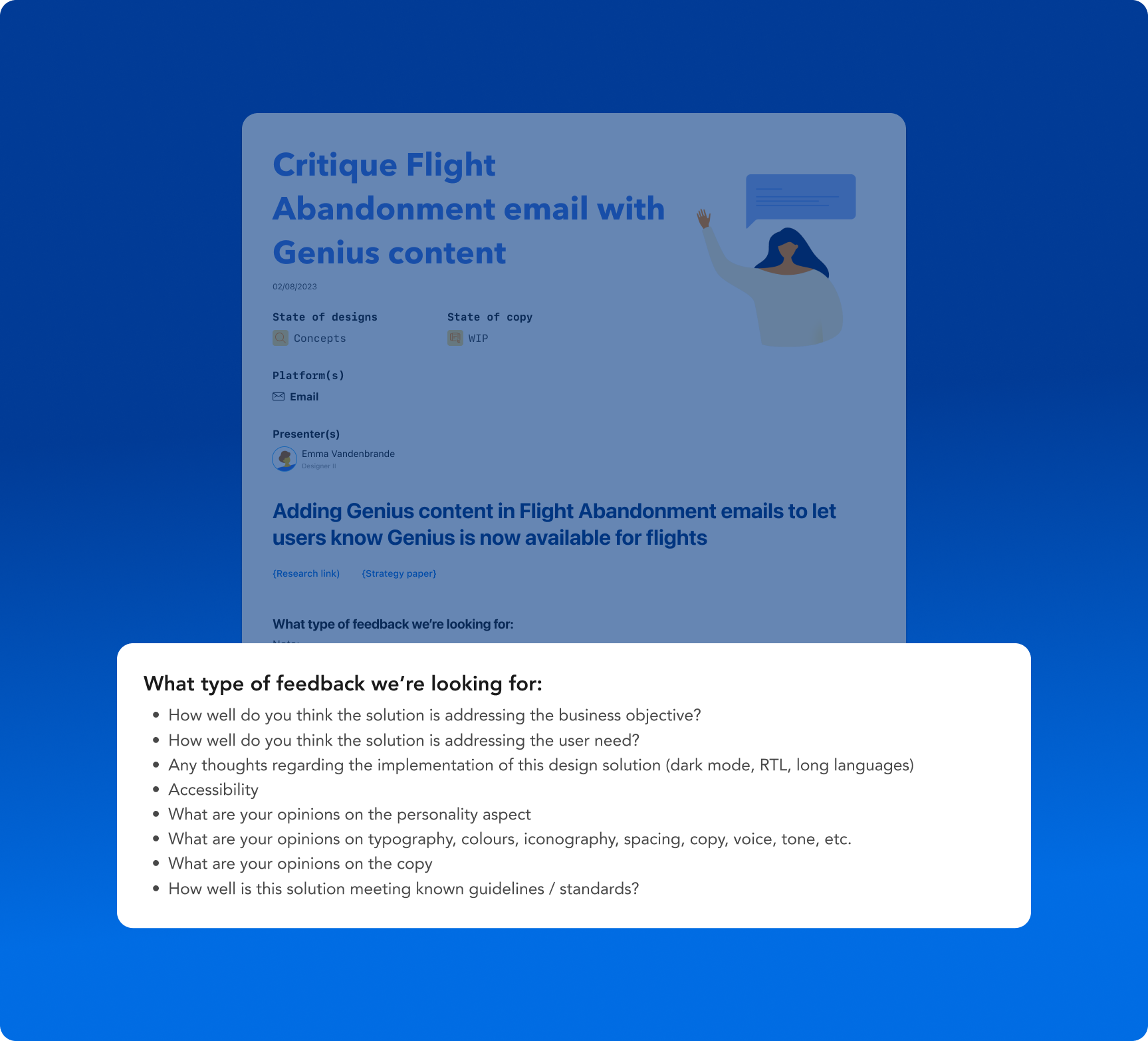
During the UX reviews, I clearly outlined the specific feedback I was seeking at this stage, focusing on areas such as layout effectiveness, messaging clarity, and user engagement. By setting these expectations upfront, I encouraged constructive input and invited advice on optimising the design for user experience, ensuring the feedback was actionable and aligned with project goals.
Step 3: user tests
After refining the designs based on UX critique feedback, I conducted 7 unmoderated interviews on usertesting.com with a US/UK audience aged 18+ for each email. Key objectives included:
- Validating the clarity of the subject line and email content.
- Identifying usability issues or pain points.
- Ensuring users' expectations were met both before opening the email and on the landing page.
For this case study, I'll focus on the user test for Flight Cart Abandonment.
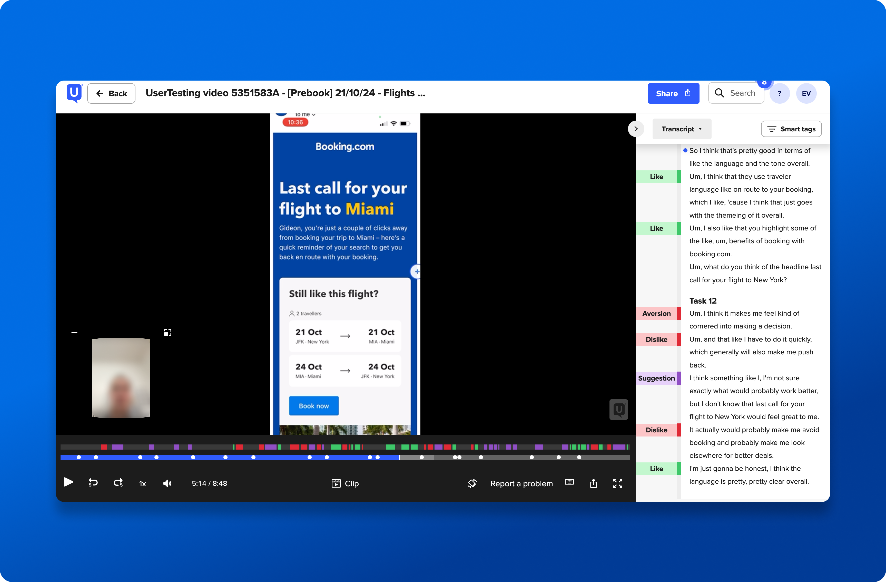
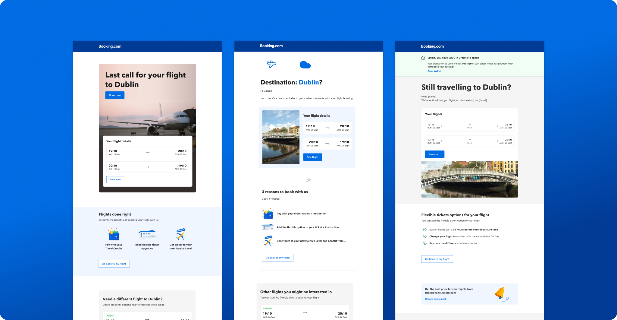
What did the user tests reveal?
Participants found the email to be clear, easy to understand, and well-structured, with concise content that was simple to follow.
However, they highlighted a few areas for improvement:
- Urgency in the header: the sense of urgency in the header copy seemed unnecessary, especially for flights booked months in advance.
- Relevance of testimonials: the testimonial section was deemed irrelevant to the users.
Additionally, during the user tests, I noticed that:
- The first CTA could be placed higher in the email for better visibility.
- Some links were not easily recognizable or were unclear as clickable elements.
- The illustrations were not optimized for mobile view, appearing too small.
What did we do to address this?
To enhance the user experience, I took the following actions:
- I collaborated with the copywriter to adopt a softer tone of voice in the copy.
- I removed the testimonial section, as it was irrelevant to the context and added unnecessary noise to the email.
- I redesigned the header to bring the first CTA higher up for better accessibility.
- I increased the size of the illustrations to improve mobile responsiveness.
- I added dividers with small icons to better guide users through the content, making sections more distinct and easier to navigate.
These changes helped refine the email's overall effectiveness and user experience.
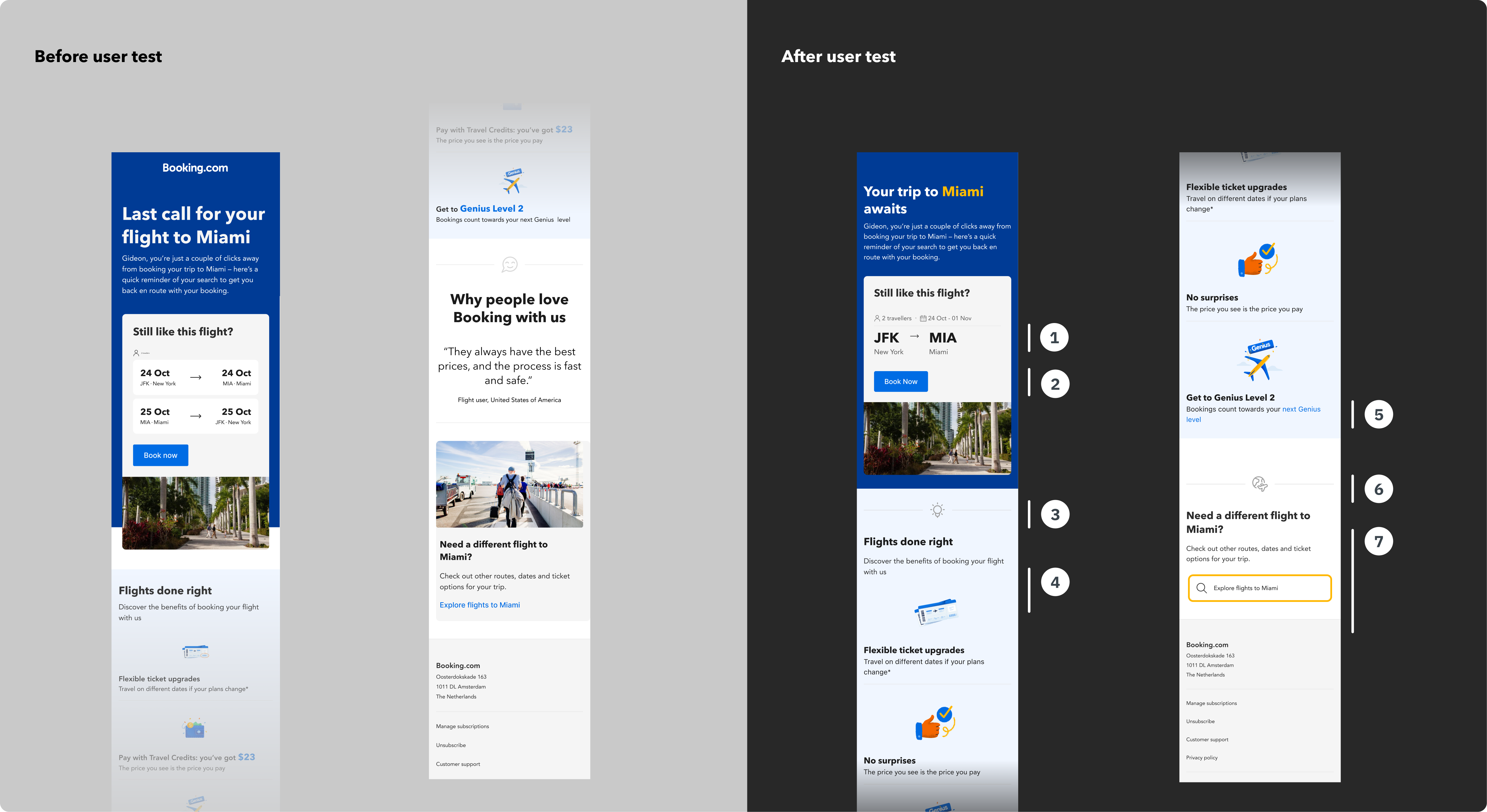
- Focus on the IATA code instead of the date
- Higher CTA
- Divider with light bulb to grab users’ attention
- Bigger illustrations
- Redesign of the link
- Divider with icon to grab users’ attention
- More simple banner to perform a new search
When was the best time to send the email?
To define the sending time, several elements are taken into account:
- The existing email and push notification flow
- User research insight
- User test comments
- Audience estimation
Did I overcome some challenges?
While developing emails within our internal CRM tool—still undergoing optimization—I navigated various technical limitations to ensure seamless functionality and effective communication. This process required extensive design trials and iterations to balance user needs with implementation constraints.
“For the Flights Cart Abandonment email, Emma tried various permutation and combinations and even though there were severe technical limitations she delivered an effective email. She engaged with multiple stakeholders seamlessly to ensure every piece of content in the email is of high relevance.” – Sonia, Marketing Specialist at Booking.com
What were the results?
The Flight Search Abandonment and Flight Cart Abandonment emails exceeded expectations, resulting in a substantial number of additional flight bookings per day.
What is next?
Building on the success of the search abandonment email, I plan to enhance personalization by leveraging Machine Learning models and Generative AI to tailor content based on user behavior and preferences. This will deliver a more customized and relevant flight journey, further optimizing engagement and boosting performance.