Heading 1
Heading 2
Heading 3
Heading 4
Heading 5
Heading 6
Lorem ipsum dolor sit amet, consectetur adipiscing elit, sed do eiusmod tempor incididunt ut labore et dolore magna aliqua. Ut enim ad minim veniam, quis nostrud exercitation ullamco laboris nisi ut aliquip ex ea commodo consequat. Duis aute irure dolor in reprehenderit in voluptate velit esse cillum dolore eu fugiat nulla pariatur.
Block quote
Ordered list
- Item 1
- Item 2
- Item 3
Unordered list
- Item A
- Item B
- Item C
Bold text
Emphasis
Superscript
Subscript
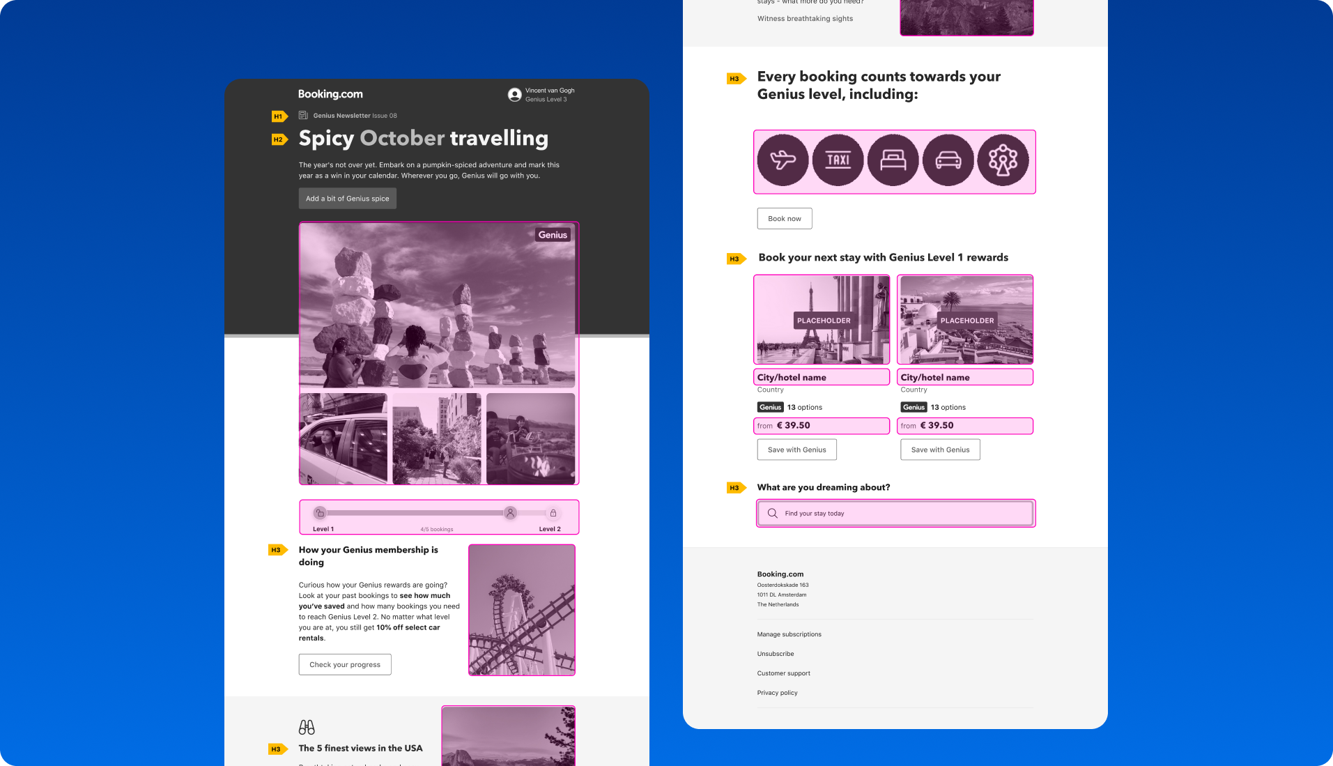
The library is a versatile toolkit designed for effortlessly creating emails and push notifications. It features a collection of pre-designed, modular patterns that function like building blocks, allowing you to craft visually appealing and highly effective messages with ease.
😵 The challenge: inconsistent messaging across channels
Booking.com is a leading tech travel company. It connects millions of travelers with memorable experiences, a range of transport options, and incredible places to stay, from homes to hotels and much more.
When I joined Booking.com, I noticed a significant issue: the lack of a centralized design library. As a result, there was inconsistency across emails and push notifications, which undermined the user experience and brand coherence. Some of the key issues included:
- Color inconsistency: multiple shades of black and blue were used across various designs.
- Typography inconsistencies: different font styles were applied in emails, leading to a fragmented look.
- Layout inconsistencies: a lack of a unified spacing system made designs feel disjointed.
- Component inconsistency: banners and buttons were designed inconsistently, making the user interface feel less cohesive.
🤔 Why did we build the library?
The goal of creating this library was clear: to establish a toolkit that would streamline the design process, reduce redundancy, and maintain a high standard of quality. We wanted to empower all teams across Booking.com to design emails and push notifications with ease, ensuring consistency and efficiency at scale.
Our goals for the library:
- Reduce duplication of work: minimize repetitive work for both design and development teams.
- Maintain high design quality: ensure that every piece of communication met our design standards.
- Empower teams: provide every team with the tools they need to create high-quality emails and notifications independently.
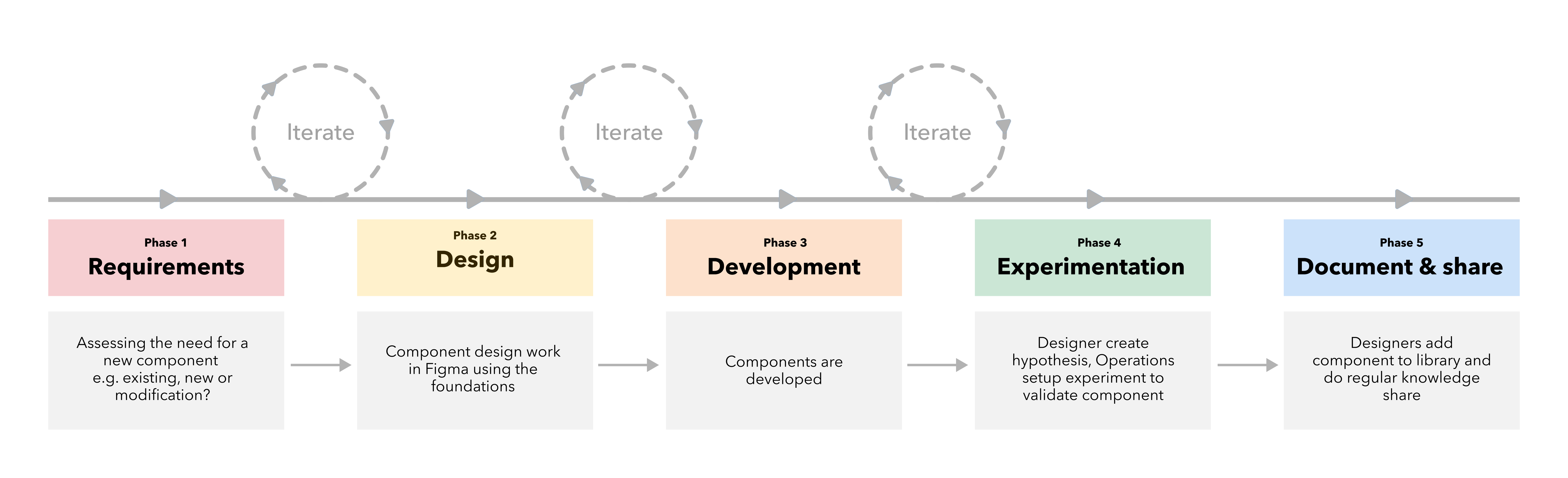
🪜 Our process: from audit to impact
Step 1: the audit
We began by conducting an extensive audit of existing email designs, identifying which ones needed updating and which were outdated. This phase involved workshops with designers from various tracks across Booking.com, allowing us to gather insights from multiple perspectives.
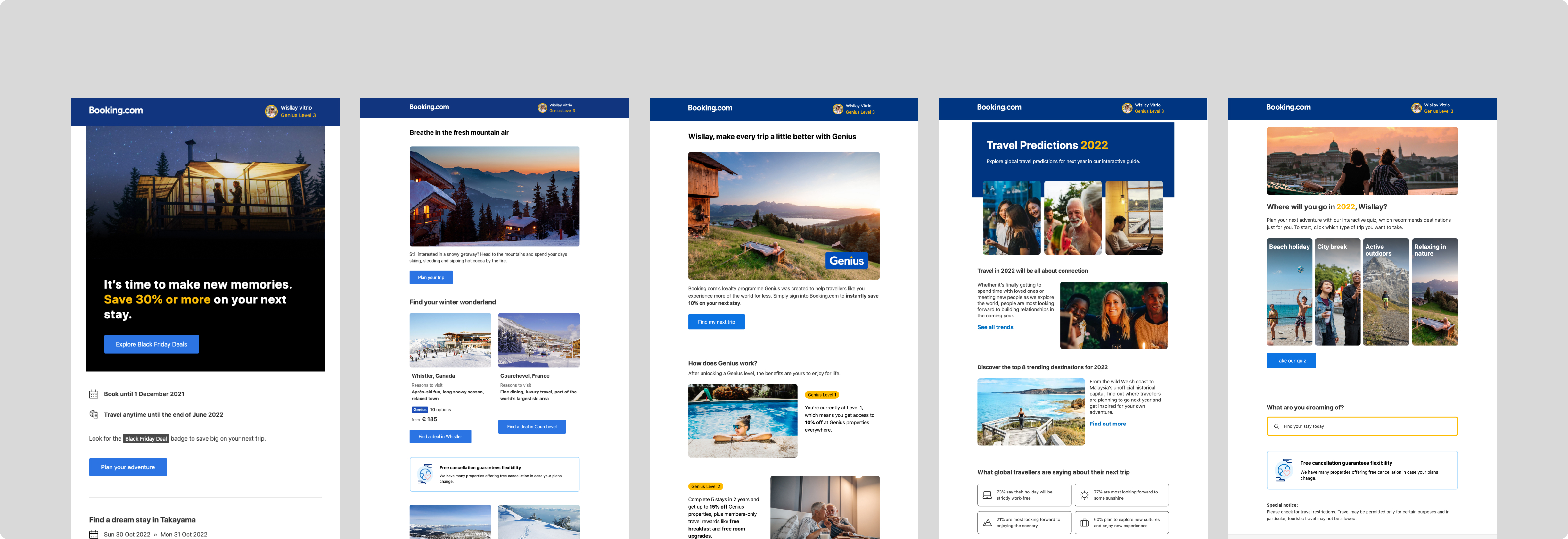
Step 2: the card sorting exercise
To ensure the library was user-centric, we conducted a card sorting exercise with designers and developers. In this exercise, participants categorized and named components, helping us better understand how users would naturally organize and refer to them. This insight was crucial for creating an intuitive, easy-to-use library.
Step 3: design workshops and refinement
Next, we identified components that needed optimization. We refined these elements and sought feedback through collaborative workshops with other designers, including those from the design system and accessibility teams. This iterative process helped ensure our components were both functional and inclusive.
For each component, we asked designers to identify potential pain points and provide suggestions for improvement. We also inquired about the component's role and purpose, whether they had alternative name suggestions, and if they could propose a potential sub-category. Lastly, we encouraged them to share any additional insights or recommendations that could enhance our guidelines.
Step 4: building the library
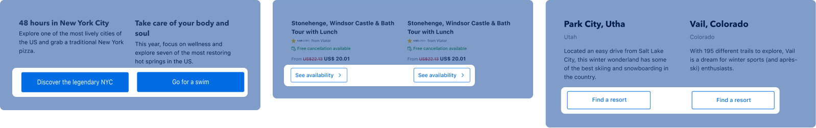
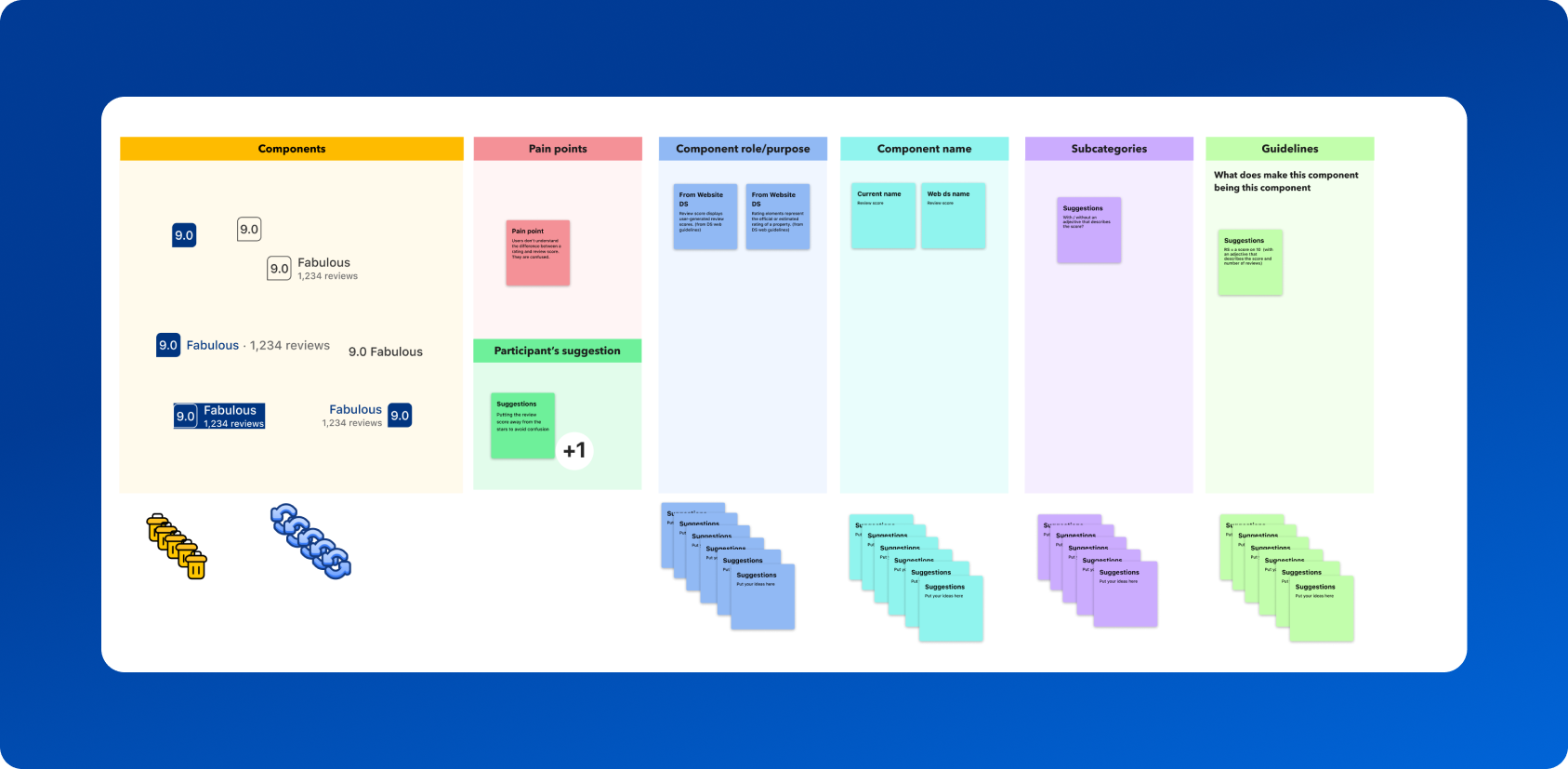
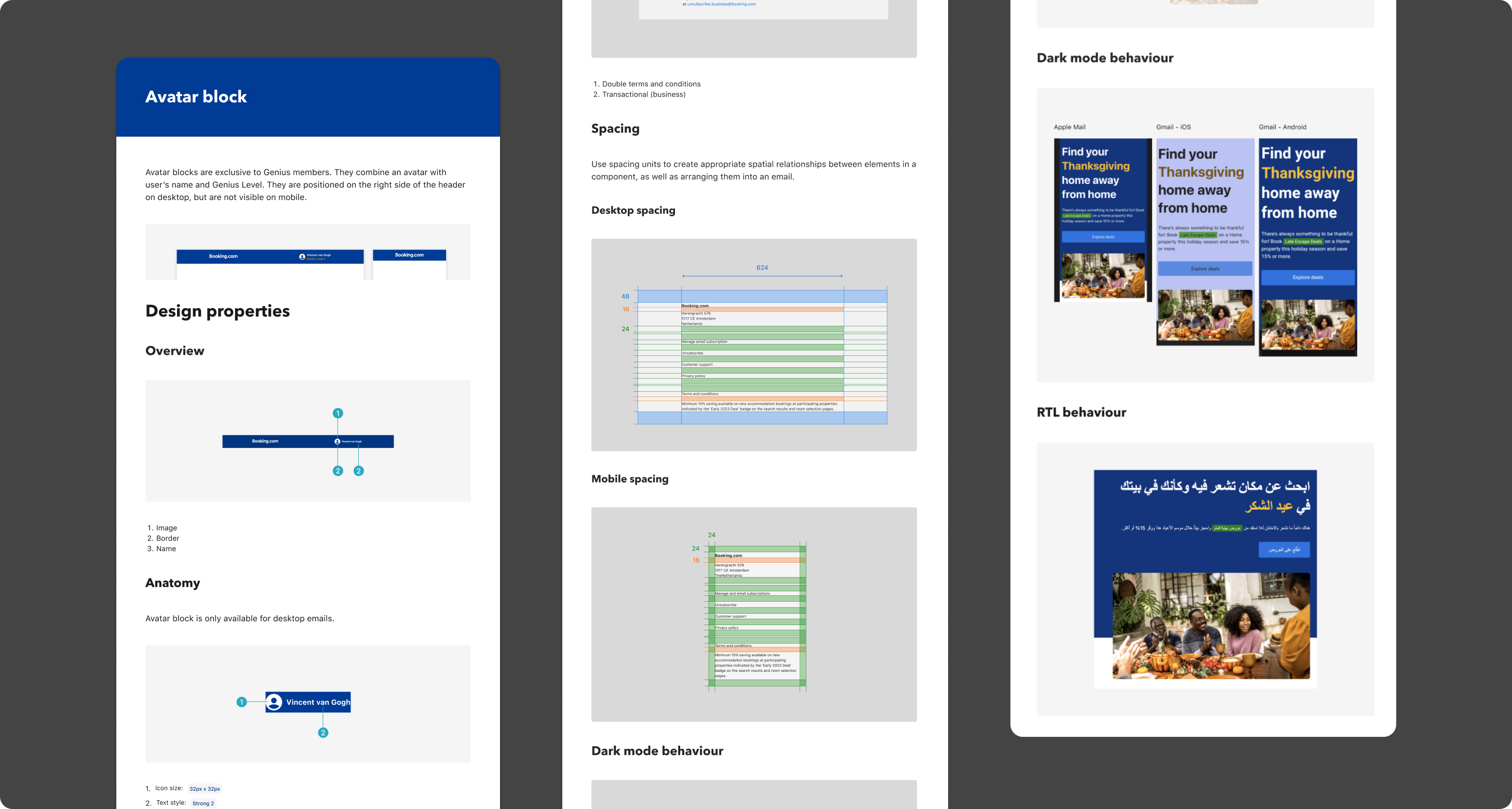
We chose the atomic design system as the foundation for the library. We began with the smallest elements—like badges and star ratings—and gradually combined them into more complex patterns and templates. This modular approach allowed us to build a flexible and scalable design system.
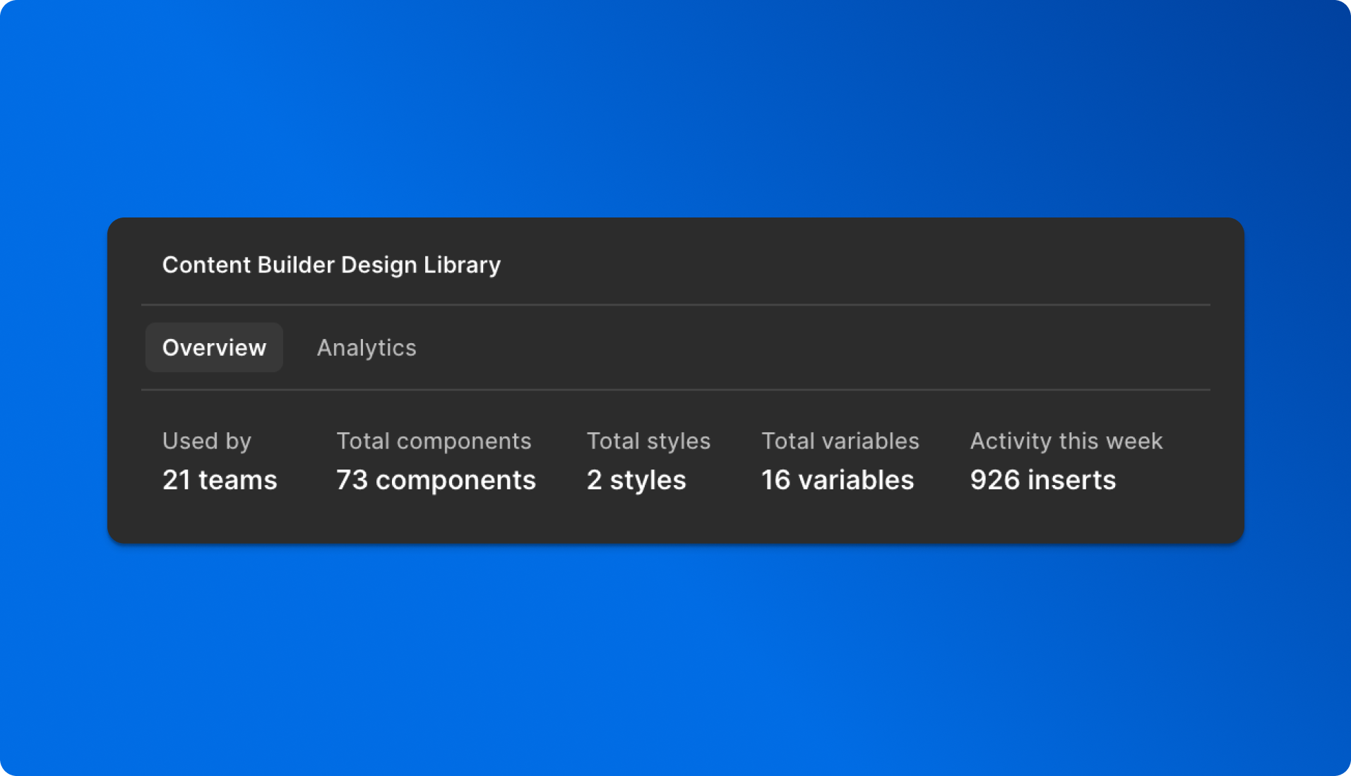
The library consists of 40 core components, with over 600 unique variants. By leveraging Figma’s variants and component properties, we created a system that allows designers to quickly adapt components for different use cases. This streamlined the design workflow, reduced duplication, and maintained consistency across projects.
Step 5: documentation
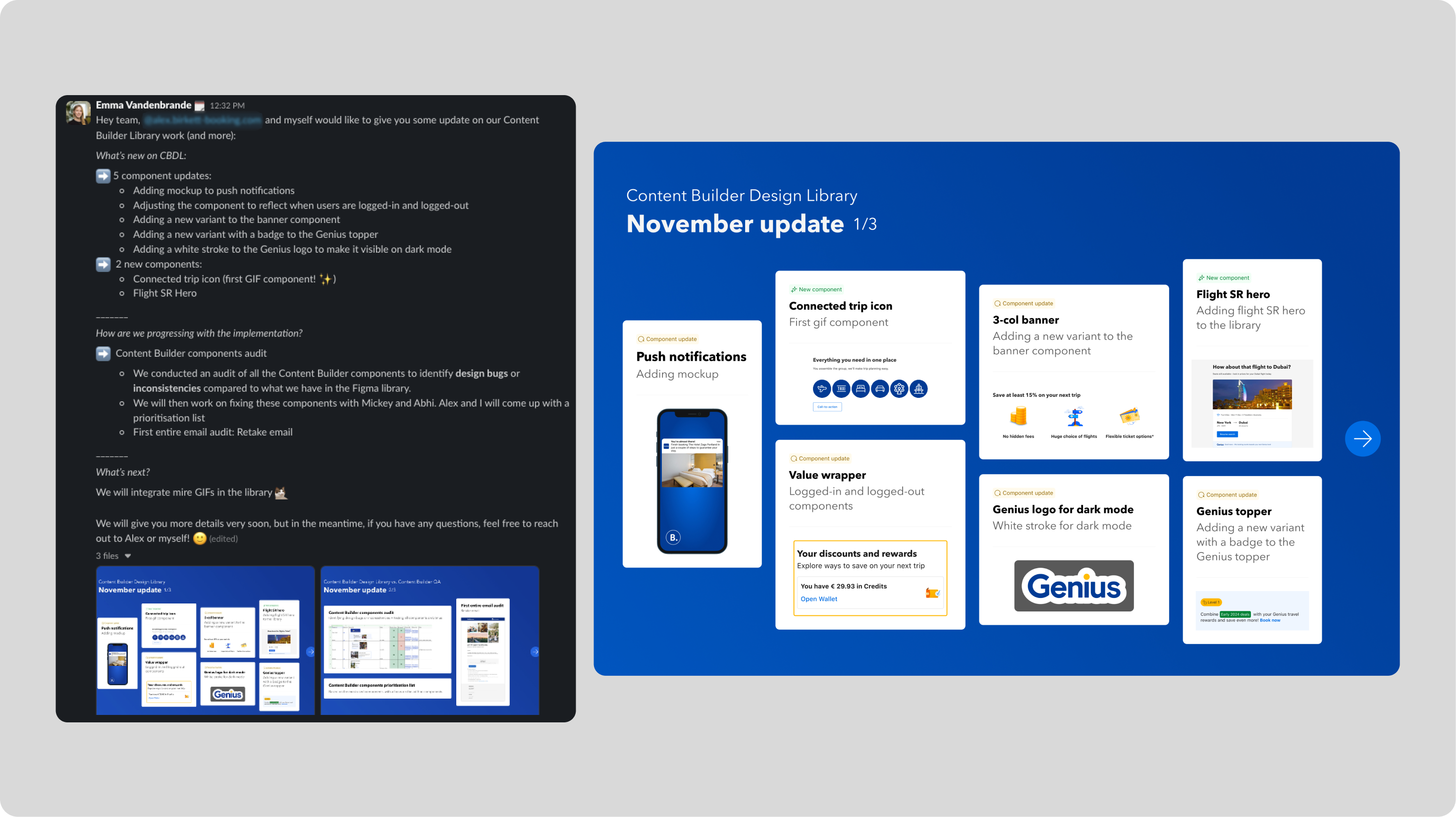
To ensure that everyone at Booking.com could easily use the library, we created comprehensive documentation. We also published monthly library updates and a "Tip of the Week" every Friday to keep designers informed about new components and Figma features.
We implement accessibility guidelines in the documentation to ensure that the content is usable and inclusive for everyone, regardless of their abilities or the tools they use. By following best practices, we remove barriers that might prevent users with visual, cognitive, or motor impairments from accessing critical information.
Accessibility isn't just a feature: it's a fundamental part of good design.
Step 6: sharing
We also published monthly library updates and a "Tip of the Week" every Friday to keep designers informed about new components and Figma features.
Step 6: the governance
We implemented a governance model to ensure the library's effectiveness and consistency. By establishing clear ownership, defining roles, and creating structured decision-making processes, we ensured the library was used consistently across teams.
How do we prioritize requests?
To streamline our process, we've developed a framework to evaluate incoming requests. We keep all requests in one place to get a complete overview of the demand.
Here’s how we approach prioritization:
- Evaluate alternative solutions
We begin by checking if an existing component or solution can solve the problem. If no suitable alternatives are available, we proceed to evaluate the request further.
- Assess business needs
Next, we consider the business impact of the request. Does it address a critical need for a business-essential project, or is it a one-off requirement with limited impact?
- Consider reusability
We evaluate whether the proposed solution can be leveraged across multiple teams or business units, maximizing its value.
- Assess ease of implementation
Finally, we analyze the effort required to implement the solution. Smaller blockers are prioritized to maintain momentum, while larger issues are planned more strategically. Balancing trade-offs between better design and faster delivery is an ongoing discussion with leadership.
Once all these factors are assessed, we calculate a prioritization score that helps us decide how to allocate our efforts effectively.
Our framework is also well-documented so that all teams can learn and provide feedback.
Step 7: knowledge sharing
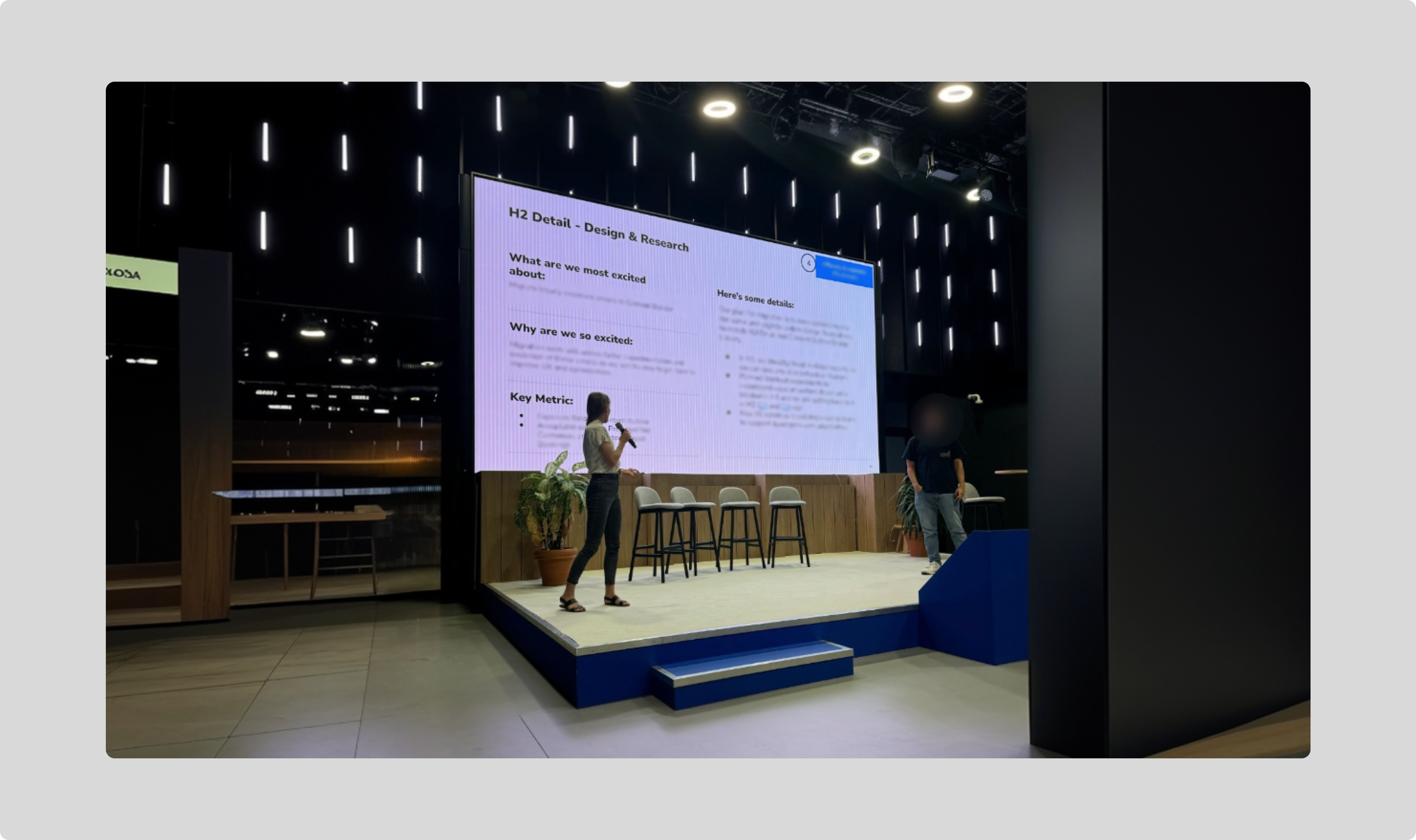
At a conference attended by over 200 participants, I had the privilege of presenting the project.
This moment was an opportunity to share the journey of developing the library, the progress we achieved, and the significant impact it had on the company.
Standing on stage, I highlighted how the library streamlined workflows, addressed critical challenges, and contributed to the organization’s success. The presentation not only demonstrated the value of the project but also sparked meaningful discussions and engagement among the audience.
📈 The Impact: measurable results
The design library had a significant, positive impact on both the quality and efficiency of our work:
- Consistency: we saw a 70% reduction in inconsistencies across color, typography, and spacing.
- Efficiency: designers saved 50% of their time when using the library, as measured through usability tests.
- Design system adoption: we tracked component usage and identified which ones were the most and least used. With an average of 828 components inserted per week, we could refine and improve the library based on real user needs.
- Accessibility: the number of accessibility issues decreased by 80%, ensuring a more inclusive experience.
“Emma's involvement enabled my team to make a significant impact on the partner experience and contributed greatly to creating consistency across our messaging channels.” – Szilvia - UX Designer, Fintech Products at Booking.com
“Emma’s contributions to our library have been instrumental in improving team efficiency” – Uli - Senior Designer in Customer Marketing at Booking.com, ex Zalando
💡 Key learnings
Creating a design system and component library is a powerful way to streamline workflows and ensure consistency.
However, its success hinges on one critical factor: adoption. Ensuring users not only know about the library but actively use, contribute to, and advocate for it is the most challenging—and rewarding—part of the process.
To drive adoption, I implemented a multi-faceted engagement strategy. This included sharing weekly "Tips of the Week", organizing interactive workshops, and hosting live demos. Quarterly surveys also helped us improve our communication and transparency since the start of the project.
All these initiatives kept every designer informed about the latest updates and features in the library, fostering a sense of connection and ownership among the team. Regular communication is key to managing expectations and building trust.
By empowering designers to see themselves as contributors and advocates, I transformed the library from a tool into a shared resource that motivated adoption, strengthened collaboration, and amplified the impact of the design system across the organization.
On the ‘how’ of this project Emma impressed me on how she included the team, with workshops and weekly tool tips. Emma also included multiple stakeholders outside our track. All these steps have been super important to get the library adopted by not only by our own team, but also teams outside customer marketing like: Attractions team, Fintech partner and Genius Plus team. – Lillian, Design manager at Booking.com
⏭️ What's next?
Quarterly Figma analytics review and ongoing improvements
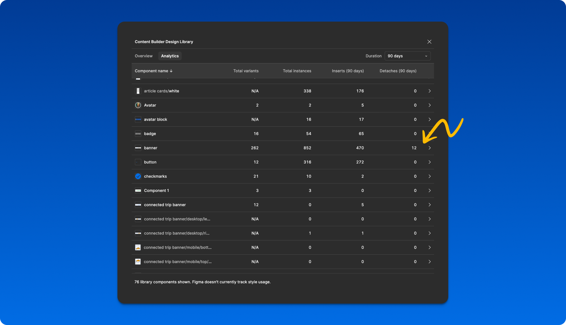
Each quarter, we analyze Figma usage data to identify the most frequently used components and those that are most often detached. For components that are regularly detached, we engage with designers to understand the underlying reasons. This feedback allows us to refine and adjust the components, ensuring they better align with designers' needs and workflows.
Expanding the design system to new platforms
Our next goal is to extend the design system to additional marketing platforms, including Meta (Instagram and Facebook) and TikTok.
🧩 Conclusion: a scalable solution for the future
The design library not only solved immediate inconsistencies but also set the foundation for future scalability. It empowered teams to create high-quality, consistent designs independently while optimizing workflow and reducing duplication. The library’s success is a testament to the power of collaboration, user-centric design, and iterative development.