Heading 1
Heading 2
Heading 3
Heading 4
Heading 5
Heading 6
Lorem ipsum dolor sit amet, consectetur adipiscing elit, sed do eiusmod tempor incididunt ut labore et dolore magna aliqua. Ut enim ad minim veniam, quis nostrud exercitation ullamco laboris nisi ut aliquip ex ea commodo consequat. Duis aute irure dolor in reprehenderit in voluptate velit esse cillum dolore eu fugiat nulla pariatur.
Block quote
Ordered list
- Item 1
- Item 2
- Item 3
Unordered list
- Item A
- Item B
- Item C
Bold text
Emphasis
Superscript
Subscript
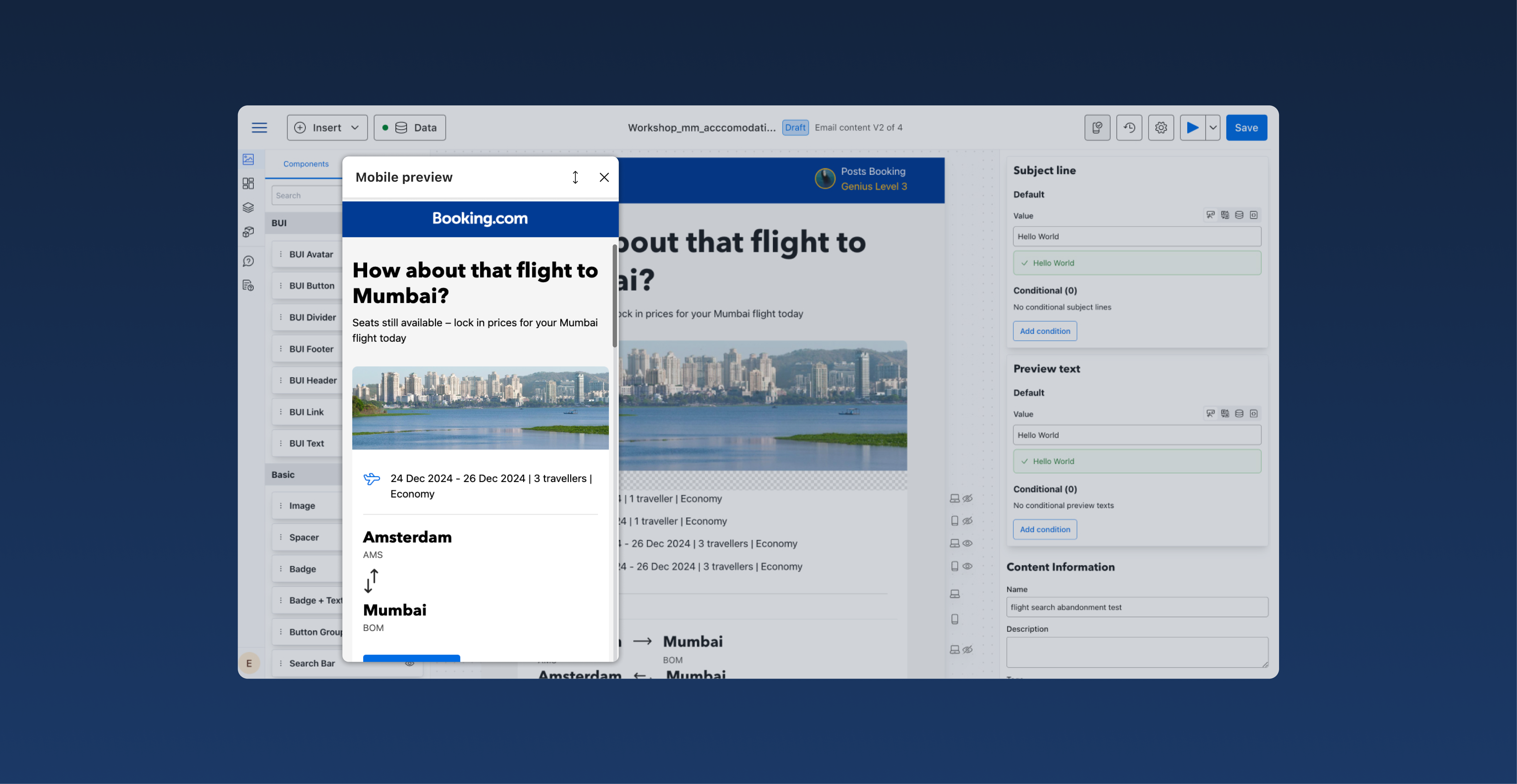
Mobile view integration in the editor view of Booking.com email builder
Booking.com is a leading tech travel company. It connects millions of travelers with memorable experiences, a range of transport options, and incredible places to stay, from homes to hotels and much more.
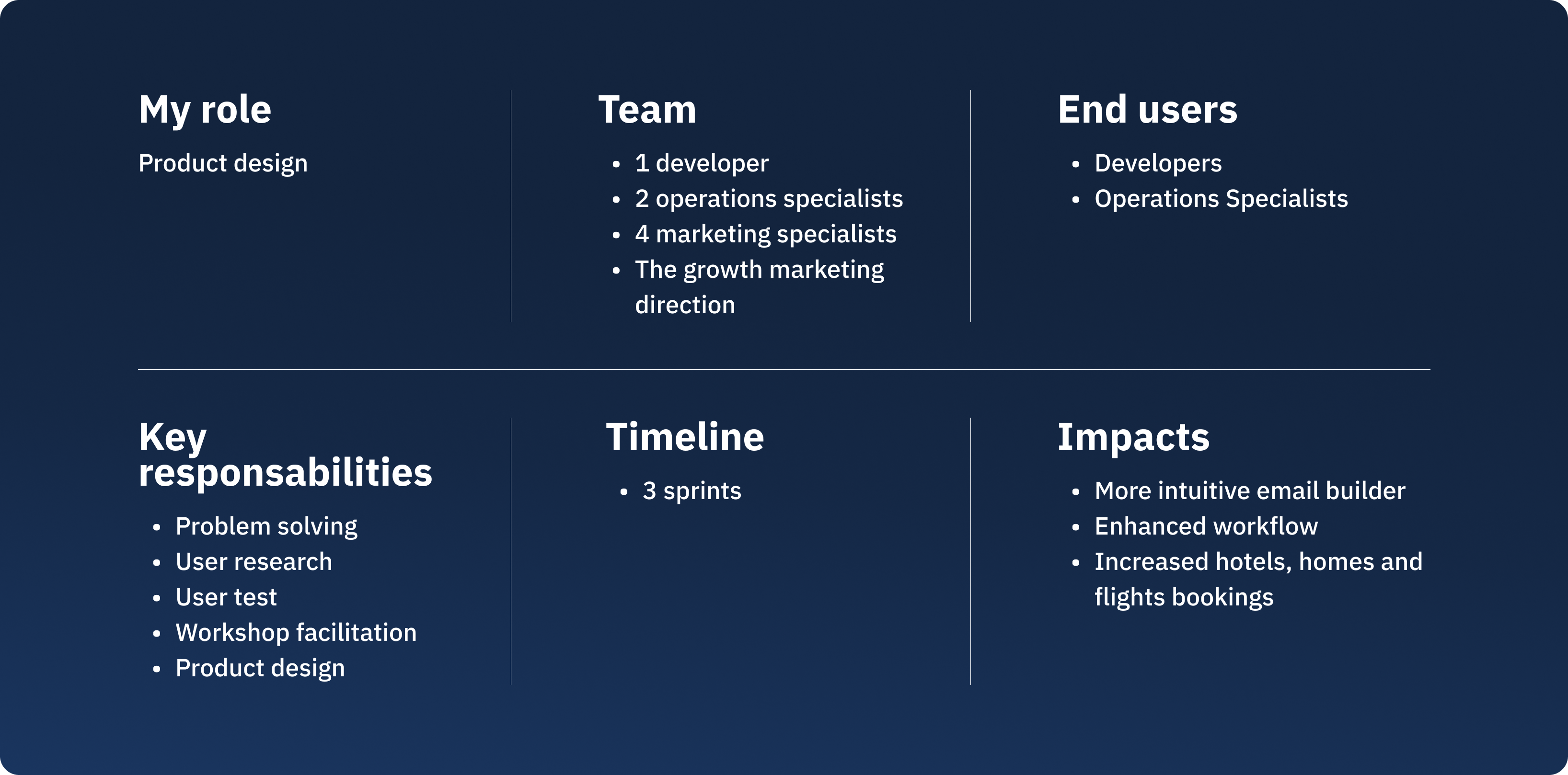
Project settings
On this project, I've been working alongside 1 developer, 2 copywriters, and 1 operations specialist in an Agile environment to deliver impactful solutions. I delivered the design within two sprints (4 months) through iterative design and stakeholder alignment.
What is the problem?
In the current email editor, users lack the ability to preview their email designs in mobile view directly within the editor page.
Instead, they are required to navigate to a separate preview page to see how their designs will appear on mobile devices. This process creates friction in their workflow.
This video shows the lack of mobile view on the editor. Users need to click on the preview button to see the content on mobile.
What were the consequences to the problem?
- Disruption in workflow:
Switching between the editor and the preview page interrupts the user's focus. Designers, developers and operations specialists must repeatedly toggle between these views to make adjustments, which slows down the design process.
- Time inefficiency:
Every switch to the preview adds extra steps, increasing the time required to finalize an email design. For users working under tight deadlines, this inefficiency can be particularly frustrating.
- Risk of oversight:
Without an integrated mobile view, users might overlook mobile-specific issues such as:- Improperly scaled images or text.
- Layouts that break due to smaller screen sizes.
- Buttons or interactive elements that are too small for touch interfaces.This could result in suboptimal emails that do not perform well on mobile devices.
- Higher cognitive load:
Constantly switching contexts between the editor and preview page forces users to mentally track changes, increasing the cognitive load and potential for mistakes.
The UX solution
Integrating mobile view directly into the editor. It will provide a seamless and efficient design process, significantly enhancing the tool's value for users.
What was my UX process?
Understand users needs
To address the challenge of integrating a mobile preview feature into an email editor, I conducted user interviews and shadowed users as they worked.
These sessions provided valuable insights into their workflows, frustrations, and expectations.
Observing their real-time interactions with the tool highlighted pain points, such as the inefficiency of switching between the editor and preview page and the risk of overlooking mobile-specific design issues.
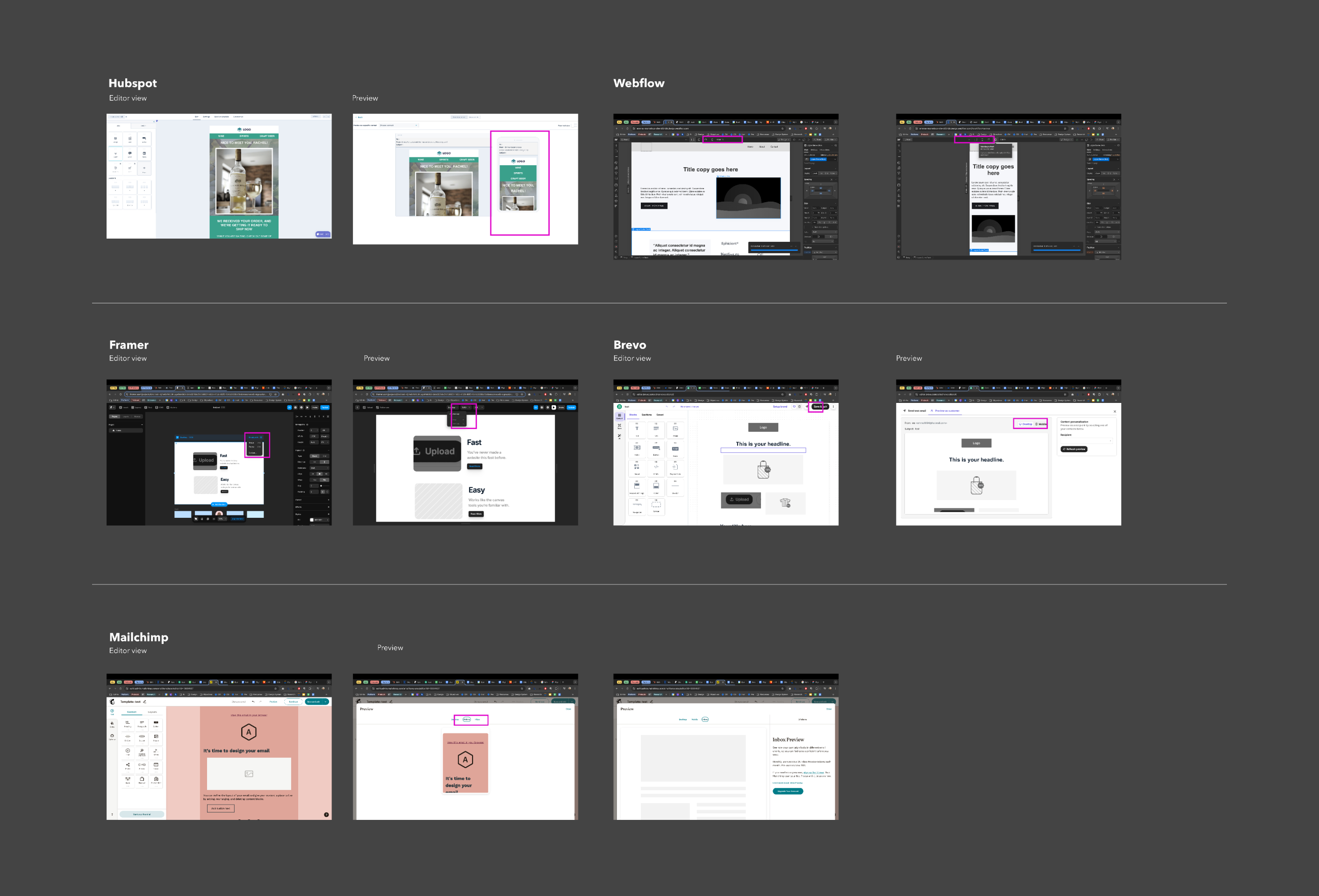
Conducting a short competitor analysis
I then conducted a competitor analysis to evaluate how similar tools handle mobile previews.
This helped identify best practices, gaps, and innovative features.
Drafting an UX solution
In this stage, I translated insights from user needs and competitive analysis into initial wireframes and prototypes tailored for mobile view.
After creating the first draft, I sought feedback from fellow designers, engaging in multiple iterative feedback loops. Each round of feedback helped refine the design, ensuring it aligned with both usability principles and aesthetic goals.
This collaborative approach allowed me to identify pain points early and improve the design progressively.
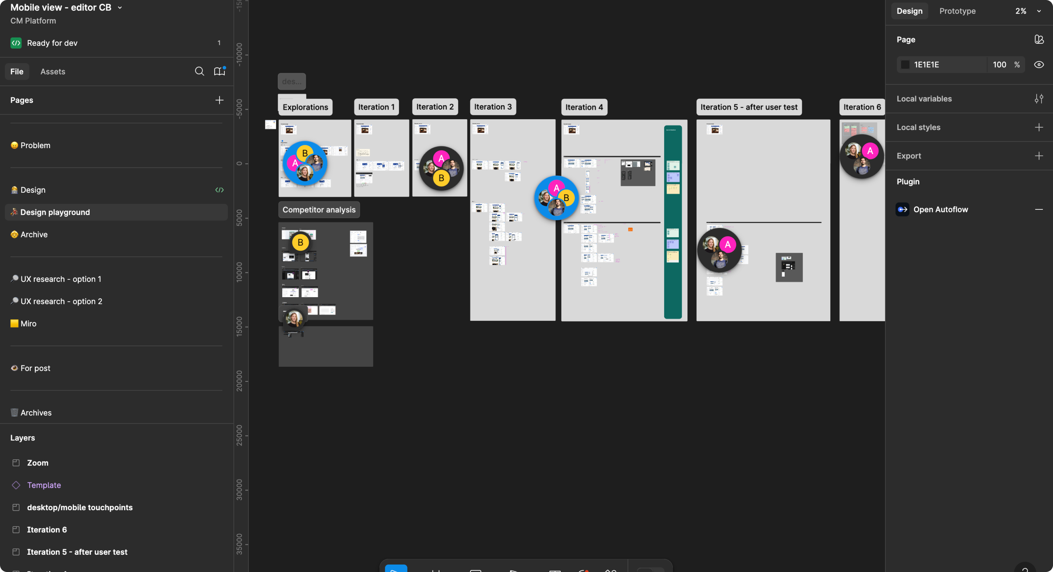
After gathering feedback and iterating, I developed two distinct solutions for the mobile interface:
1. The modal option
A modal appears directly on the canvas, providing a focused view for actions or information.
This modal can be repositioned on the canvas, allowing users to maintain visibility of surrounding elements while interacting with it.
2. The free-move option
Inspired by tools like Figma, this option allows users to freely navigate the entire canvas without constraints.
It provides a seamless, immersive experience, enabling users to interact with elements dynamically and intuitively.
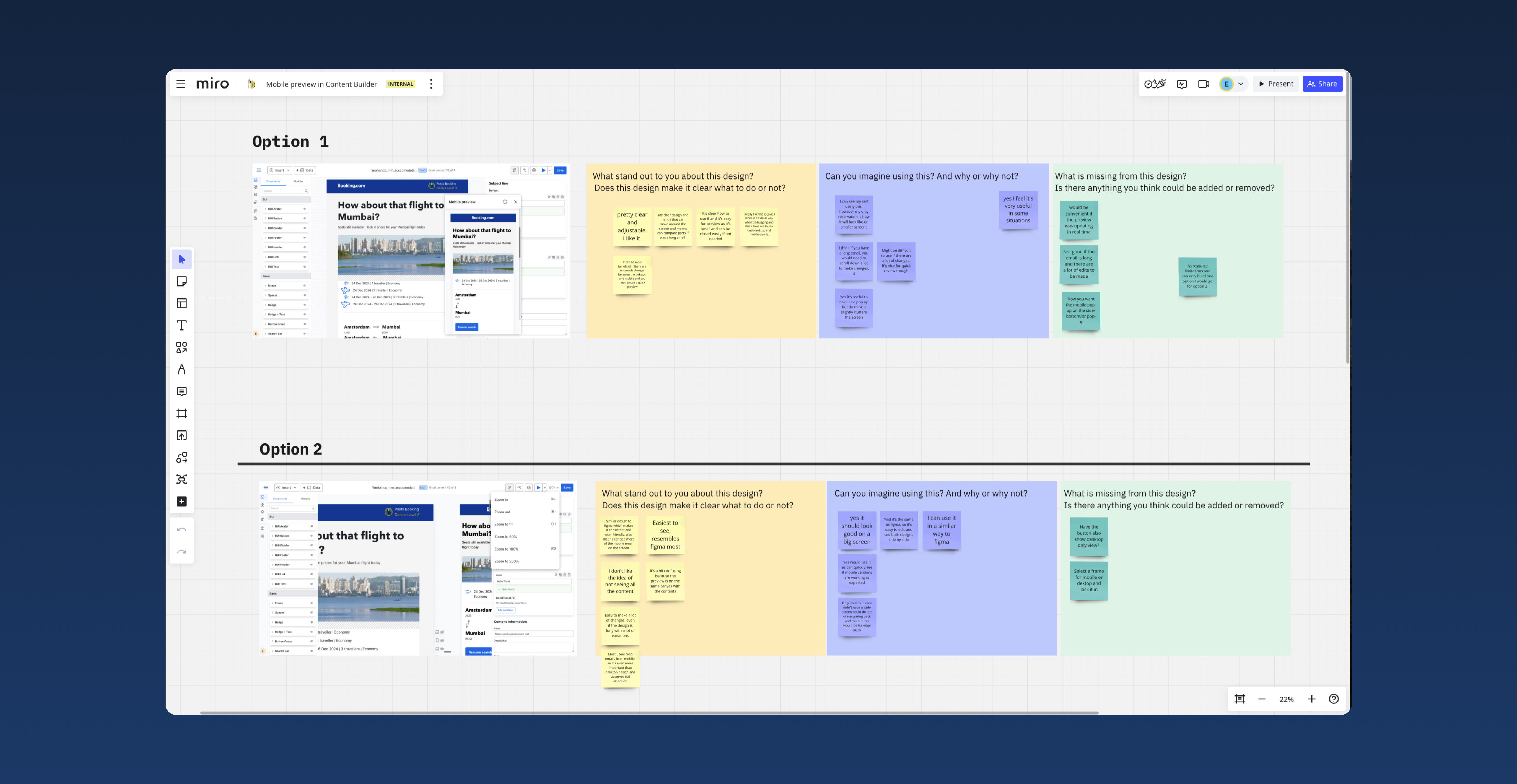
Workshop with end-users
To determine the best option, I facilitated a user-centered workshop on Miro with end users: marketers, operations specialists and developers.
During the session, I demonstrated both options using interactive prototypes built in Figma. After the demos, participants provided feedback through an anonymous sticky-note exercise on three dedicated boards, each framed in a specific color for clarity:
- Yellow Frame: "What stands out about this design?"
Participants highlighted the strengths and unique aspects of each option.
- Purple Frame: "Can you imagine using it? Why or why not?"
This board captured users' thoughts on the practicality and appeal of each design, including potential challenges they foresaw.
- Green Frame: "What is missing from this design?"
Here, participants noted gaps or features they felt were necessary for an optimal experience.
The anonymous format encouraged honest and detailed feedback, which provided valuable insights to guide the final decision.
Design decision and refinement
Based on the feedback gathered during the workshop, I selected the modal option as the final design.
Users found the free-move option confusing because the desktop version was editable, while the mobile version was only a preview, leading to inconsistent interaction expectations.
To address user concerns gathered during the workshop and enhance the modal design, I made the following refinements:
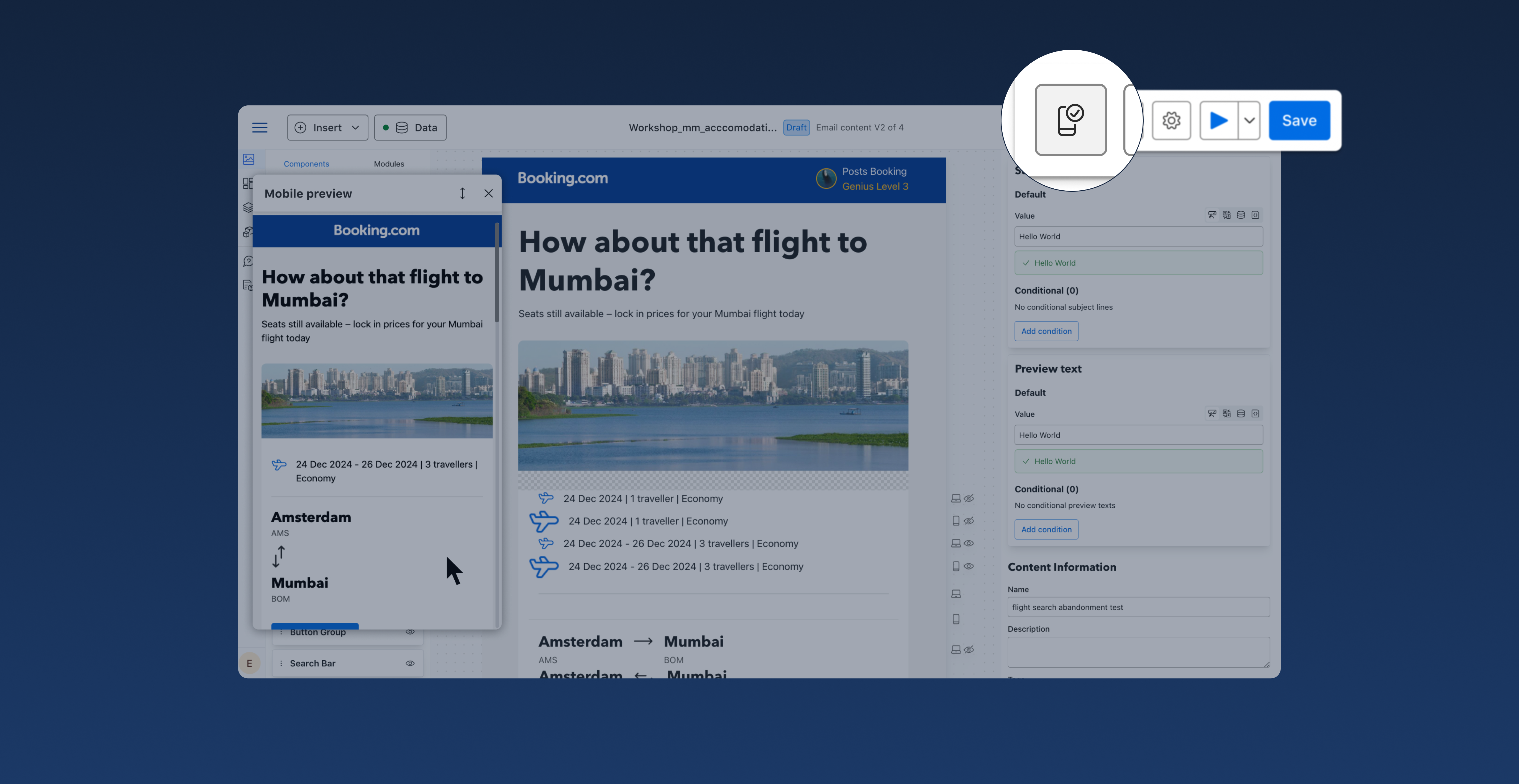
1. Mobile preview button in the header
To improve accessibility and streamline the user experience, I introduced a mobile button in the header navigation.
This button allows users to quickly display the mobile preview of the email. The button's design was carefully integrated into the header toolbar, ensuring it aligns with the existing interface's visual language. I chose an intuitive icon to represent the mobile view, making it immediately recognisable and easy to use.
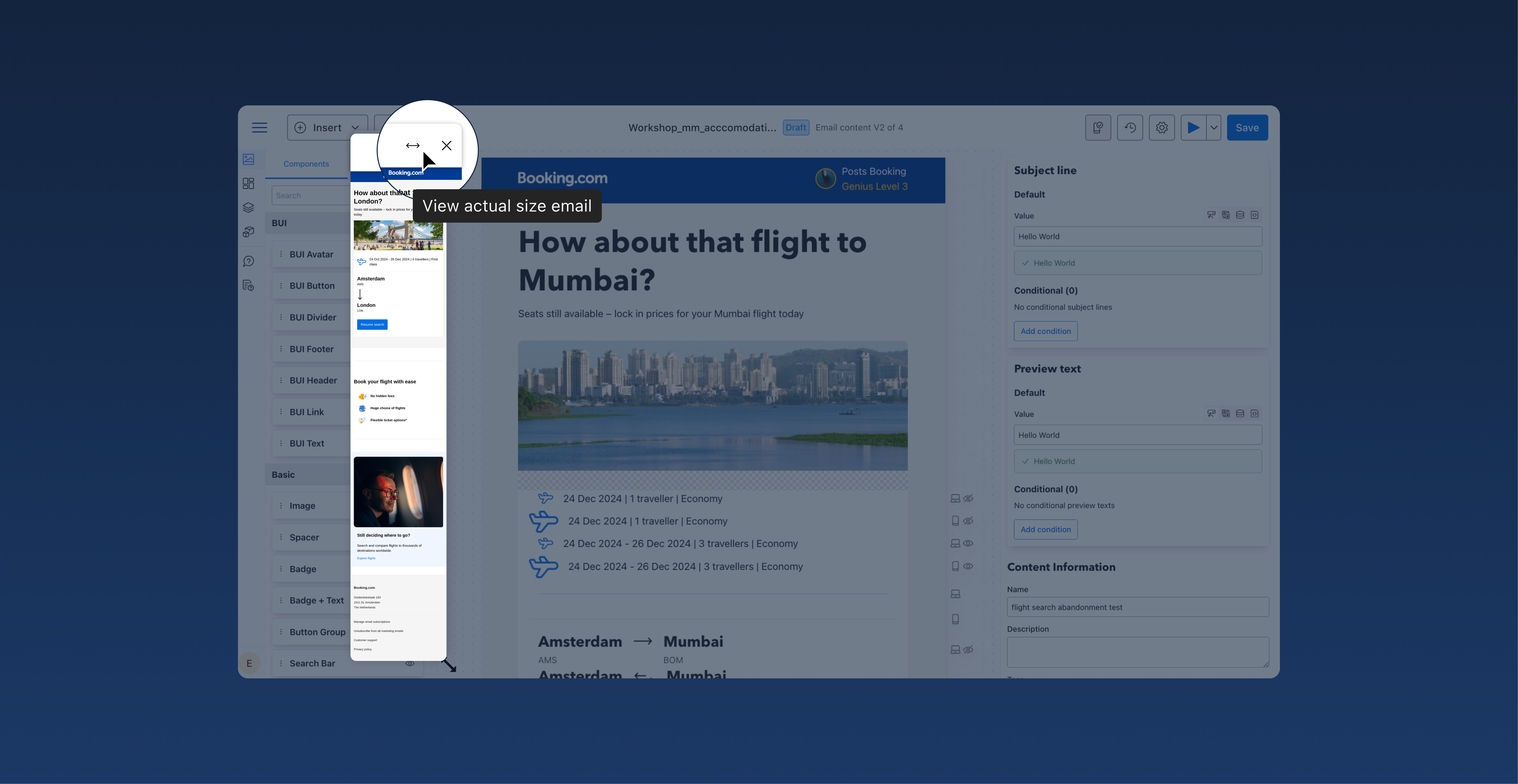
2. Full-size mobile email in one click
To address user feedback about frustration with excessive vertical scrolling, I introduced an arrow icon to the modal.
This icon allows users to quickly expand the preview and view the design in full size with a single click, streamlining their workflow.
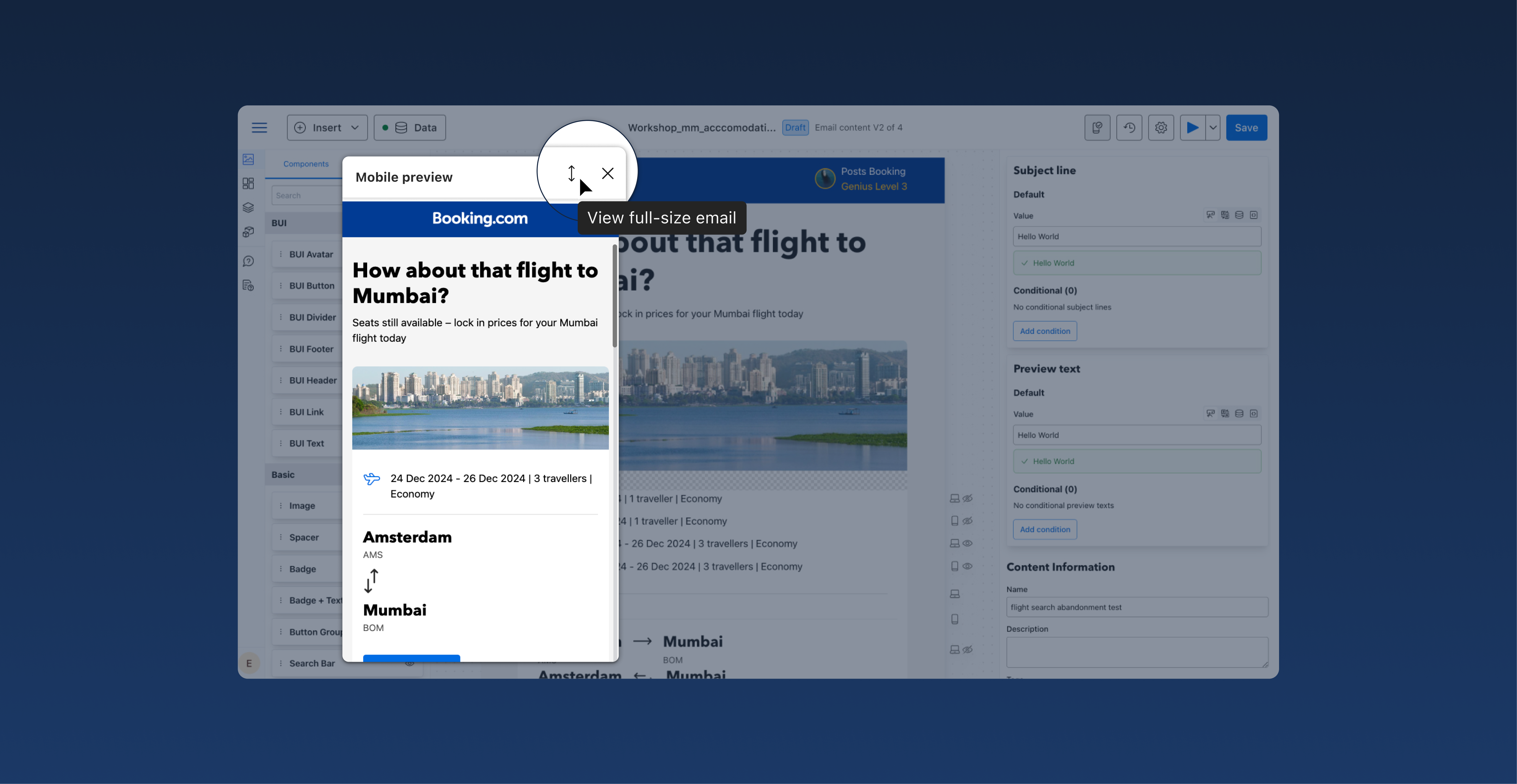
Once the email is displayed in its full size, the button transforms into a "View actual size" option, offering users a seamless way to toggle between views.
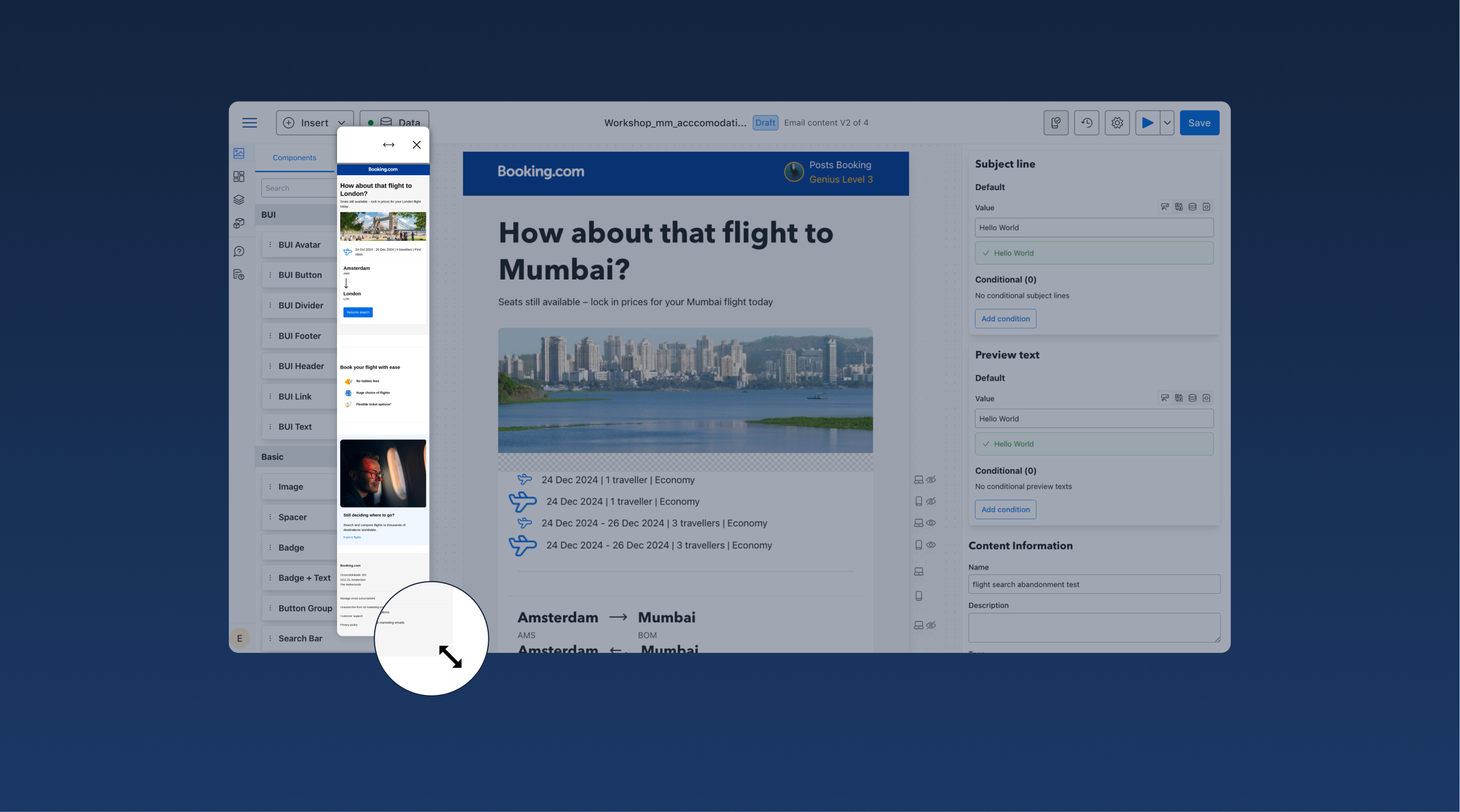
3. Resizable modal
To provide greater flexibility, I enabled users to resize the modal dynamically.
This adjustment allows users to customise their workspace based on their specific needs, offering a balance between visibility and interaction.
Did I overcome challenges?
During a workshop, users expressed enthusiasm for combining two options we presented, suggesting a mix of both would meet their needs best.
However, this solution was not technically feasible due to the additional development time and resources required. This posed a significant challenge, as it risked user disappointment and frustration.
To address this, I took proactive steps to mitigate concerns while fostering trust and maintaining transparency:
- Collaborating with the design and development teams: I initiated discussions with the design and development teams to thoroughly explore the feasibility of the suggestion. This collaboration allowed me to fully understand the technical constraints and ensured that I could provide users with clear and accurate explanations.
- Engaging with users post-workshop: After the workshop, I maintained transparency by sending a follow-up email to all participants. In this communication, I empathized with their excitement for the combined option and explained the reasoning behind our chosen approach. I provided a detailed overview of the decision-making process, outlined the constraints and trade-offs, and highlighted how the selected option aligned with project goals.
These steps not only ensured honesty and transparency but also demonstrated my commitment to collaboration and user-centered decision-making. By addressing the issue openly and engaging users throughout the process, I helped turn a potentially frustrating experience into an opportunity to build trust.
What are the expected impacts?
The mobile preview button enhances user workflows by allowing a better mobile design preview on the editor screen.
It improves design accuracy and efficiency. For end users, it also ensures better context awareness, flexibility, and confidence in outputs, ultimately leading to better UX for Booking.com's customers and potentially more bookings.