Heading 1
Heading 2
Heading 3
Heading 4
Heading 5
Heading 6
Lorem ipsum dolor sit amet, consectetur adipiscing elit, sed do eiusmod tempor incididunt ut labore et dolore magna aliqua. Ut enim ad minim veniam, quis nostrud exercitation ullamco laboris nisi ut aliquip ex ea commodo consequat. Duis aute irure dolor in reprehenderit in voluptate velit esse cillum dolore eu fugiat nulla pariatur.
Block quote
Ordered list
- Item 1
- Item 2
- Item 3
Unordered list
- Item A
- Item B
- Item C
Bold text
Emphasis
Superscript
Subscript
Epieos, a company providing investigative and software services to both organizations and individuals, has made significant investments in the OSINT and cybersecurity communities.
As part of the project, I led the development of the entire branding, UX, and design system. In this case study, I will delve into the design system, with a focus on the grid system, logo, color palette, typography, buttons, dialogs, input fields, and key pages.
Foundations of the design system
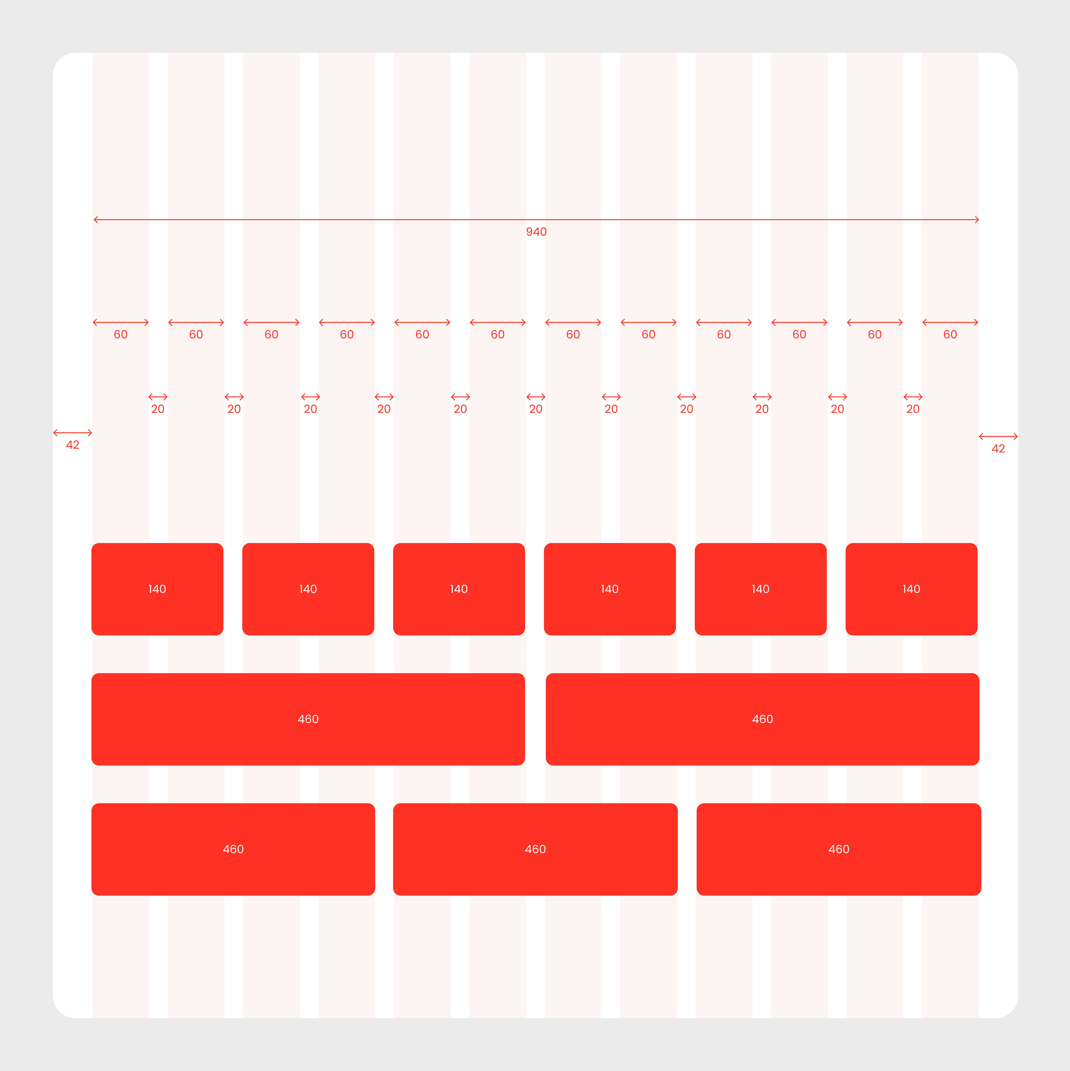
Grid system
The grid system forms the backbone of the design, ensuring that the layout remains consistent and structured across all devices. The gutters are calculated to be divisible by 4, with a standard 20px gutter width. This approach helps group elements in a logical and visually pleasing way, enhancing the overall user experience. Epieos' spacing grid uses a 4px increment, allowing for pixel-perfect alignment and scalability.
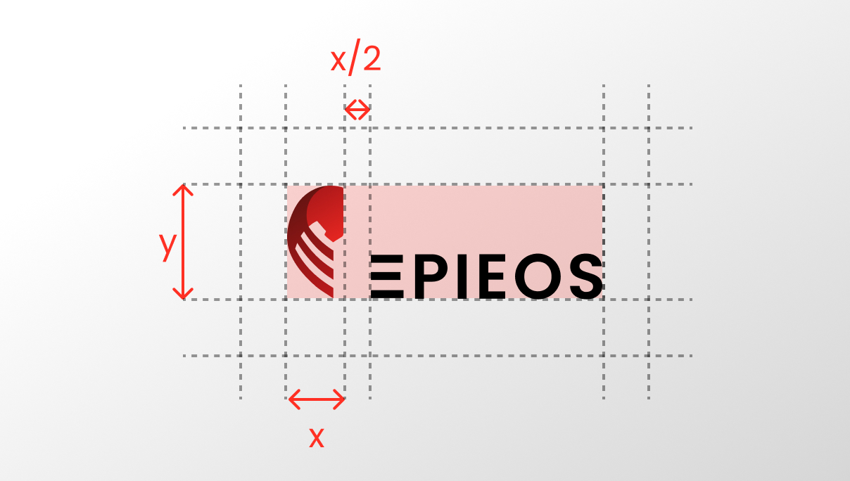
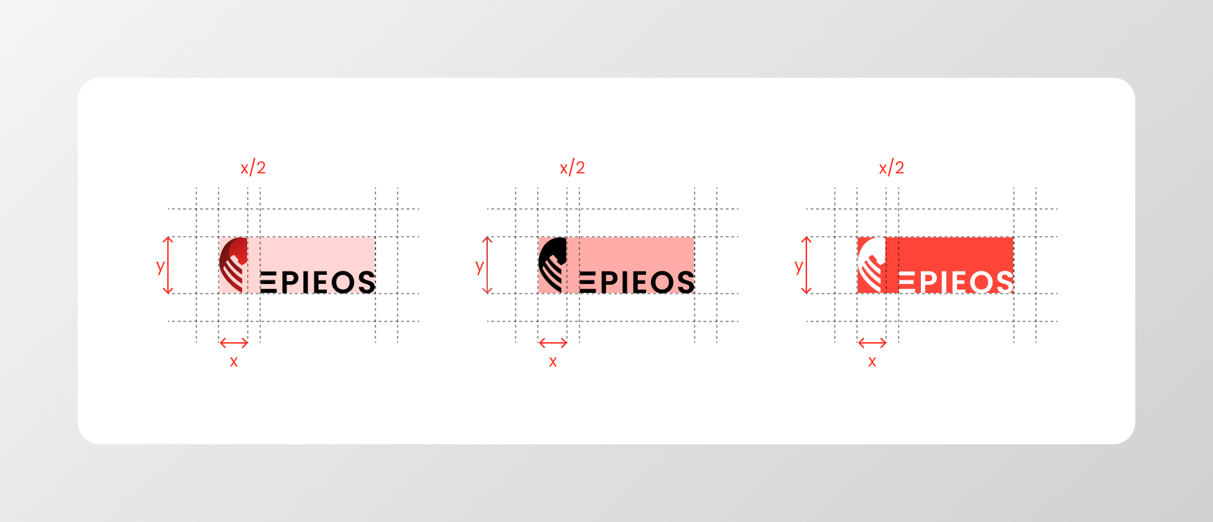
Logo
The Epieos logo is a visual representation of the company’s core values.
It features a horse, symbolizing the concept of a "Trojan," which aligns with the company’s focus on security and investigation. The logo is thoughtfully divided into three segments, visually referencing the shape of the letter "E" to reinforce the brand's identity and create a memorable, balanced design.
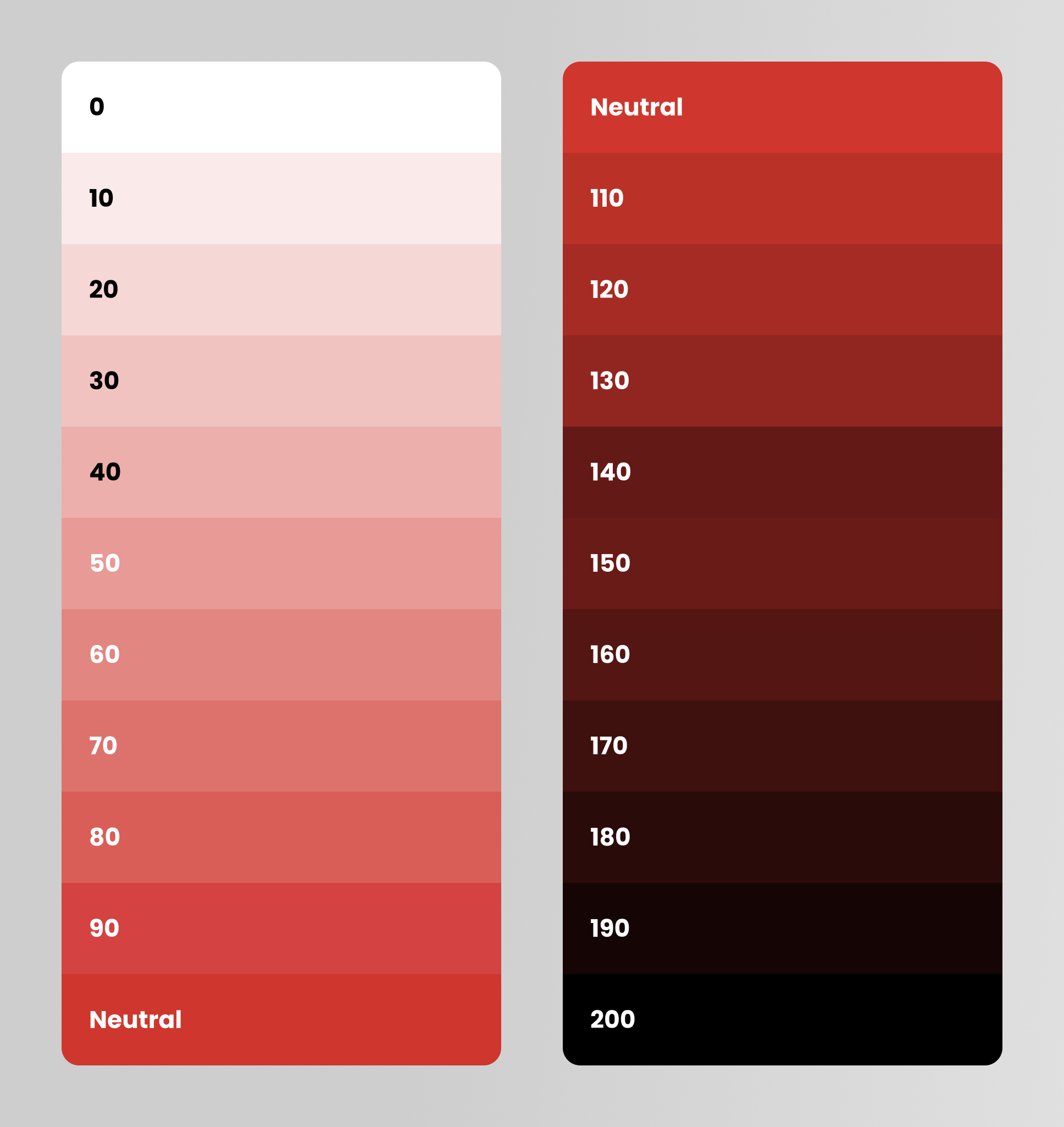
Color Palette
The primary color for Epieos is red, symbolizing power, urgency, and trust.
This color can be adjusted to lighter or darker shades by adding 10% white or black, respectively. Additionally, a neutral color option is available for balance.
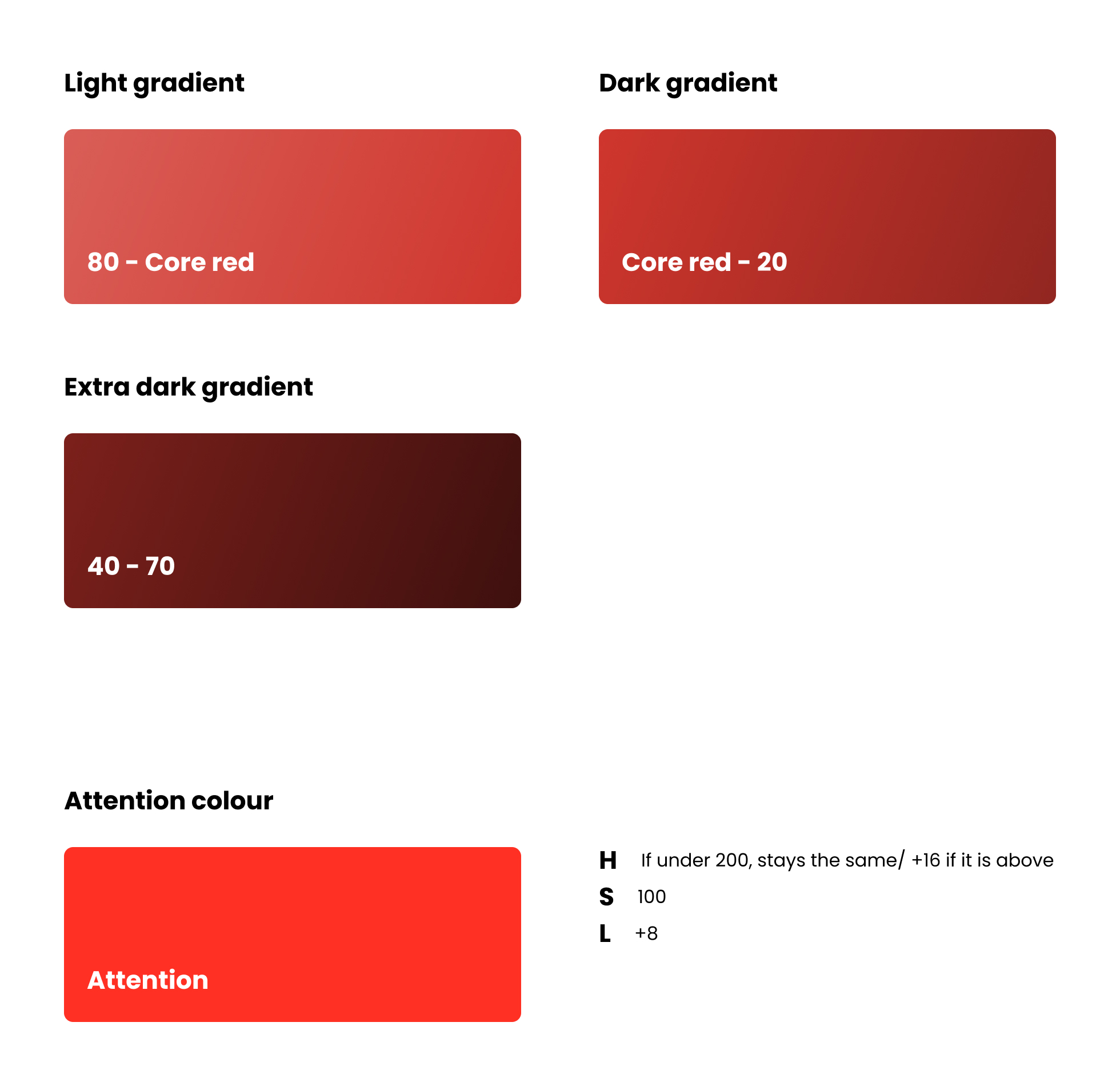
Gradients are applied across various pages to create depth and visual interest. Light gradients are used on dark backgrounds, while darker gradients are applied on light backgrounds, each carefully crafted from specific shades within the color spectrum.
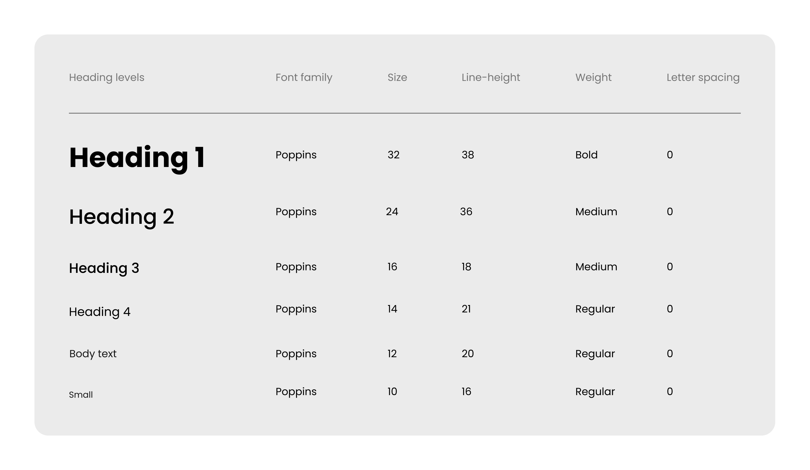
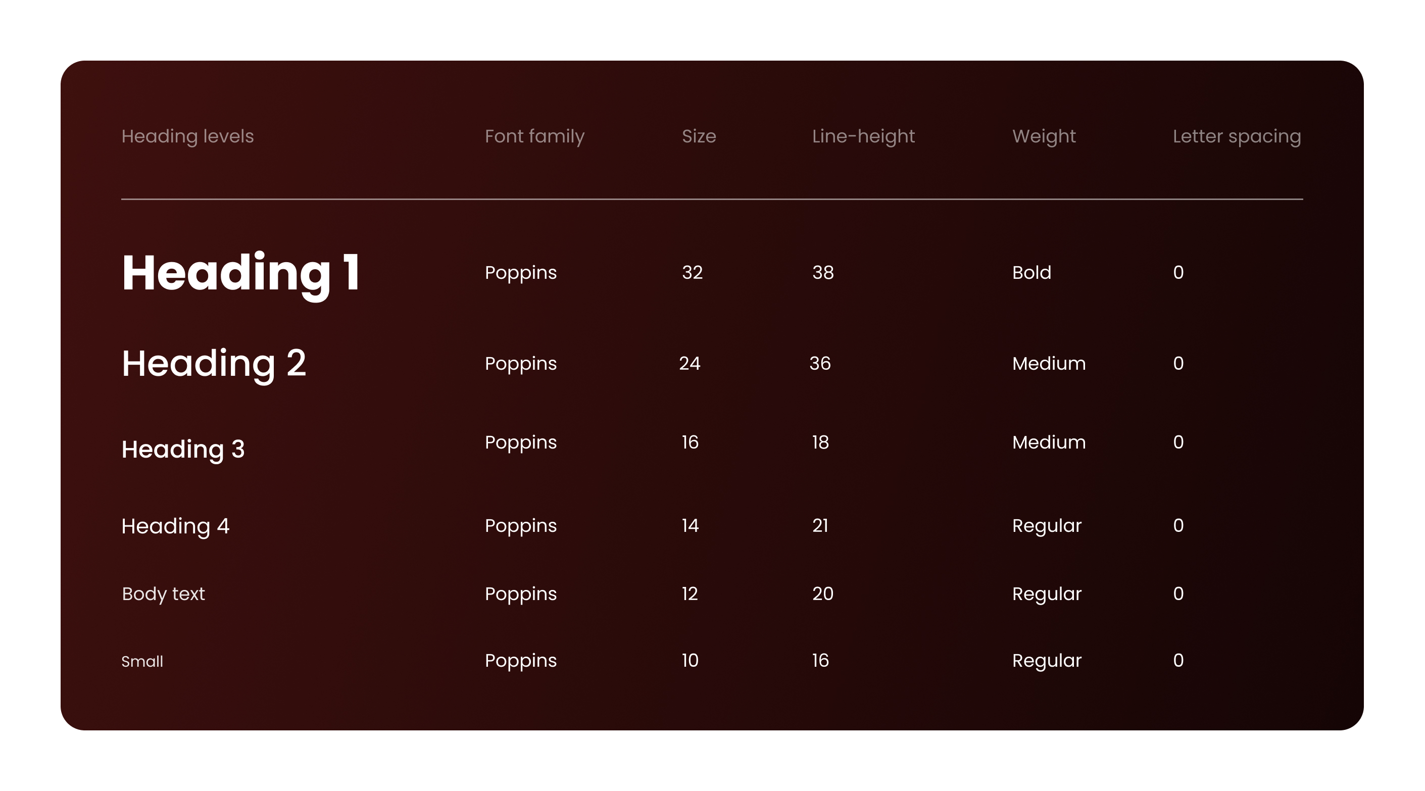
Typography
For typography, we chose Poppins as the primary typeface due to its modern and geometric design, which complements the brand’s clean and approachable aesthetic. A clear hierarchy was established by using bold weights for headings and regular or light weights for body text, ensuring readability and balance.
In Figma, we implemented typography styles and variables for consistent text formatting across headings, subheadings, body text, and buttons. This approach streamlined the design process, making it easier to maintain uniformity and quickly adapt to different screen sizes or layouts.
- Typography System for Light Backgrounds
- Typography System for Dark Backgrounds
UI elements
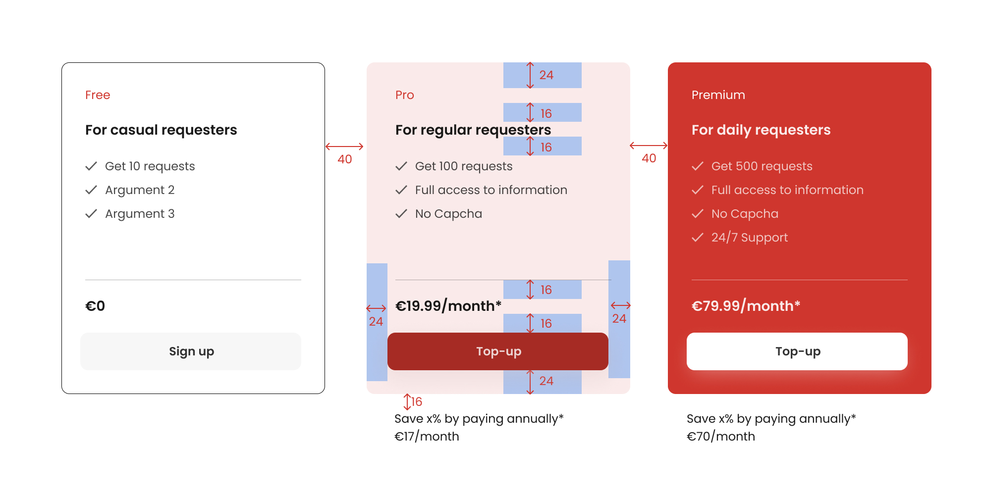
Buttons
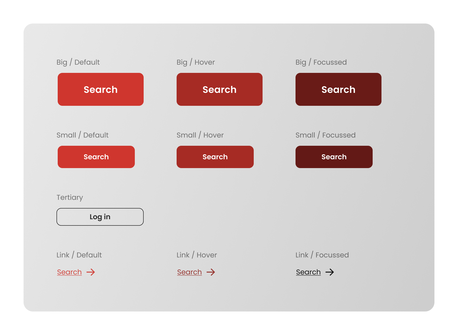
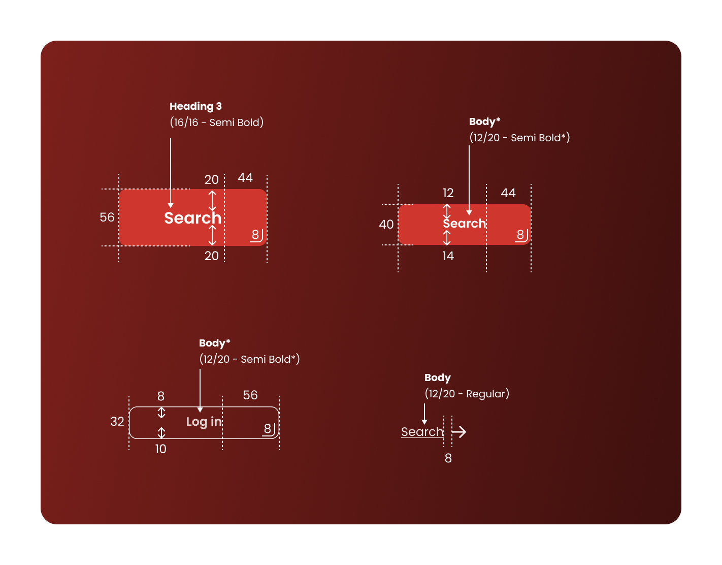
The button component set is designed to ensure consistency across user interactions. I created variants for large, small, and link-style buttons, each with defined states for default, hover, and focus interactions. By utilizing Figma’s styles and variables, we ensured that font sizes, spacing, and colors could be adjusted seamlessly across different components and layouts. Every button was carefully measured, with defined paddings, margins, and spacing to guarantee pixel-perfect alignment across all screen sizes. This attention to detail ensured that buttons were both accessible and consistent, enhancing the user experience.
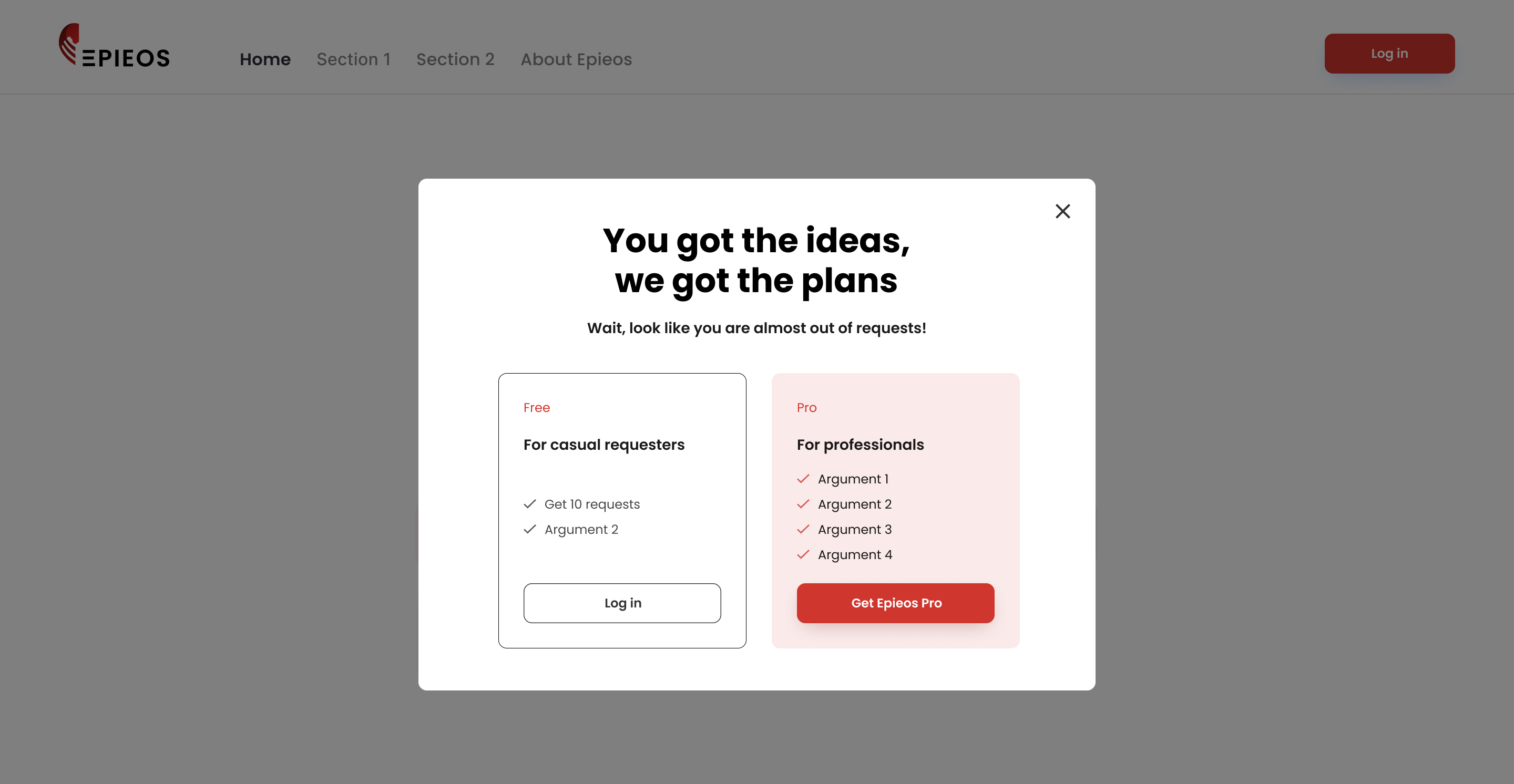
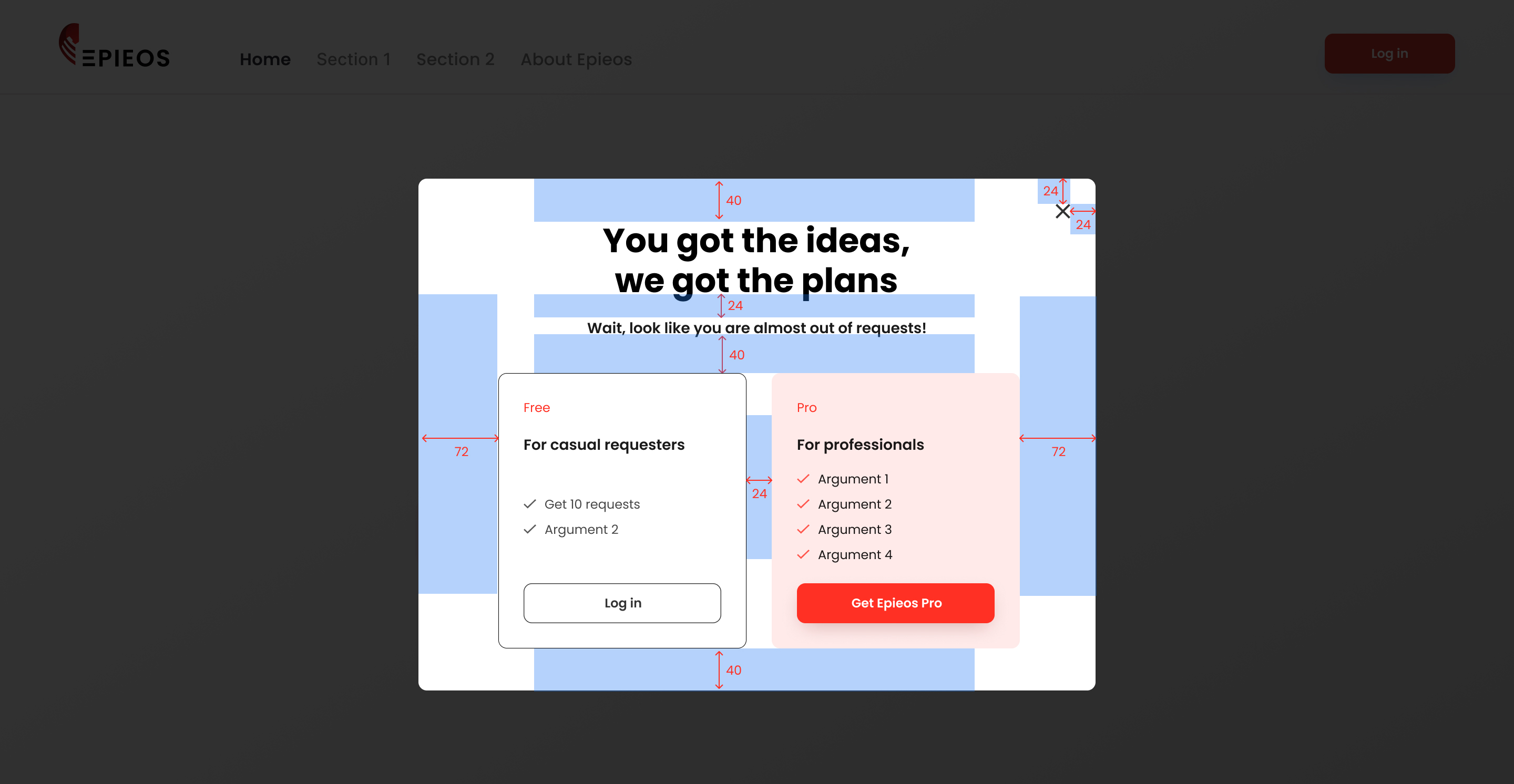
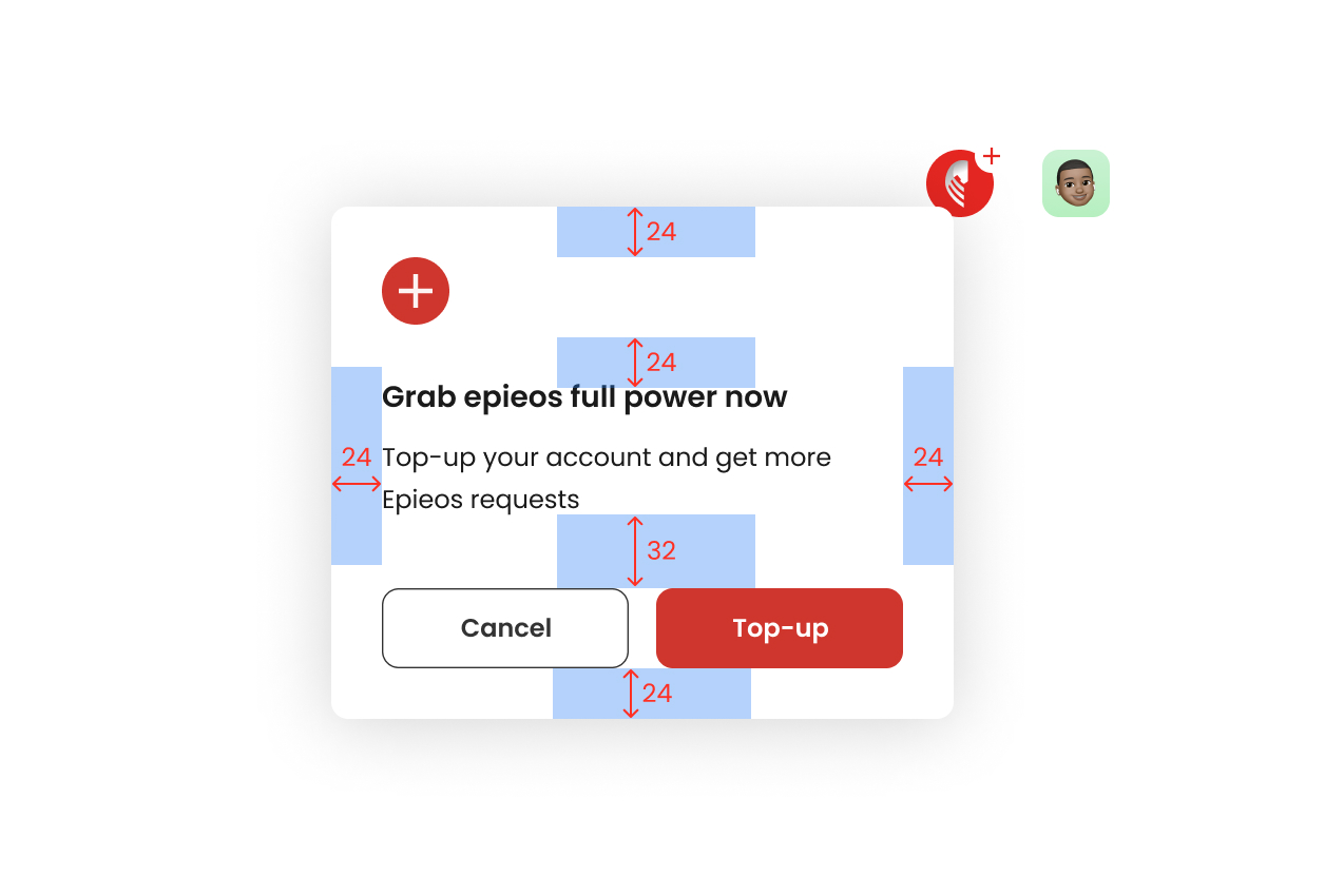
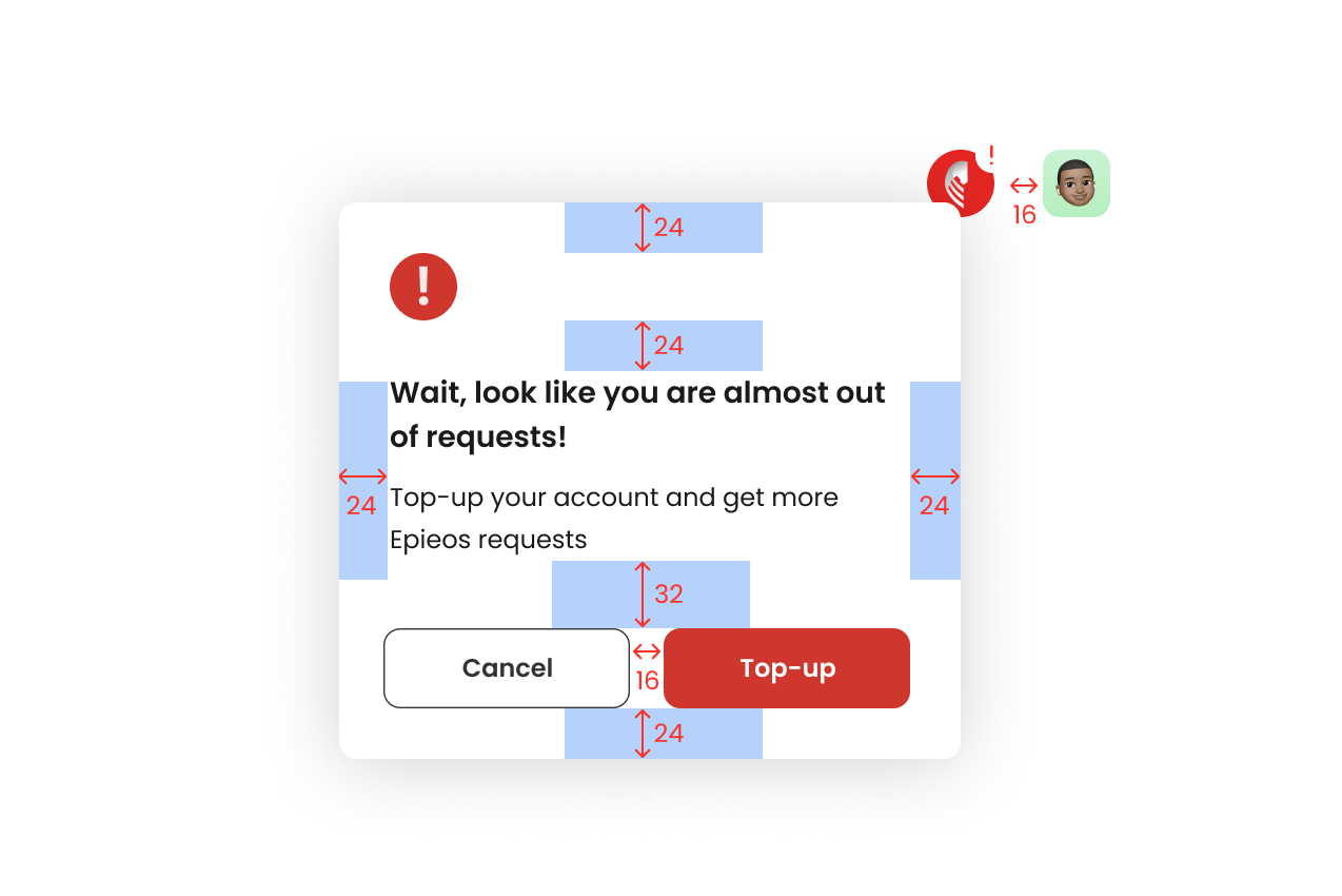
Dialogs
Dialogs were designed to provide clear and concise communication with the user. The design emphasizes clarity, accessibility, and responsiveness, ensuring users can interact with these elements without confusion or frustration. Each dialog component adheres to the same spacing system as other elements, maintaining consistency across the interface.
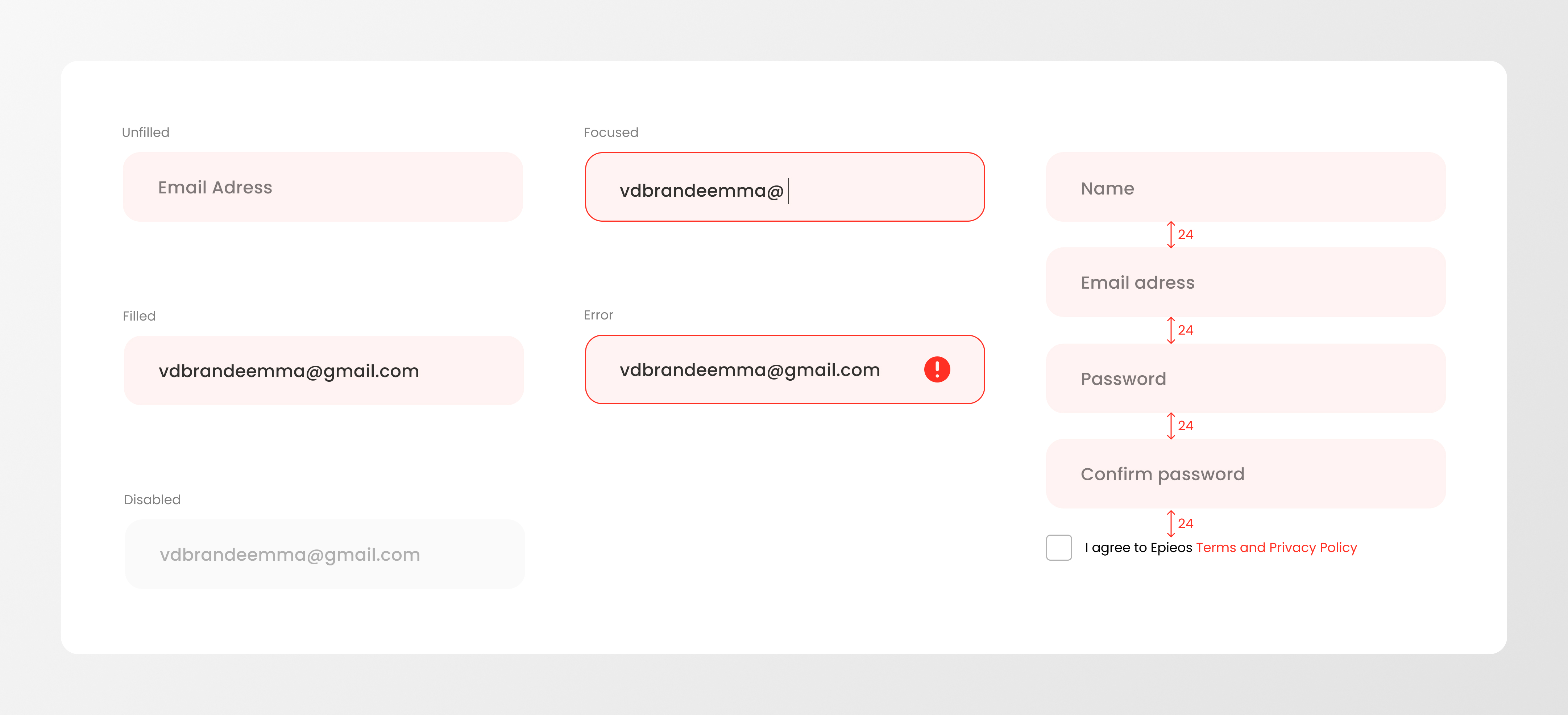
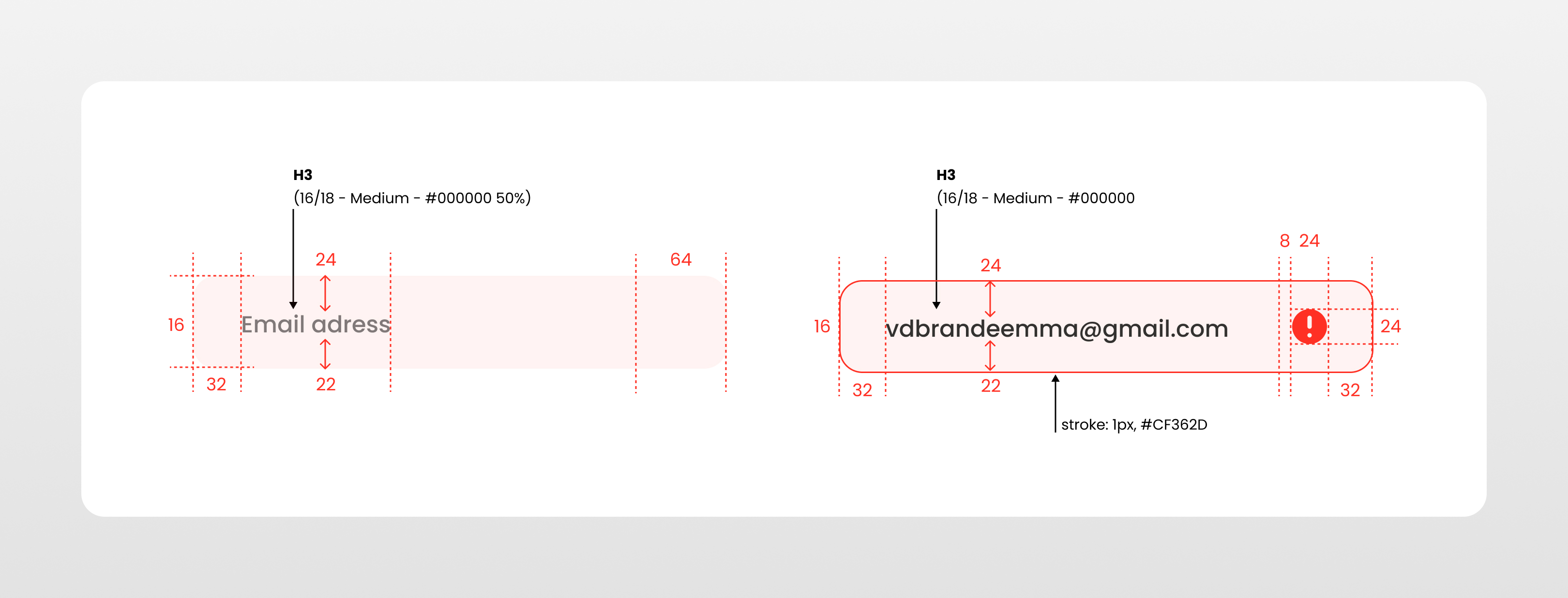
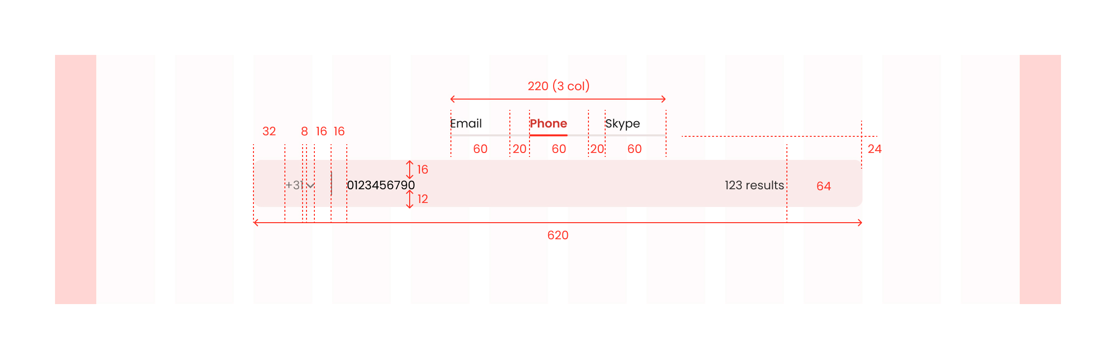
Input fields
The design of input fields focused on simplicity and clarity. Each input field was designed with an intuitive structure, making it easy for users to interact with forms and provide necessary information. The consistent use of spacing and typography across input fields ensures that the user experience remains seamless and straightforward.
Navigation Bar
The navigation bar was designed to provide users with clear, easy access to important sections of the website. Consistent with the overall design system, the navigation elements were structured for usability, with a focus on simplicity and organization. Category navigation was also streamlined to ensure users could quickly locate and explore the content most relevant to them.
Pages
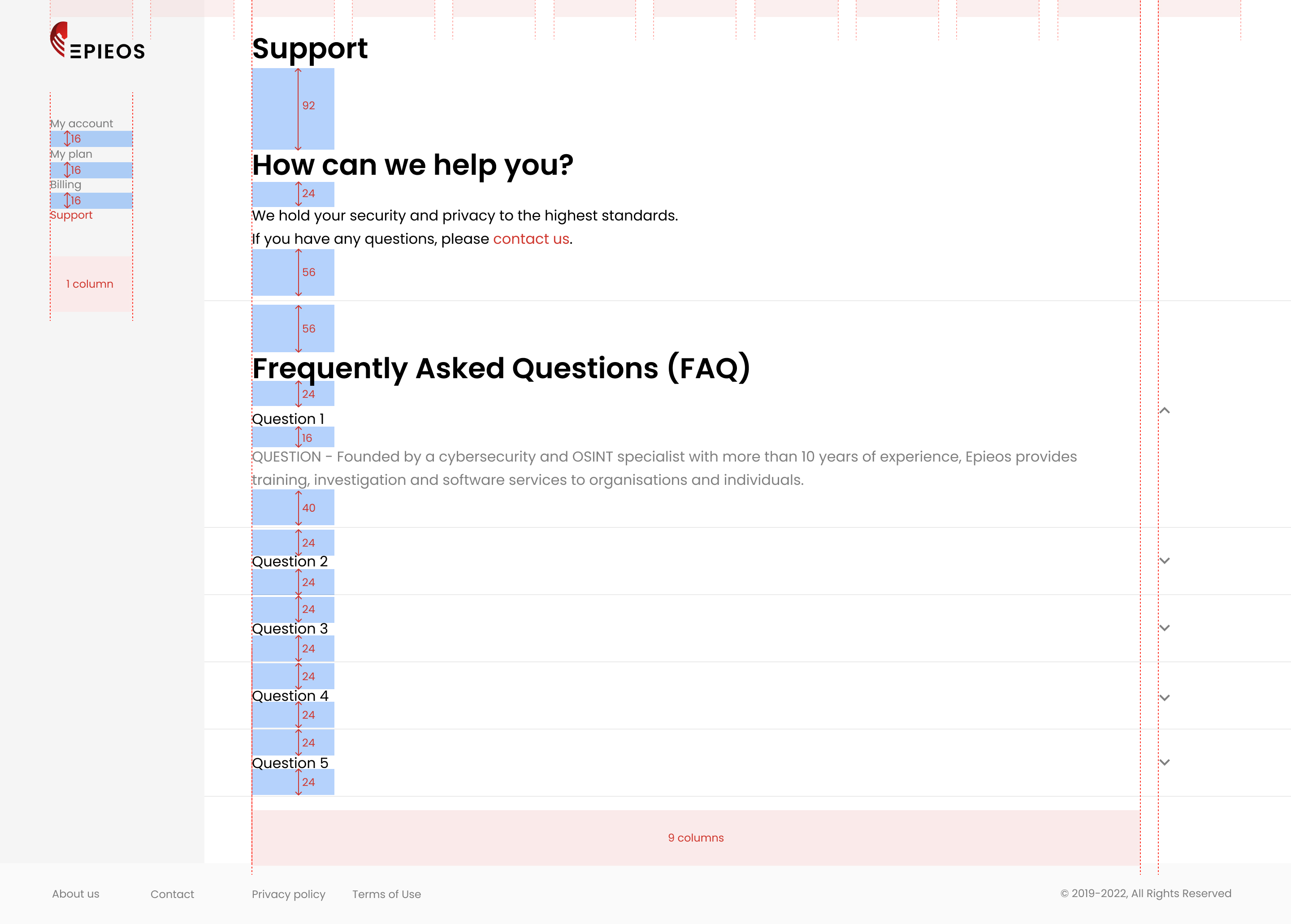
Support page
The support page was designed to offer users easy access to help and resources. Its layout is organized and user-friendly, ensuring users can find answers to their questions efficiently. The support page uses the same grid system and typography styles as the rest of the website to maintain consistency.
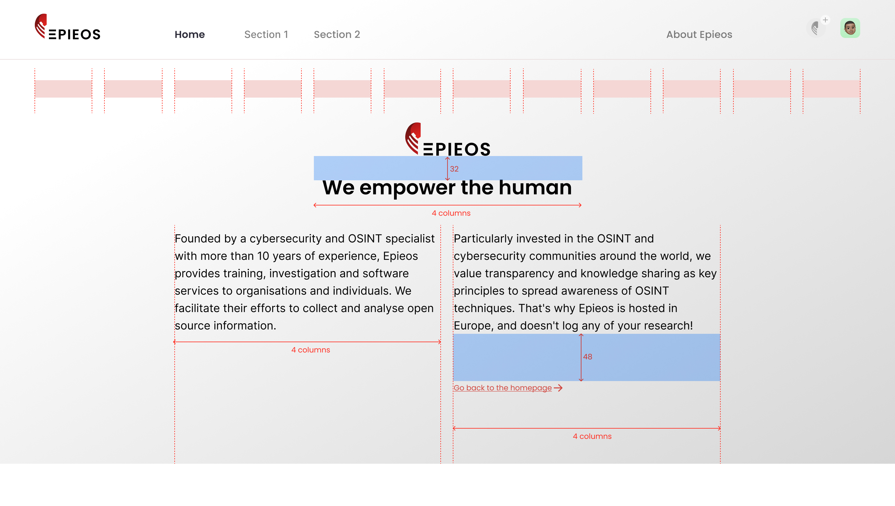
About us page
The "About Us" page offers a detailed introduction to Epieos, showcasing the company's mission, vision, and values. The design emphasizes clarity and approachability, making it easy for users to understand what the company stands for while maintaining a professional and visually engaging layout.