Heading 1
Heading 2
Heading 3
Heading 4
Heading 5
Heading 6
Lorem ipsum dolor sit amet, consectetur adipiscing elit, sed do eiusmod tempor incididunt ut labore et dolore magna aliqua. Ut enim ad minim veniam, quis nostrud exercitation ullamco laboris nisi ut aliquip ex ea commodo consequat. Duis aute irure dolor in reprehenderit in voluptate velit esse cillum dolore eu fugiat nulla pariatur.
Block quote
Ordered list
- Item 1
- Item 2
- Item 3
Unordered list
- Item A
- Item B
- Item C
Bold text
Emphasis
Superscript
Subscript
Epieos.com is a powerful search engine that retrieves social media and online information using email addresses or phone numbers.
The goal of the project was to create a seamless and intuitive platform catering to cybersecurity experts, investigators, and everyday users. As the Product designer, I was responsible for conceptualizing and delivering a user-friendly interface that balanced technical functionality with simplicity.
💯 Starting with the positive: the impact of my design
Before diving into the challenges we tackled, it’s important to highlight the tangible impact of the improved user experience at Epieos.com:
Quantitative Impact
- Upsell conversion rate: The refined user experience led to a significant increase in upsell conversions, showing users’ increased willingness to explore and invest in additional features.
- Retention rate: Enhanced engagement strategies contributed to higher retention rates, signaling greater customer satisfaction and loyalty.
- Bounce rate: Intuitive search engine and clear calls-to-action reduced bounce rates, allowing users to quickly find the information they needed.
- Visit duration: The average visit duration increased, reflecting a frictionless, engaging experience that encouraged exploration and trust.
Qualitative data
Epieos.com has earned positive feedback from users, highlighting its effectiveness and relevance for end users:
Epieos helped us find the criminals we were looking for 10 years – Epieos' user
😵 The challenge: poor UX in the OSINT industry
Before Epieos, individuals and professionals faced significant challenges in uncovering information linked to email addresses or phone numbers:
- Incomplete tools: existing solutions lacked access to a broad and comprehensive range of data sources.
- Complex interfaces: many tools were overly technical and difficult to navigate, especially for non-technical users.
- Lack of trust: open-source intelligence platforms often raised concerns about data reliability and privacy. Many users questioned the legitimacy of the sources or feared unintentionally violating legal or ethical boundaries, which made them hesitant to use or recommend these tools.
These barriers directly impacted user growth and retention. The complex concepts, poor usability and trust issues prevented many potential users from trying the tools and discouraged long-term usage among those who did.
For Epieos, this meant a clear opportunity: create a platform that is more intuitive, transparent, and trustworthy, so users not only feel safe using it and are motivated to return and rely on it regularly.
What sets Epieos apart?
- Privacy-preserving search: the platform allows users to discover associated social media profiles and other relevant information without notifying the individuals being searched. This unique capability is invaluable for safeguarding personal security, supporting investigations, and allowing discreet research.
- Access to 550+ modules: with connections to over 550 websites and social networks. This breadth of data sources makes OSINT more efficient, accessible, and effective for both professionals and casual users.
💪 How we enhance UX in the OSINT industry
Addressing core user needs
To address the challenges in the OSINT industry, I started by identifying core user needs:
- They want an intuitive and simple tool for retrieving information from email addresses and phone numbers. Existing tools often failed to meet these criteria due to their complexity and lack of clarity.
- On top of that, users want to feel secured. Most of them are scared to use OSINT platforms due to privacy and security concerns.
Aligning user needs with the business goals
Since fear and hesitation can be major barriers, building trust was essential to drive user adoption and long-term engagement.
Crafting design principles
Having the users needs in mind, the CEO and I collaborated to define core design principles for Epieos. To enrich our brainstorming process, we also leveraged generative AI tools like ChatGPT and Gemini to refine and expand our ideas. Together, we established the following guiding principles:
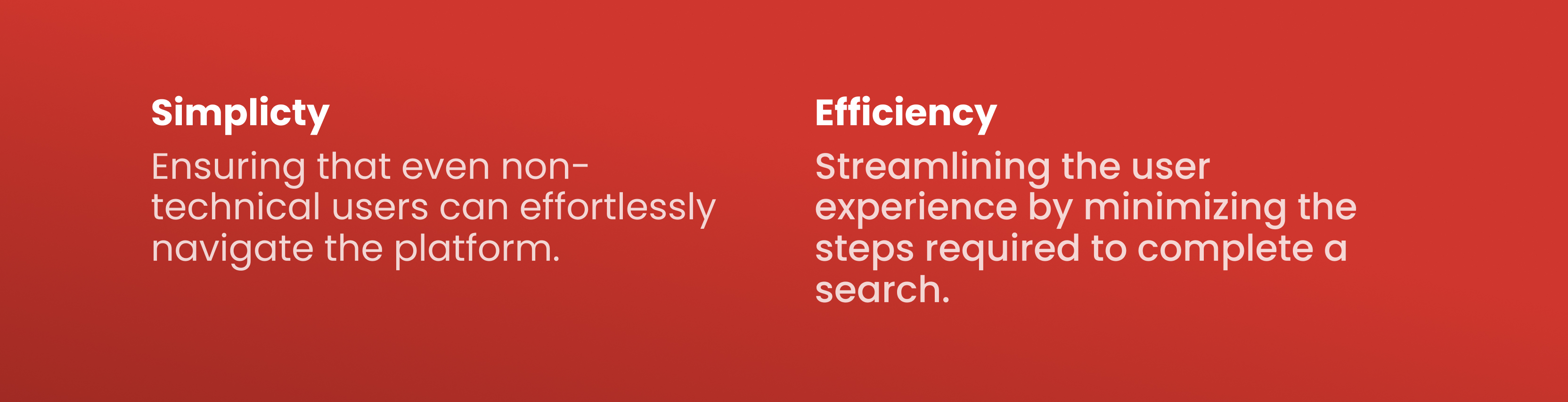
- Simplicity: ensuring that even non-technical users can effortlessly navigate the platform.
- Efficiency: streamlining the user experience by minimizing the steps required to complete a search.
These principles became the foundation for my design strategy.
Defining the information architecture
To create a well-structured tool, the CEO, engineers and myself collaborated to define the key pages and their interconnections. After thorough planning, we identified the core pages necessary for Epieos to deliver a seamless user experience:
- Homepage: the main landing page, featuring the search engine and an introduction to the tool.
- Sign-in page: where users log in to access their accounts.
- Profile page: allows users to manage their account details and settings.
- Pricing page: outlines subscription plans and pricing options.
- About page: provides information about Epieos, its mission and the team behind it.
- Contact page: features contact details.
Other pages, such as the Terms and Conditions and Privacy Policy were also included for compliance and user clarity.
In this case study, I’ll focus on the most impactful pages from a UX perspective: the homepage and the pricing plan flow.
Designing an intuitive and simple experience and building trust
Aiming for simplicity
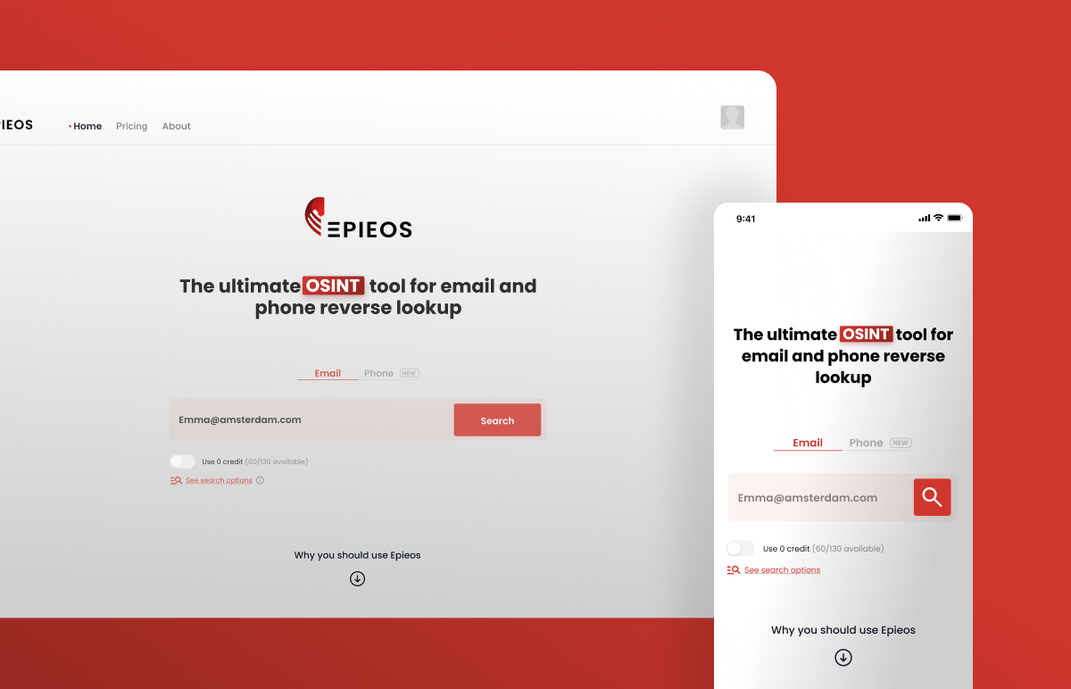
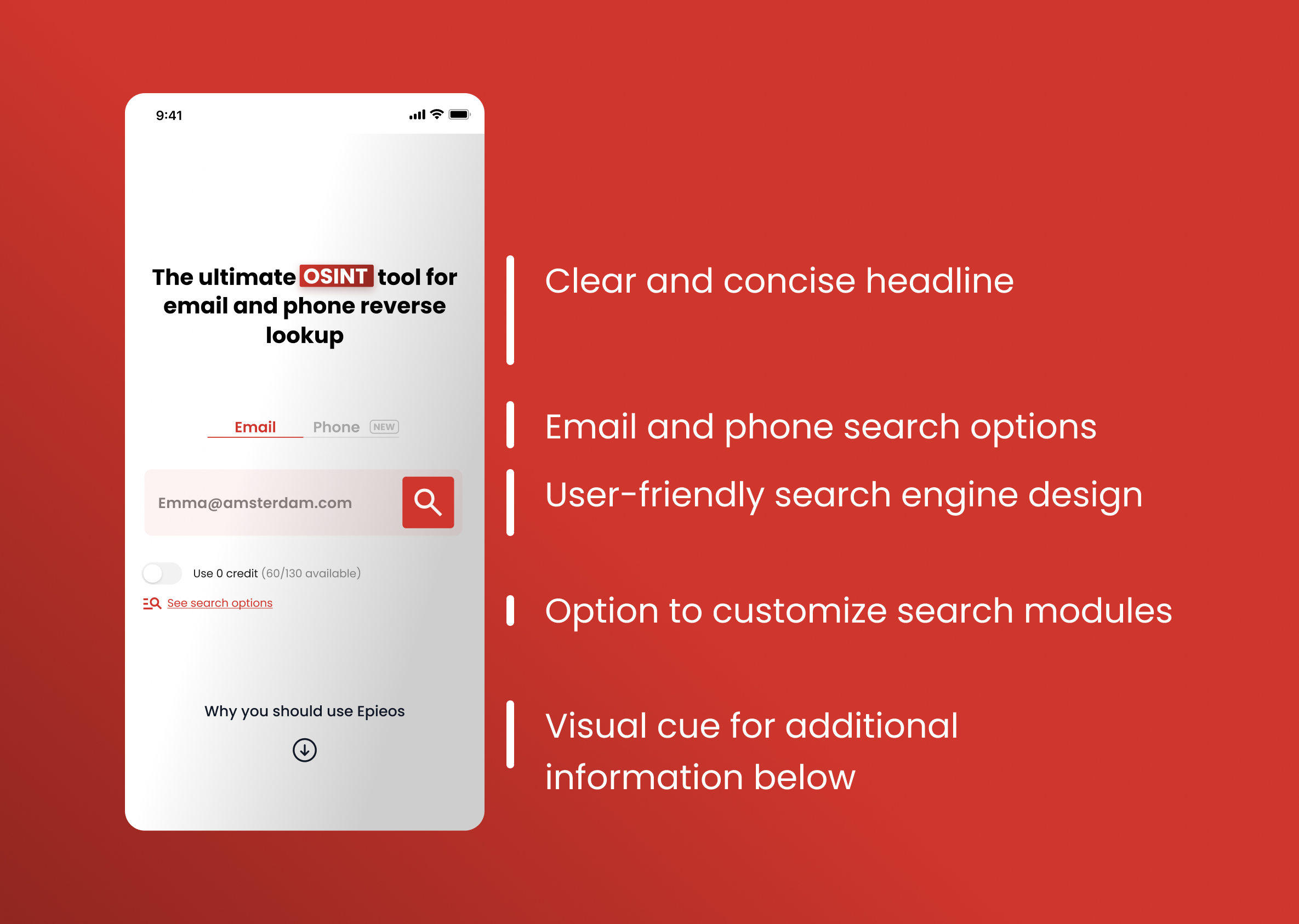
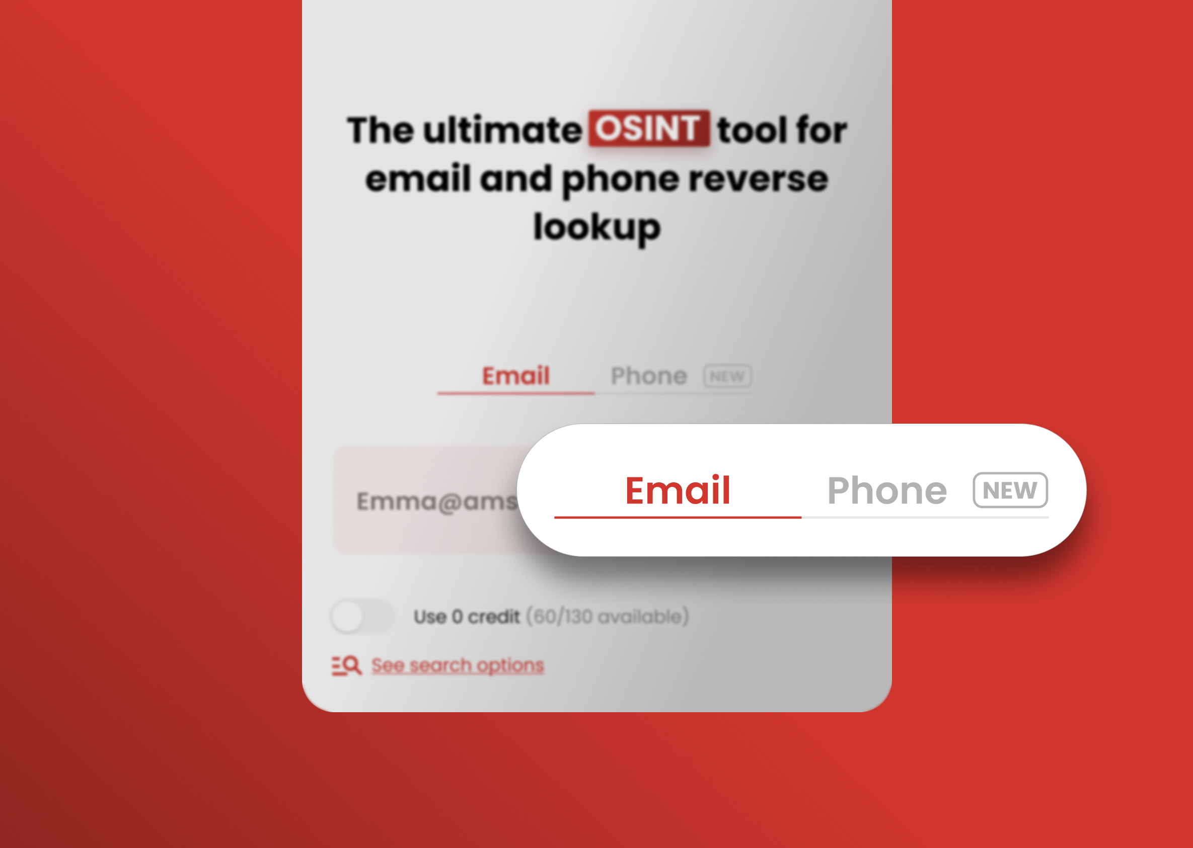
My primary goal was to design an intuitive and user-friendly tool. To achieve this, I focused on keeping the homepage clean and straightforward, showcasing only Epieos’s core feature above the fold. The core search functionality is prominently displayed above the fold, ensuring users can immediately understand and interact with the platform without distractions.
Minimising cognitive load
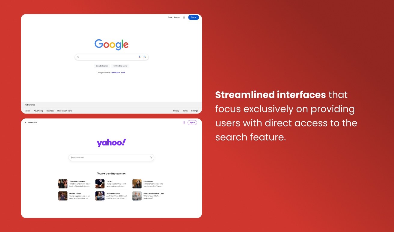
To ensure ease of use, I drew inspiration from familiar search engines like Google and Yahoo, creating a design that minimizes cognitive load. By leveraging a layout users are already accustomed to, I was able to promote seamless navigation and make the tool accessible to both technical and non-technical audiences.
Empowering users
Tabs for email and phone searches were added to make switching between functionalities quick and easy. For users with advanced plans, a “See search options” link was included to enable customization and accommodate diverse needs.
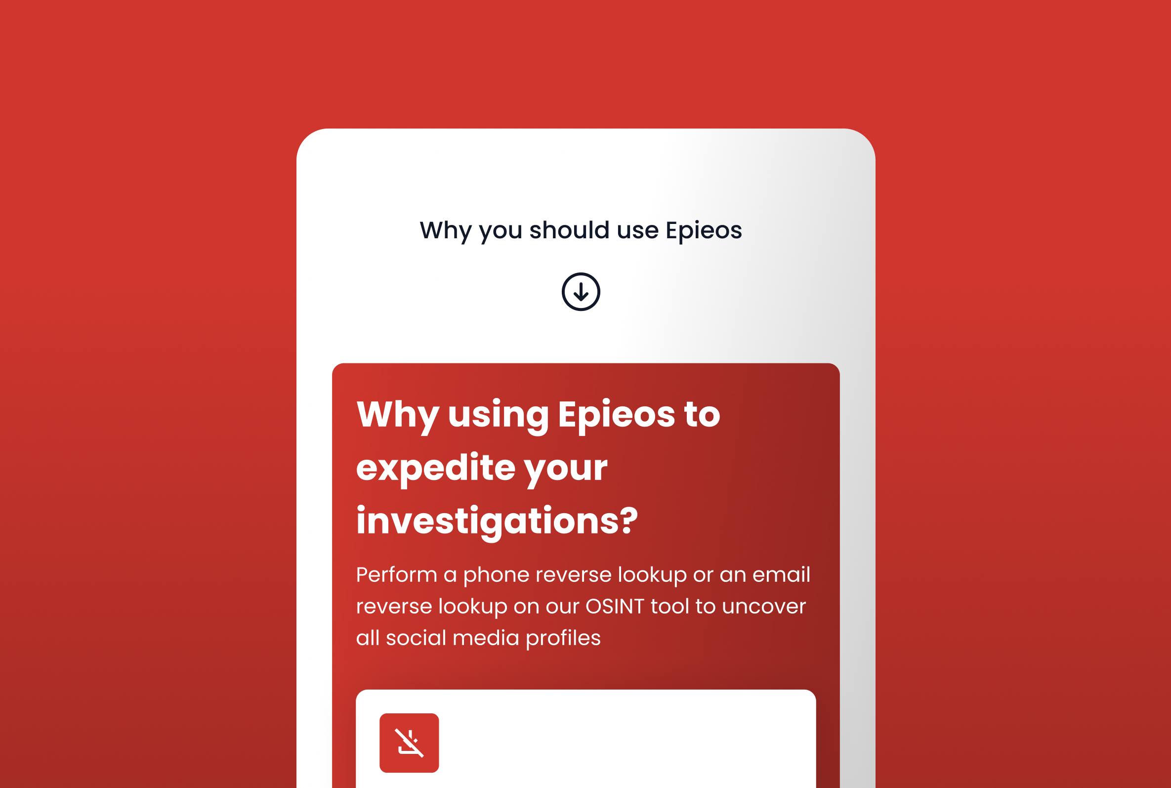
Encouraging exploration
A subtle downward arrow acts as a visual cue, signaling additional content below the fold without detracting from the primary functionality. This design choice ensures the interface remains focused while encouraging users to explore more about Epieos.
Building trust with USP, social proof and magic link
USP and social proof
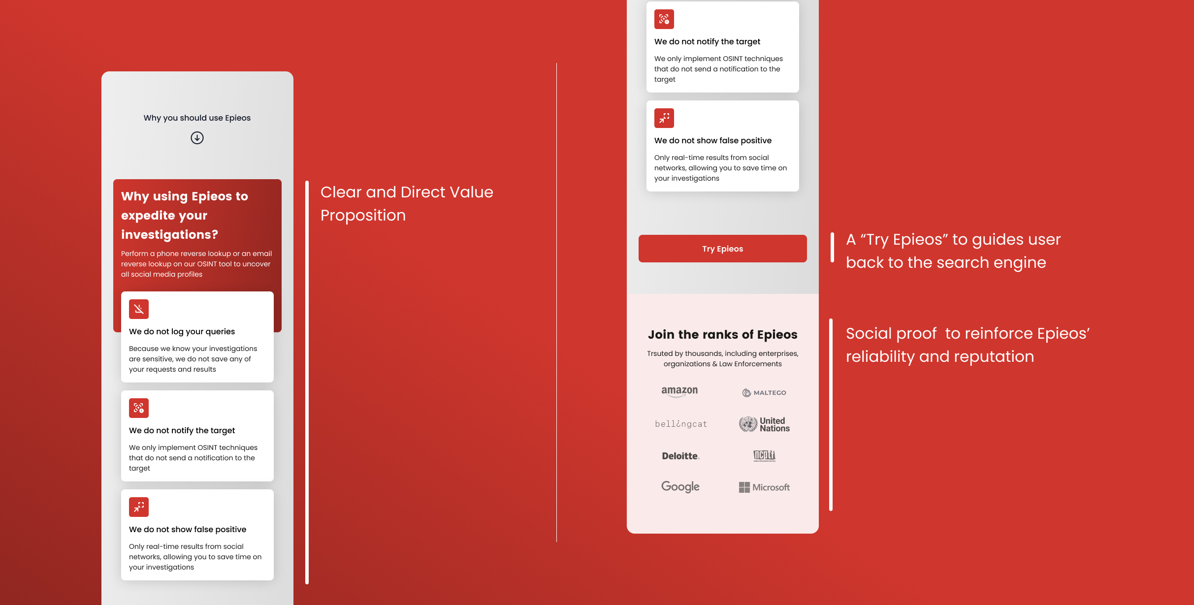
As users scroll down, the design shifts focus from functionality to trust-building and showcasing Epieos' value. Below the fold, the interface highlights:
- Three key benefits presented with clear icons to emphasize Epieos’ strengths.
- Social proof with recognizable logos reinforce credibility and establish trust.
- Call-to-Action with a prominent "Try Epieos" button that provides seamless navigation back to the search engine.
This is valuable as most users in the OSINT space are scared of unintentionaly crossing ethical or legal boundaries.
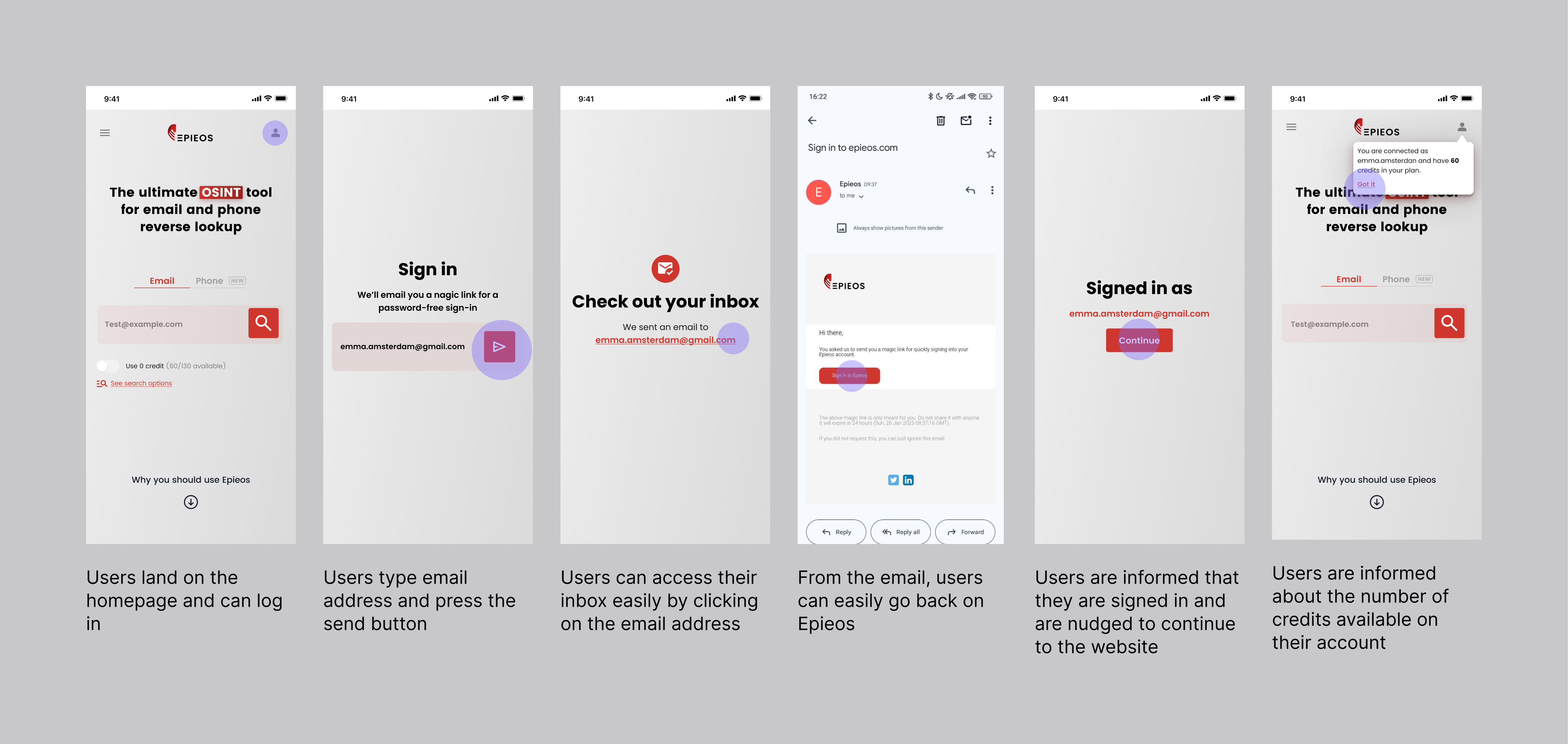
Magic link
To provide both simplicity and security, we implemented the magic link method for sign-in.
This approach removes the need for passwords, often a weak link in account security, by sending a time-sensitive, single-use link directly to the user’s email. By reducing reliance on traditional credentials, we minimize phishing risks and unauthorized access, while also offering a frictionless authentication experience.
📲 How we build a pricing experience that converts
On Epieos, users can subscribe to 3 plans with increasing levels of features and access as the price goes up:
- Member plan for users with basic needs and occasionally usage
- Osinter plan for more frequent users
- Custom plan for businesses with high usage and flexible features
On top of that we have the "visitors": users who do not have an account.
Use of strategic nudges to upsell
To encourage users to subscribe to the Osinter or Custom plans, we've implemented strategic nudges in the pricing flow.
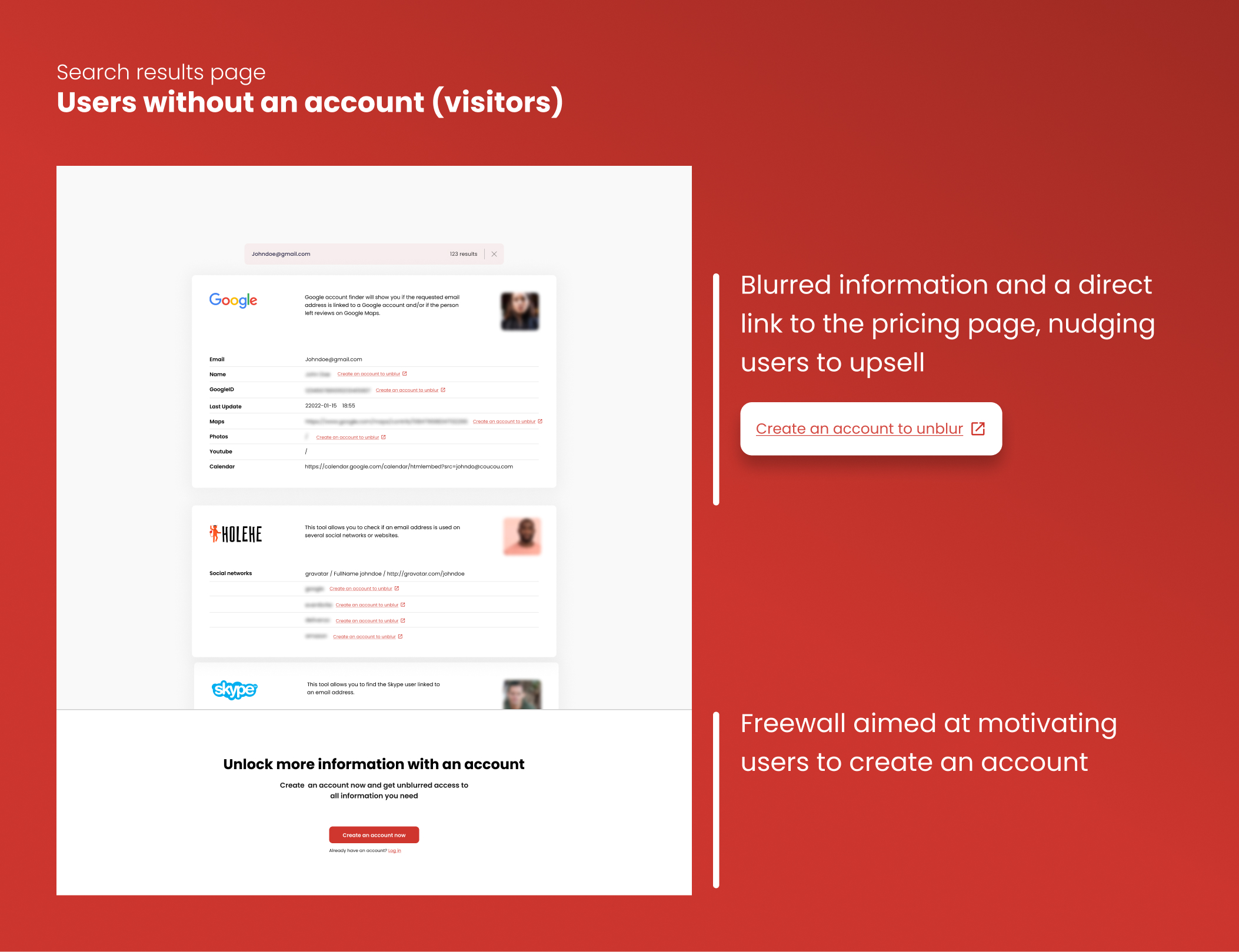
😩 Users without an account encounter a limited number of results on the results page, which can restrict their experience. Additionally, they are required to complete a Captcha for every search, which can slow down the process.
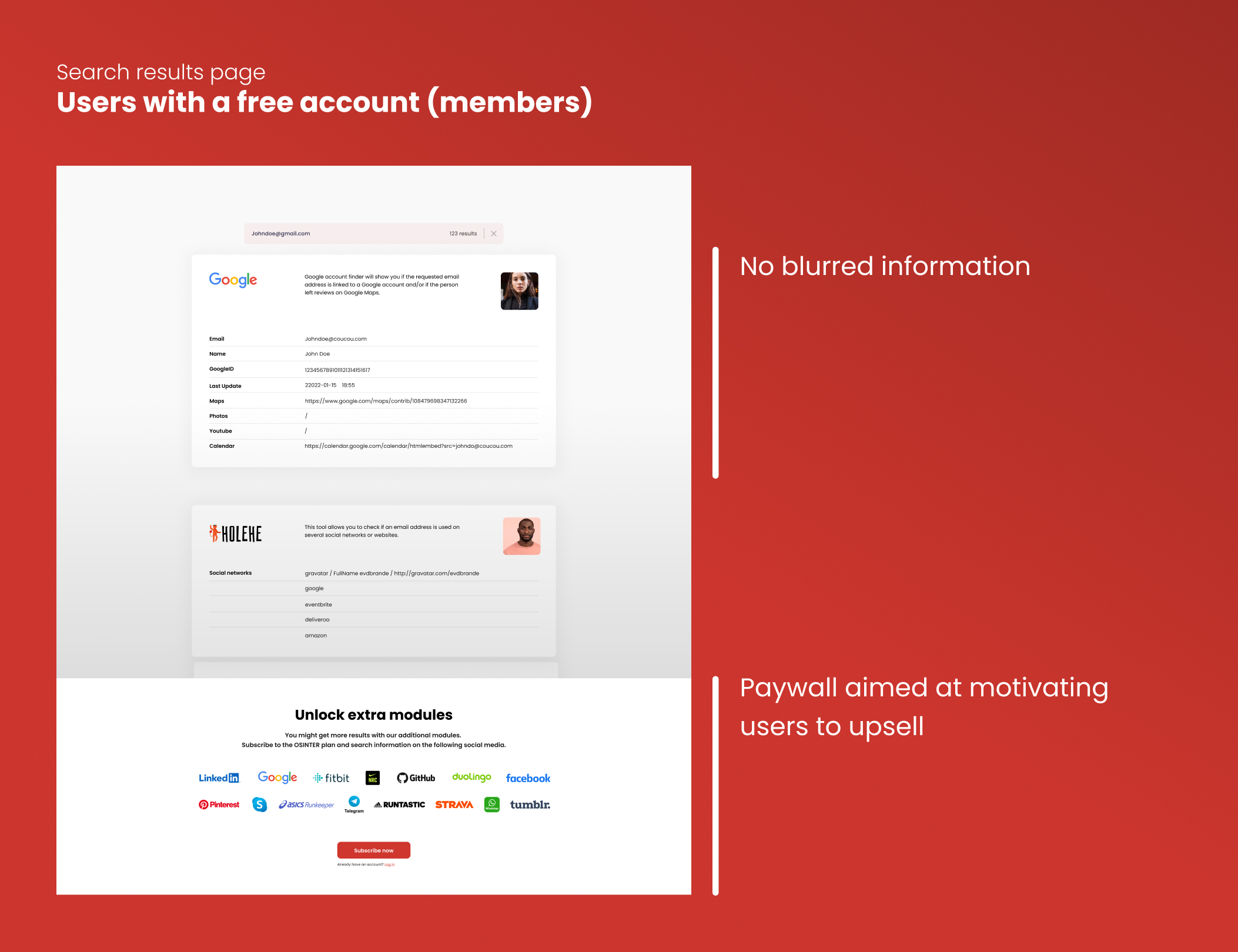
😎 In contrast, users with a Member, Osinter or Custom subscriptions enjoy a smoother and more efficient experience, free from these additional hurdles, enhancing their overall satisfaction with the tool. Osinter users have access to more modules compared to the Member subscribers.
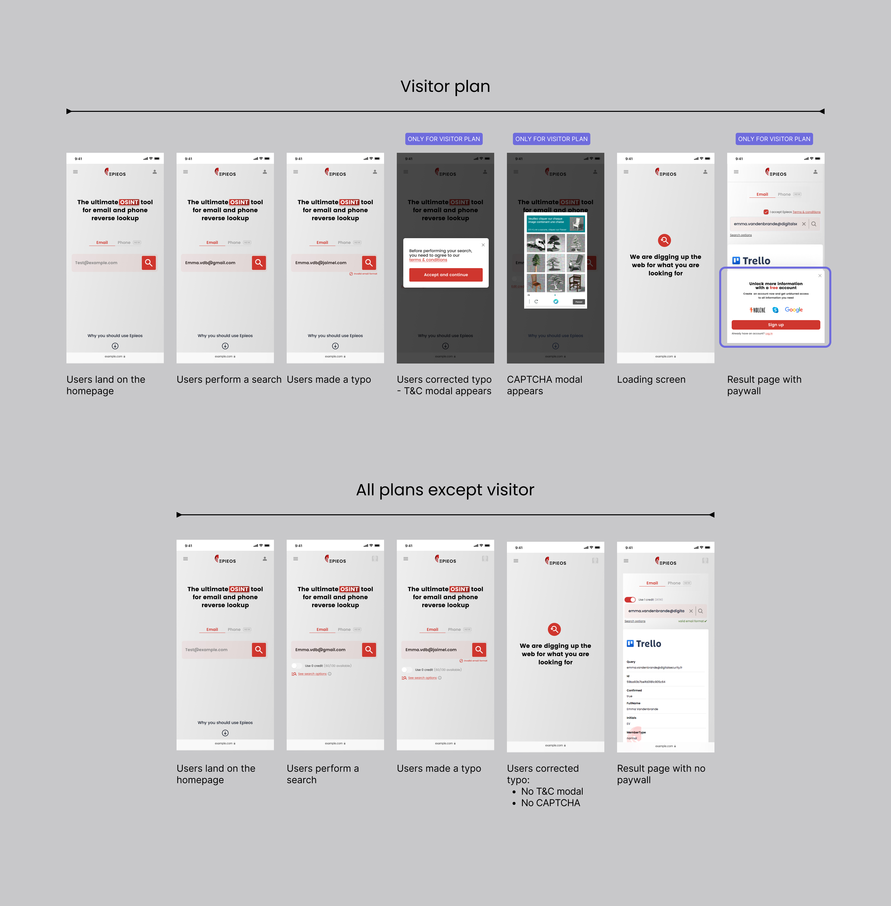
To support the business goal of increasing subscription rates while maintaining a good user experience, I introduced design elements such as a Captcha, a terms and conditions verification for each search and a paywall. These elements helped protect the platform from misuse and clarified the value of premium access.
Additionally, I limit the access to certain features for the free users (visitors plan) and guide them to the upgrade path by highlighting the benefits of a subscription. This approach balanced business needs with user experience by keeping interactions secure, guiding user expectations and ensuring that paying users enjoy a faster and more exhaustive experience.
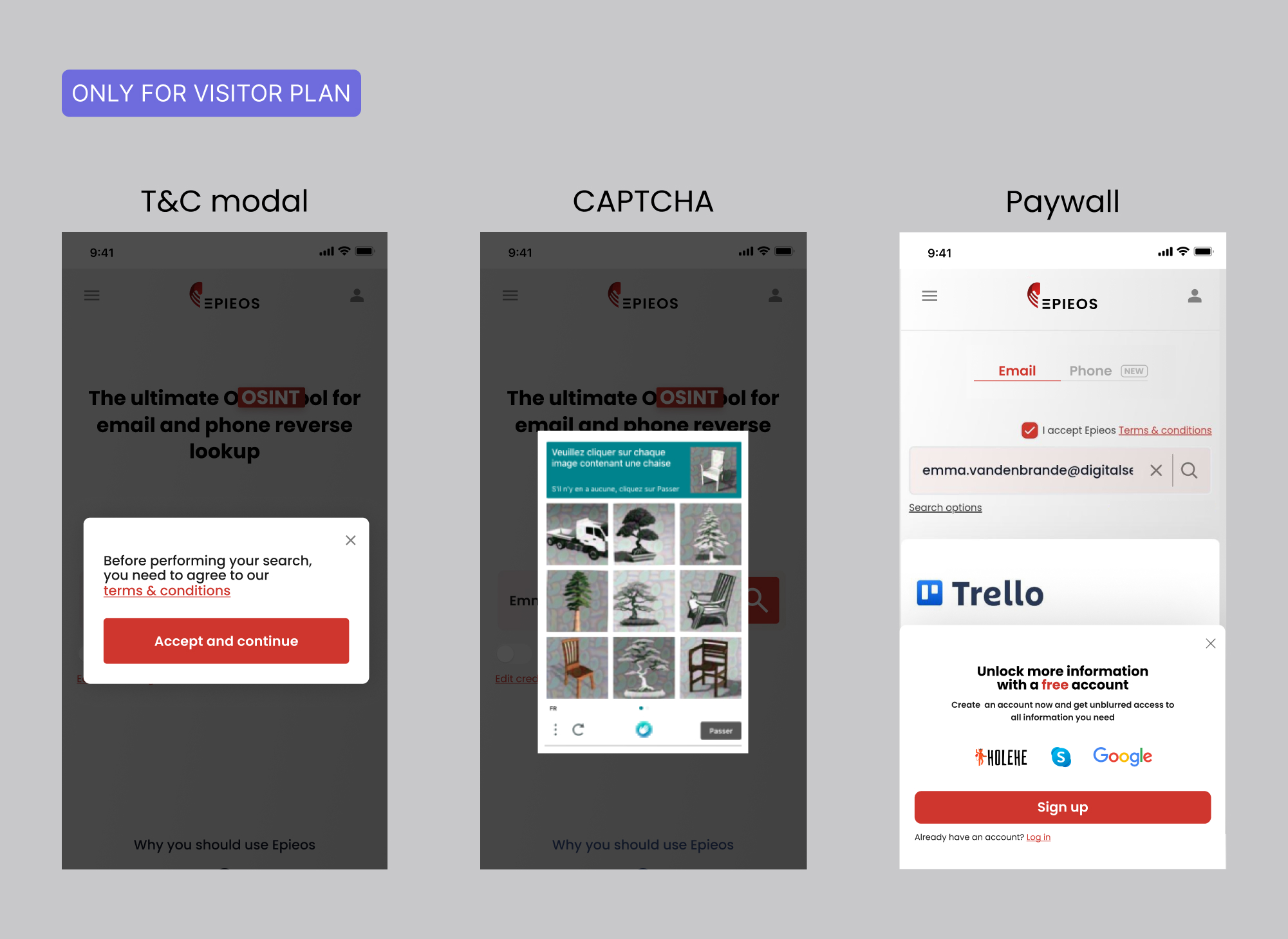
The design of the search results page also supports this strategy by displaying blurred results and a freewall to unregistered users (visitors). This approach sparks curiosity and nudges visitors toward exploring subscription options to gain full access.
For Member users, the search results page includes a paywall designed to encourage upgrades. After experiencing the value of the free plan, users are gradually introduced to the benefits of premium features and additional modules. The paywall prompts them to consider a paid subscription to unlock the full experience.
This strategy leverages the psychology of curiosity and the desire for more to drive user engagement and revenue growth. By offering a taste of the platform's value and gradually introducing paywalls, we encourage users to invest in the product and unlock its full potential.
🤝 How collaborating for success led us to success
The product was developed through the collaborative efforts of the UX designer, the engineers and the CEO.
Working in an Agile environment allowed us to stay informed about the latest progress. The iterative design process was a collaborative effort among all team members, ensuring a balance between user needs, technical feasibility and business objectives.
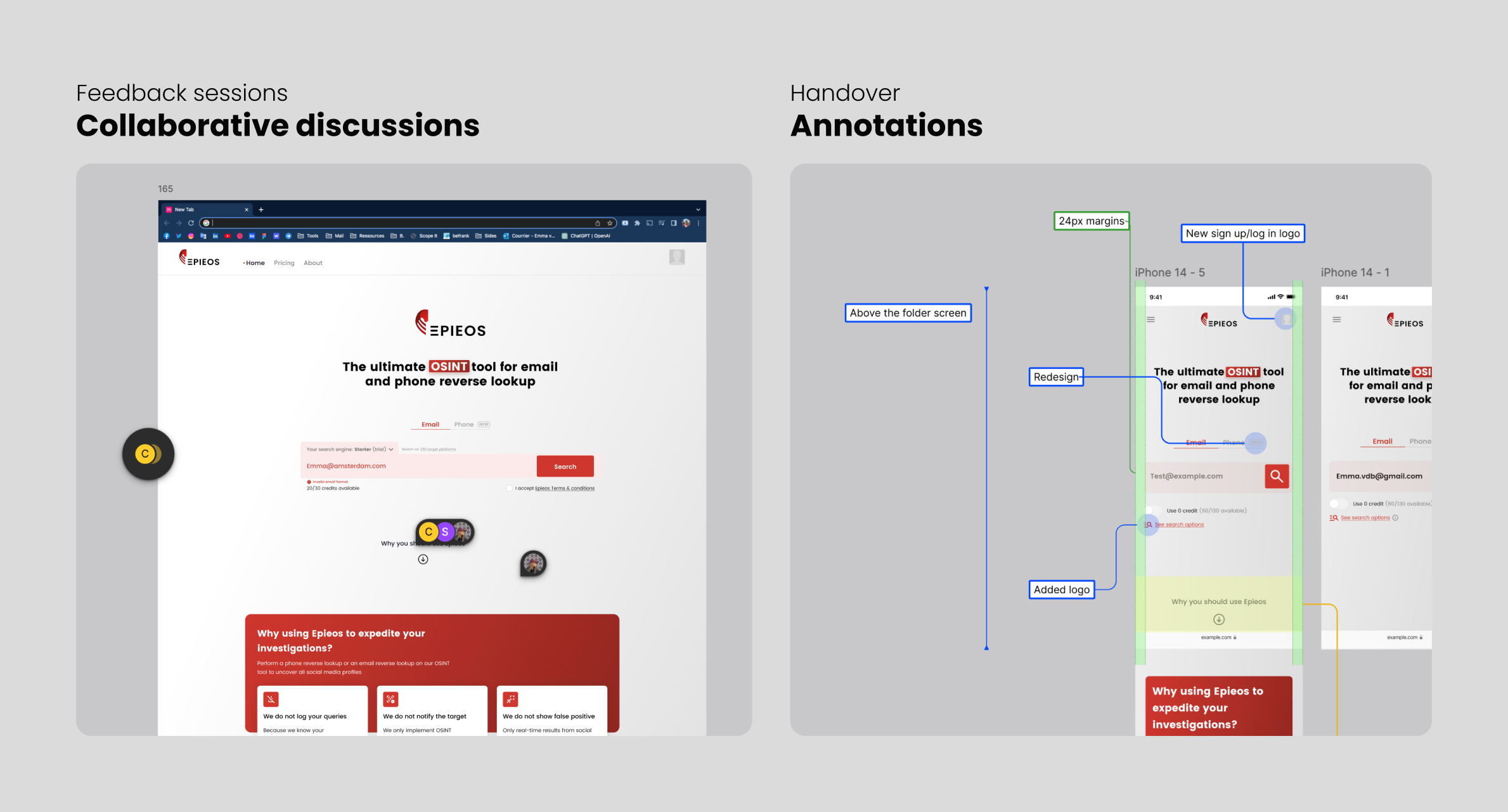
We held regular catch-ups and sprint ceremonies, which helped reduce time-to-market and identify potential issues early on. Additionally, organizing frequent feedback sessions enabled us to enhance the product and ensure a seamless handoff for implementation.
Finally, the design files were delivered to the developers using Dev Mode and detailed annotations, providing them with all the necessary information to work independently and efficiently.
👀 How we overcame challenges along the way
Given the fast-evolving nature of the OSINT industry, we often had to make strategic trade-offs to remain agile. This meant temporarily pausing the development of certain features in order to quickly address more pressing user needs or respond to emerging market trends.
On multiple occasions, we reprioritized our roadmap to stay ahead of competitors and seize timely opportunities, ensuring the product remained relevant, secure, and aligned with both user expectations and business goals.
👉 Looking ahead: continuous improvement and future enhancements
Feedback and iterations
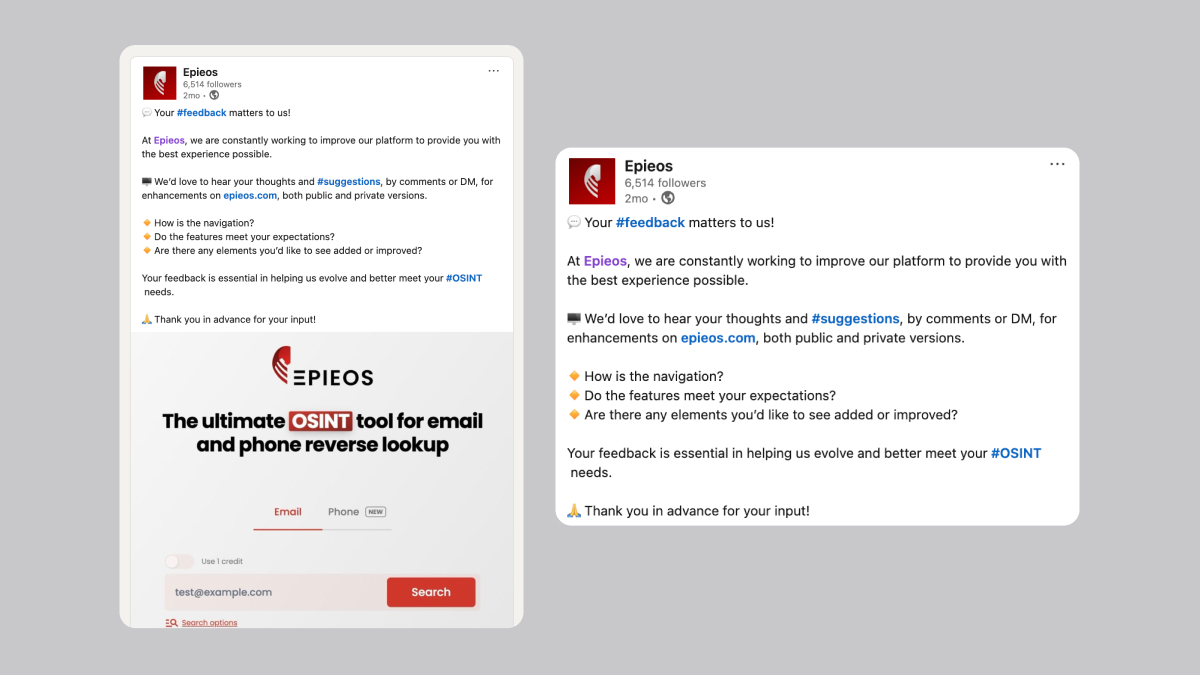
We continuously gather qualitative feedback from users through various channels, including online forums, social media platforms like Reddit, and in-person interactions at tradeshows. Additionally, we continuously monitor key metrics like bounce rate, visit duration, and pageviews per visit to track the impact of UX improvements.
UX optimisations and new features
We have developed a prioritization list of new UX features and improvements to be implemented in the coming months. New designs have already been crafted and are currently in development.
💡 Final note
To bring this case study to a close, Epieos.com showcases the power of UX design in transforming complex tools into user-friendly platforms.
This project highlights my ability to identify user needs, craft strategic design solutions and collaborate with cross-functional teams to create a meaningful impact.