Heading 1
Heading 2
Heading 3
Heading 4
Heading 5
Heading 6
Lorem ipsum dolor sit amet, consectetur adipiscing elit, sed do eiusmod tempor incididunt ut labore et dolore magna aliqua. Ut enim ad minim veniam, quis nostrud exercitation ullamco laboris nisi ut aliquip ex ea commodo consequat. Duis aute irure dolor in reprehenderit in voluptate velit esse cillum dolore eu fugiat nulla pariatur.
Block quote
Ordered list
- Item 1
- Item 2
- Item 3
Unordered list
- Item A
- Item B
- Item C
Bold text
Emphasis
Superscript
Subscript
Epieos.com is an evolving OSINT search engine platform that helps million of users to easily retrieve information from an email address or a phone number.
As we continue to grow, we are planning to update our pricing plans and redesign our pricing page to make it more user-friendly. Our goal is to provide a clear and intuitive overview of the available plans, helping users easily understand their options and subscribe without any hassle.
What was the problem?
Epieos.com, a growing search engine platform, has been evolving rapidly. As part of our expansion, we recognized the need to revisit our pricing strategy and redesign the pricing page.
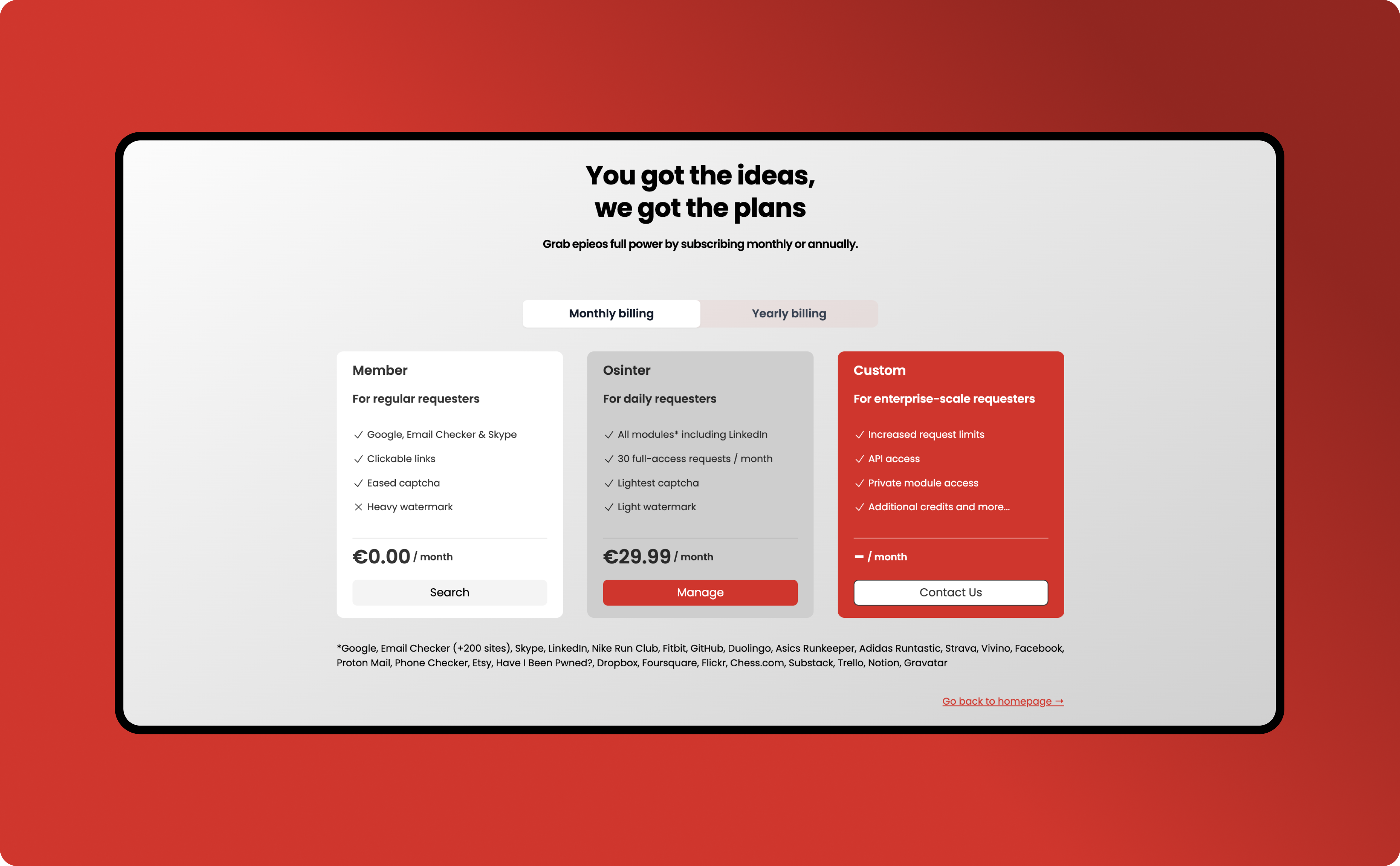
The current structure featured three subscription plans—Member, Osinter, and Custom—each catering to different user needs.
However, feedback revealed a key problem: users found the pricing plans confusing and struggled to understand the differences between them, making it difficult to choose the right option.
The UX solution: a more transparent and flexible pricing structure
To address this, I spearheaded an overhaul of the pricing page with 2 key objectives:
- Clarify the options: help users understand the features, benefits, and costs of each plan easily.
- Introduce a new plan: provide more flexibility by adding a 4th plan, designed to appeal to a broader range of users.
The Design process
Step 1: understanding user pain points and strategic collaboration
To begin, I reviewed user feedback and analyzed the pain points, which provided clear insights into the areas needing improvement. Users wanted a pricing structure that felt more intuitive and transparent, so I worked closely with the CEO to align on a new strategy that would balance user needs with the company’s goals for growth.
The new plan strategy
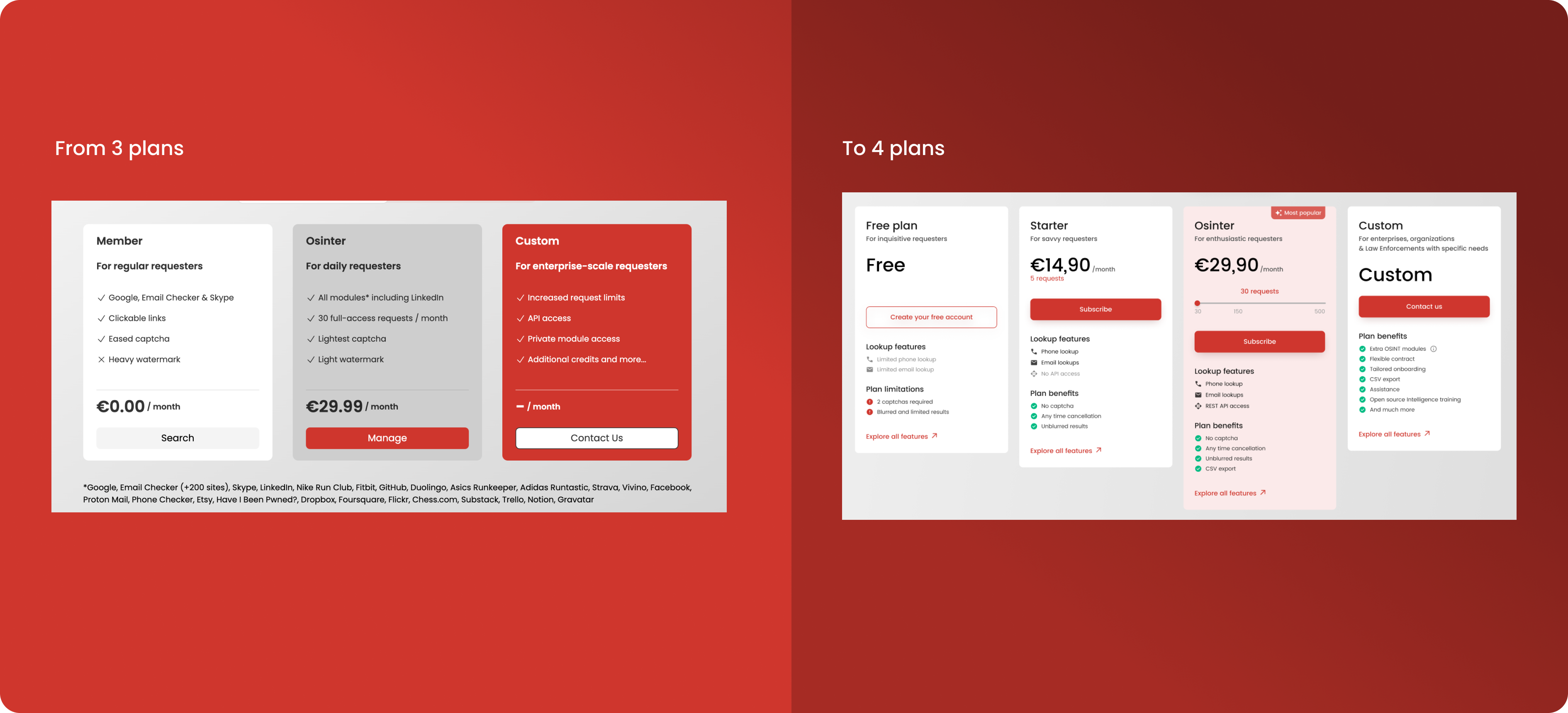
From 3 pricing plans to 4 pricing plans
Our new pricing structure included:
- Free plan: for casual users who want to explore.
- Starter plan: designed for users with specific needs but lower usage.
- Osinter Plan: aimed at enthusiastic, daily users.
- Custom Plan: for enterprise clients with specialized requirements.
The addition of the Starter plan offered more flexibility, giving users more choice based on their usage level.
The introduction of the yearly plan
We also introduced a clear discount indicator for the yearly plan to enhance transparency and highlight cost savings for users.
This change not only simplifies decision-making but also encourages long-term subscriptions, benefiting both users and the business. By committing to a yearly plan, users enjoy better value, while the company gains the advantage of retaining customers for a full year.
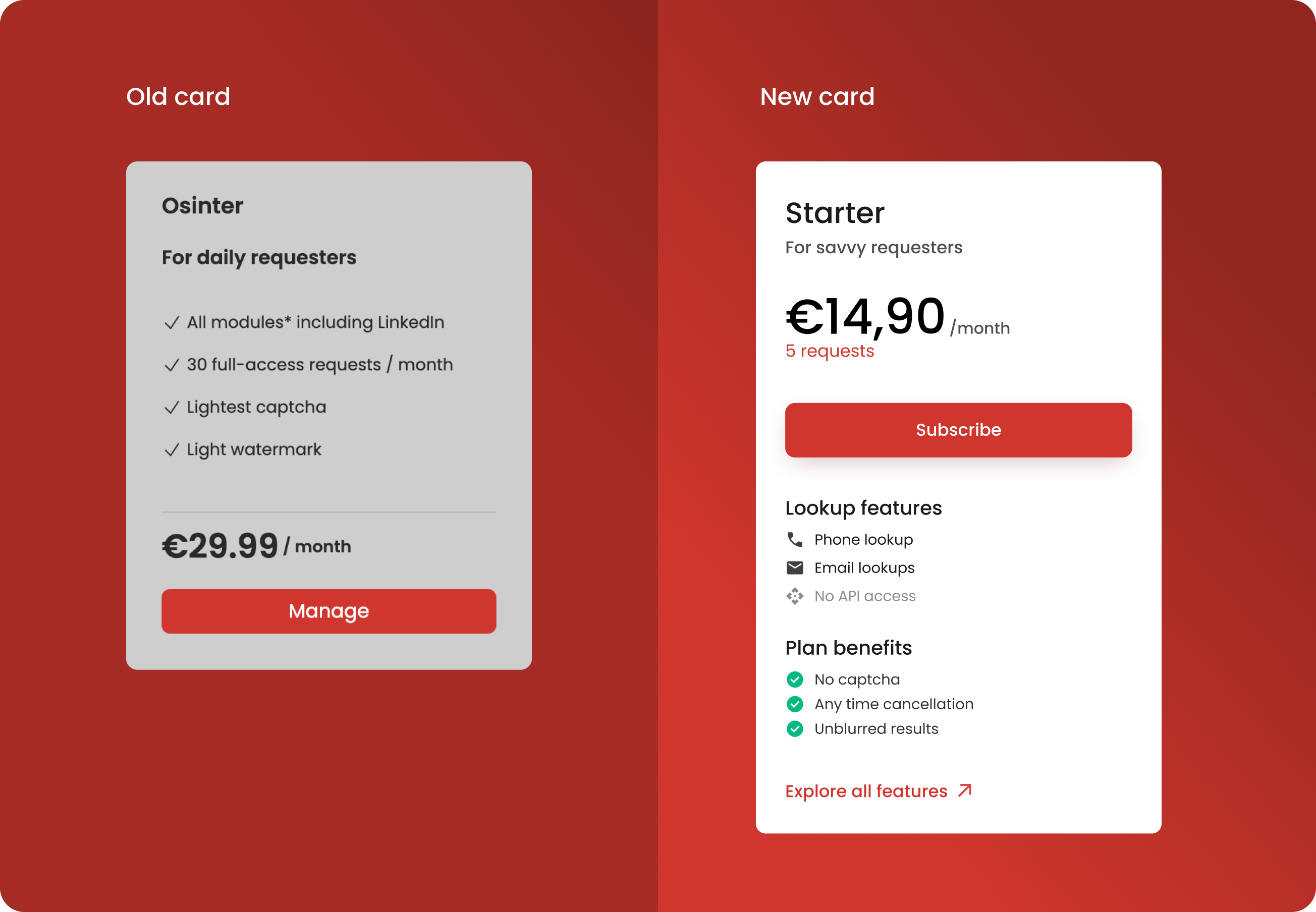
Step 2: improving card design
The redesign focused on improving both the layout and content clarity.
Clearer pricing and benefits breakdown
Each plan now provides a more detailed breakdown of features, limitations, and benefits, making it easier for users to compare options and understand what they are getting.
Plan benefits such as "No captcha," "Anytime cancellation," and "Unblurred results" are more highlighted to improve transparency.
Lookup features and plan benefits are clearly separated into categories, making it easy to scan and compare.
Improved Visual Hierarchy
Buttons are prominently displayed and higher in the card, making it easier for users to take action and the use of icons (e.g., phone, email) next to lookup features improves readability.
Refining the "Osinter" Card for Maximum Impact
I dedicated significant effort to optimizing the "Osinter" card, as it was key to driving revenue growth.
- The use of social proof: the prominent "Most Popular" label at the top instantly captures attention, positioning this plan as the best value for the majority of users. This strategic visual cue taps into the psychological principle of social proof, subtly encouraging users to consider this plan as the go-to option.
- The slider for better flexibility: to enhance user experience and flexibility, I incorporated an interactive price slider. By prominently displaying the price, users can easily understand the cost. The slider allows users to explore different levels of usage (requests) and see how their selection directly impacts the pricing, making the decision-making process more transparent and personalized.
This combination of clear value messaging and interactivity not only draws users in but also empowers them to make more informed, confident choices.

Step 3: implementing a feature comparison table
To improve the clarity of the page, we introduced a detailed feature table to provide users with even more information.
Our goal was to enhance transparency and empower users to make better-informed decisions. By enabling side-by-side comparisons, the table clearly highlights the features included or excluded in each plan, eliminating ambiguity and making it easier for users to identify the option that best suits their needs.
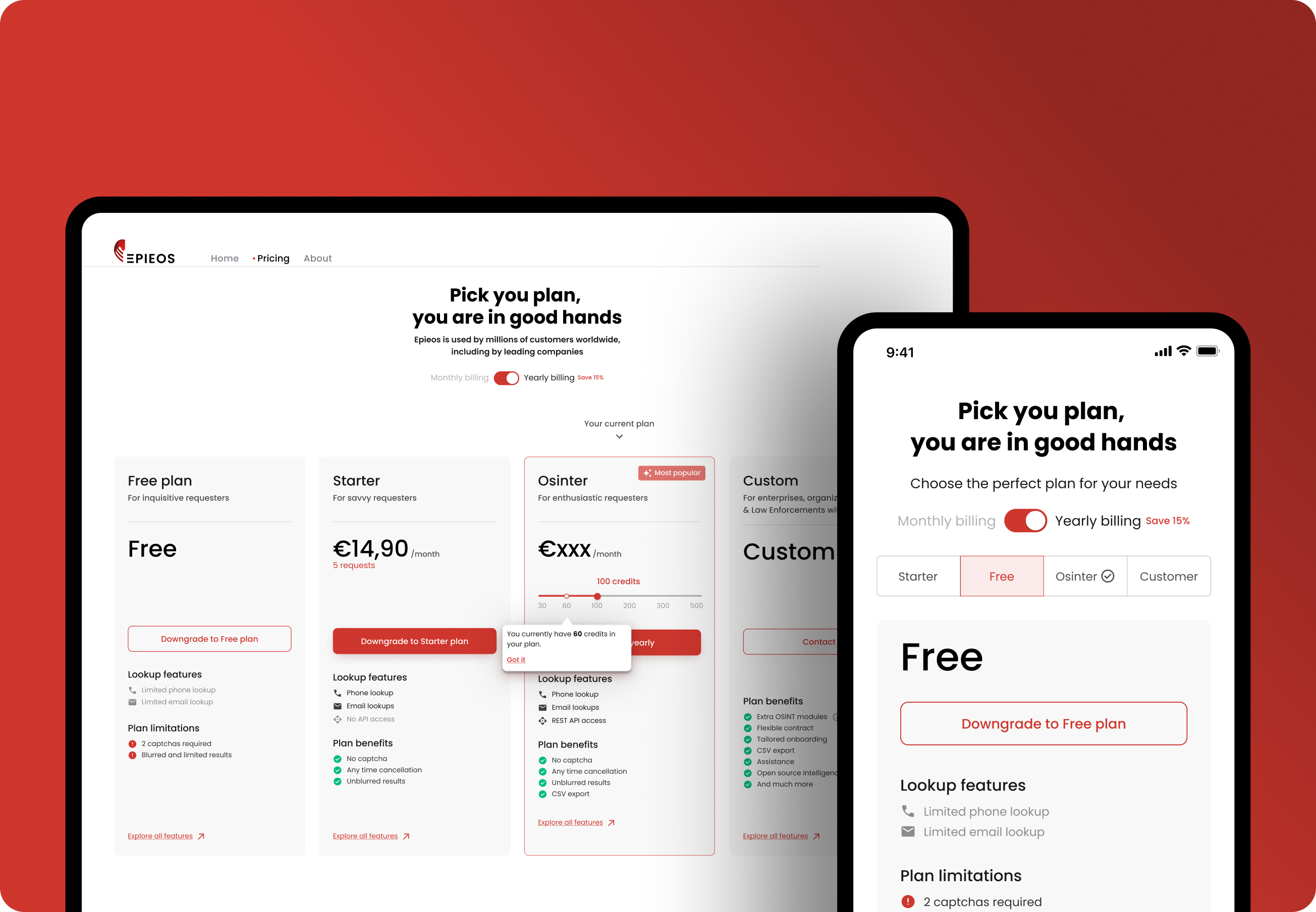
Since on mobile, screen space is limited, displaying the feature table in the same horizontal layout as on desktop would make it hard to read and interact with.
To address this, the mobile version shows the plans as a carousel or stacked layout, where users can scroll or swipe through individual plans one at a time. This approach improves accessibility and user engagement across different screen sizes.
User feedback: early success and positive reception
The redesigned pricing page has not yet been fully launched, but early feedback from user testing has been overwhelmingly positive.
Users found the new layout clearer, the benefits of each plan easier to understand, and the overall flow much smoother. This feedback suggests that the changes will improve user satisfaction, streamline the decision-making process, and ultimately drive more subscriptions.
Conclusion: a balance of user-centered design and business growth
This redesign project exemplifies the power of user-centered design and strategic thinking. By closely listening to user feedback, addressing pain points, and creating a clear, intuitive experience, we’ve not only enhanced the user experience but also created a flexible and scalable solution that supports both business goals and customer needs. The early success of this redesign shows promising potential for Epieos.com’s growth, setting a strong foundation for future expansion.
This case highlights my ability to tackle complex challenges by combining design expertise, user insights, and business strategy, and is a key example of how thoughtful UX design can drive both customer satisfaction and business success.