Heading 1
Heading 2
Heading 3
Heading 4
Heading 5
Heading 6
Lorem ipsum dolor sit amet, consectetur adipiscing elit, sed do eiusmod tempor incididunt ut labore et dolore magna aliqua. Ut enim ad minim veniam, quis nostrud exercitation ullamco laboris nisi ut aliquip ex ea commodo consequat. Duis aute irure dolor in reprehenderit in voluptate velit esse cillum dolore eu fugiat nulla pariatur.
Block quote
Ordered list
- Item 1
- Item 2
- Item 3
Unordered list
- Item A
- Item B
- Item C
Bold text
Emphasis
Superscript
Subscript
At Epieos.com, an OSINT search engine used by millions to retrieve online data from email addresses and phone numbers, I led the complete end-to-end redesign of the subscription and pricing experience.
This project combined user research, UX strategy and product design to solve critical user pain points while supporting core business goals: boosting conversion, increasing retention, and clarifying pricing structures.
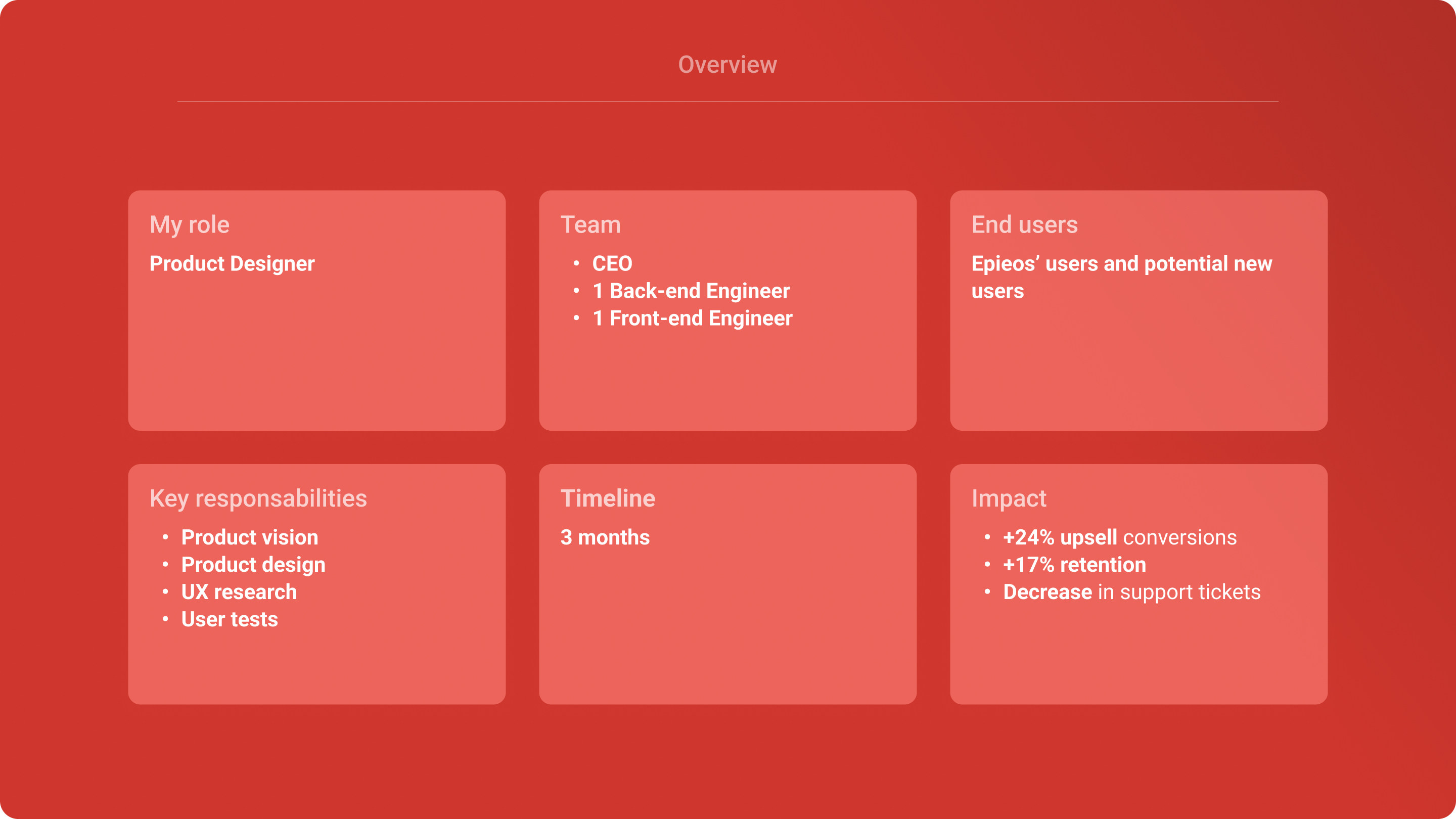
💯 Starting with the positive: the impact of our designs
Before diving into the challenges we tackled, it’s important to highlight the tangible impact of the improved user experience at Epieos.com.
Quantitative impact
- +24% increase in upsell conversions after the pricing redesign
- +17% improvement in user retention, thanks to a smoother upgrade path, long-term incentives and nudges.
- Marked decrease in support tickets and confusion around pricing, showing the impact of better hierarchy and transparency.
Qualitative data
“The clarity in the plans made it easy to find exactly what we needed.” – Epieos' user during usertest
😵 The challenge: confusion, friction and drop-offs
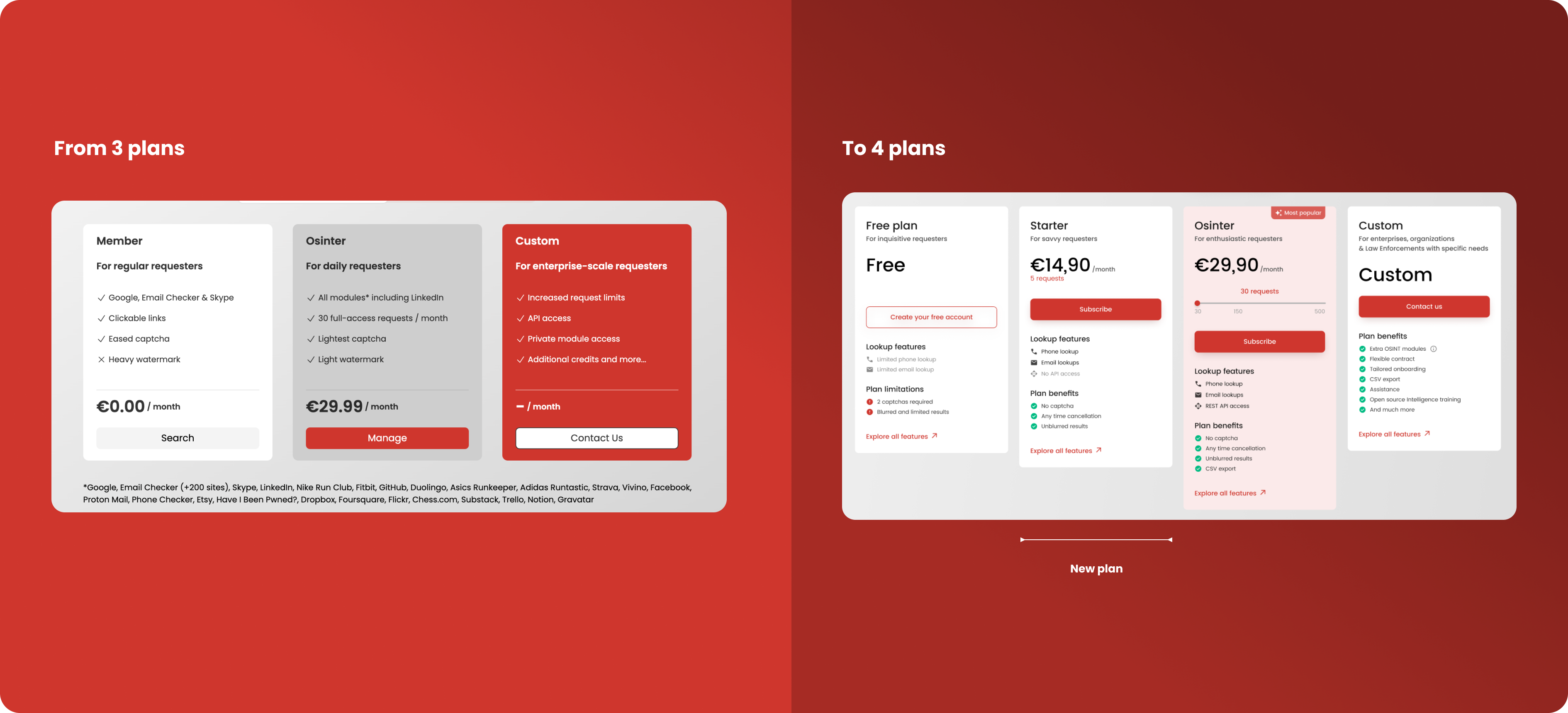
Epieos originally offered three subscription plans: Member, Osinter, and Custom. But user behaviour and feedback revealed major friction points:
- Users didn’t understand the differences between plans.
- Many were unsure which plan matched their needs.
- The pricing cards lacked visual structure, resulting in user drop-offs and low engagement.
💡 Our overall strategy: a clearer, smarter and more flexible pricing experience
I worked closely with the CEO and engineers to gather insights from users and define a vision for a more scalable subscription experience.
From these insights, we focused on 3 pillars:
1. Introducing a 4th plan
To create a smoother upgrade path and therefore increasing the conversion opportunities, we added a new Starter plan positioned between the Free and Osinter plans.
This unlocked an option for casual users needing more flexibility without committing to high-volume usage.
New pricing structure:
- Free: Basic, limited access
- Starter: Occasional users needing extra functionality
- Osinter: Power users working daily with Epieos
- Custom: For Law Enforcements and companies with specific needs
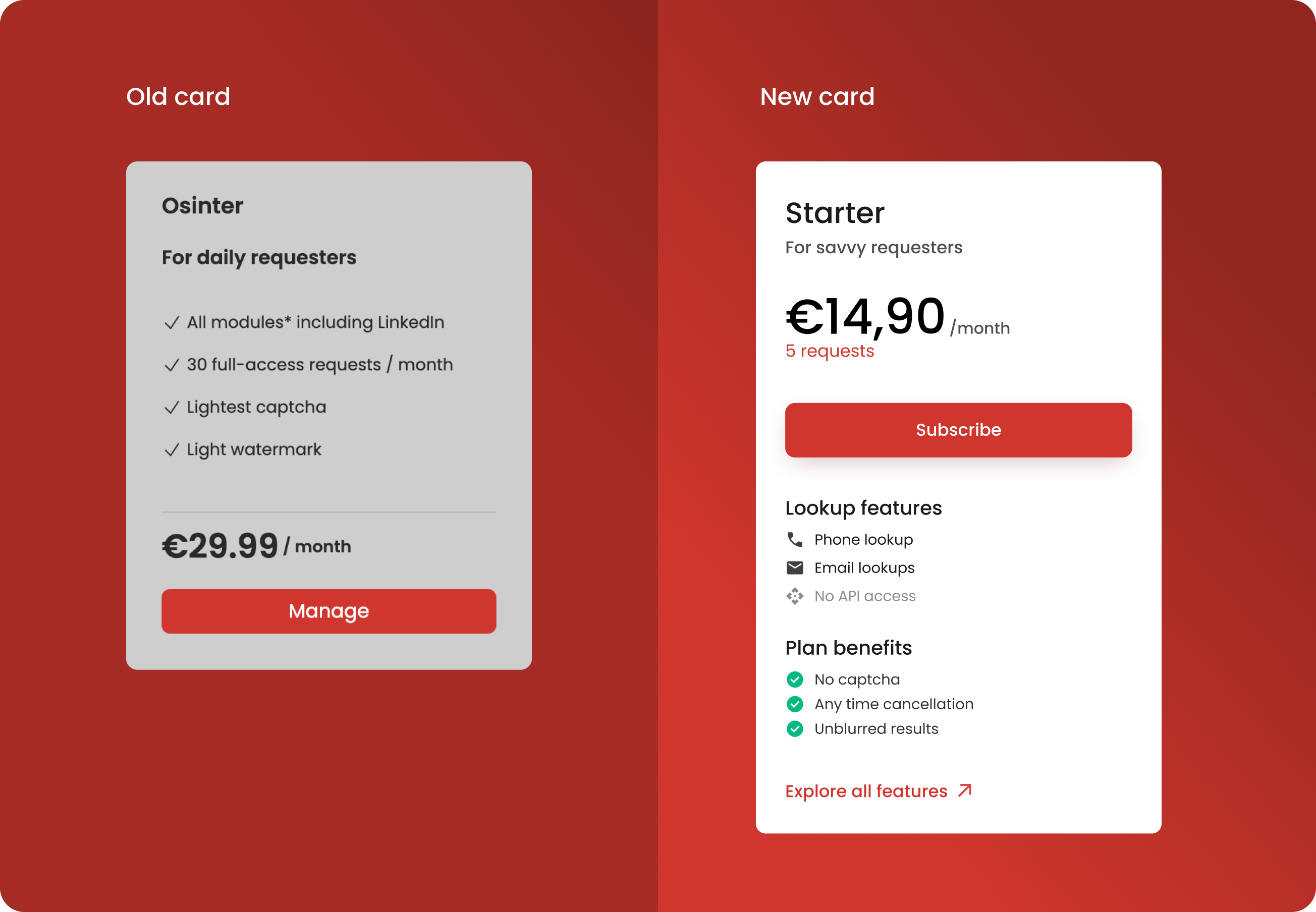
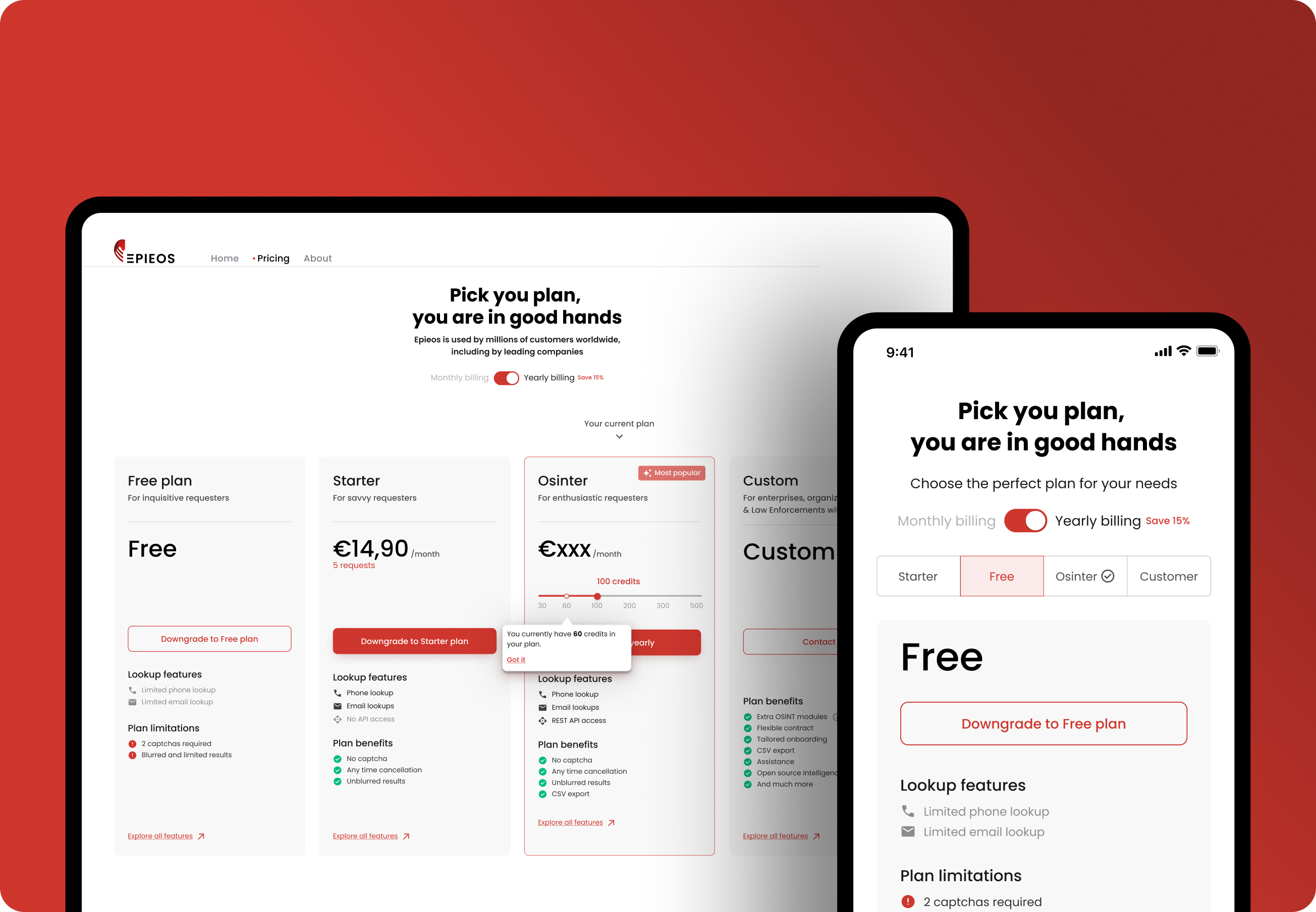
2. Improving the pricing card
We redesigned the pricing cards to:
- Use visual hierarchy and whitespace for better scannability
- Group features under intuitive categories: "Lookup features" and "Plan benefits"
- Add visual cues to grab attention, reassure and reinforce benefits like “No captcha” or “Unblurred results”
- Move up the price information and main CTA for better accessibility
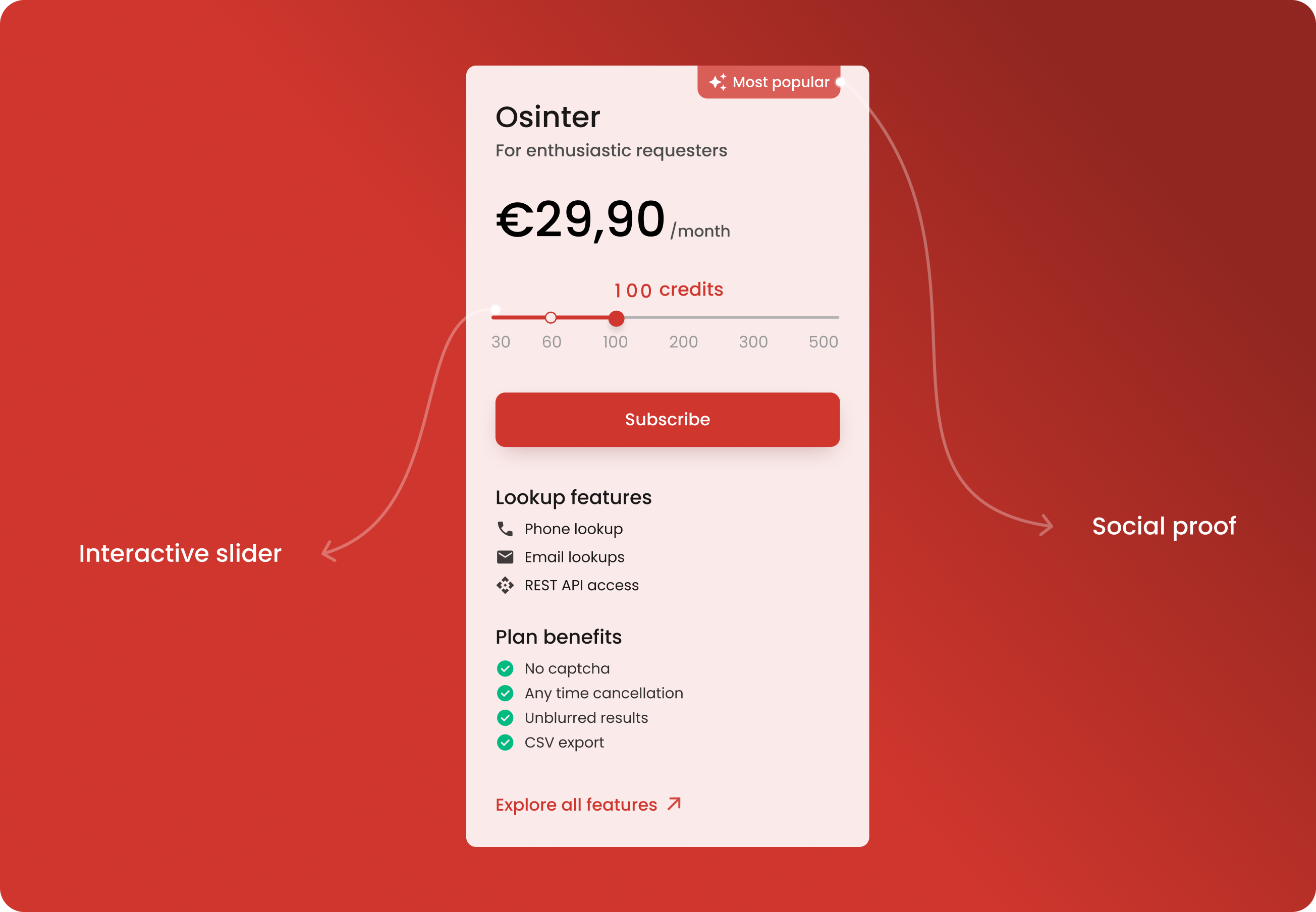
Focus on the Osinter card, the primary driver of revenue
We dedicated significant effort to optimising the "Osinter" card, as it was key to driving revenue growth.
- The use of social proof: the prominent "Most Popular" label at the top instantly captures attention, positioning this plan as the best value for the majority of users. This strategic visual cue taps into the psychological principle of social proof, subtly encouraging users to consider this plan as the go-to option.
- The slider for better flexibility: to enhance user experience and flexibility, we incorporated an interactive price slider. By prominently displaying the price, users can easily understand the cost. The slider allows users to explore different levels of usage (requests) and see how their selection directly impacts the pricing, making the decision-making process more transparent and personalised.
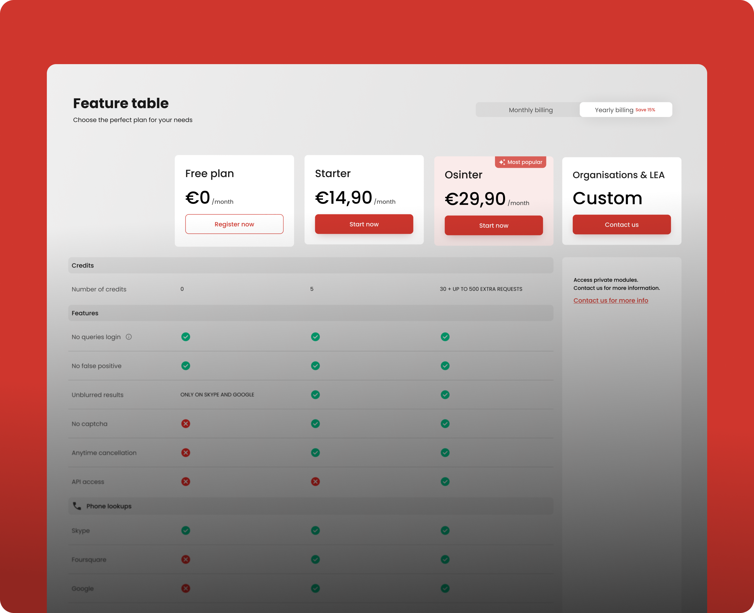
3. Designing a feature table
To improve the clarity of the plans, we introduced a detailed feature table to provide users with even more information.
Our goal was to enhance transparency and empower users to make better-informed decisions. By enabling side-by-side comparisons, the table clearly highlights the features included or excluded in each plan, eliminating ambiguity and making it easier for users to identify the option that best suits their needs.
Since on mobile, screen space is limited, displaying the feature table in the same horizontal layout as on desktop would make it hard to read and interact with.
To address this, the mobile version shows the plans as a carousel, where users can scroll through individual plans one at a time. This approach improves accessibility across different screen sizes.
📊 Our strategy to increase retention
Boosting retention wasn’t just about keeping users: it was about making them feel confident, valued, and supported throughout their journey with Epieos.
We implemented multiple UX strategies aimed at reducing friction, improving clarity and providing value over time.
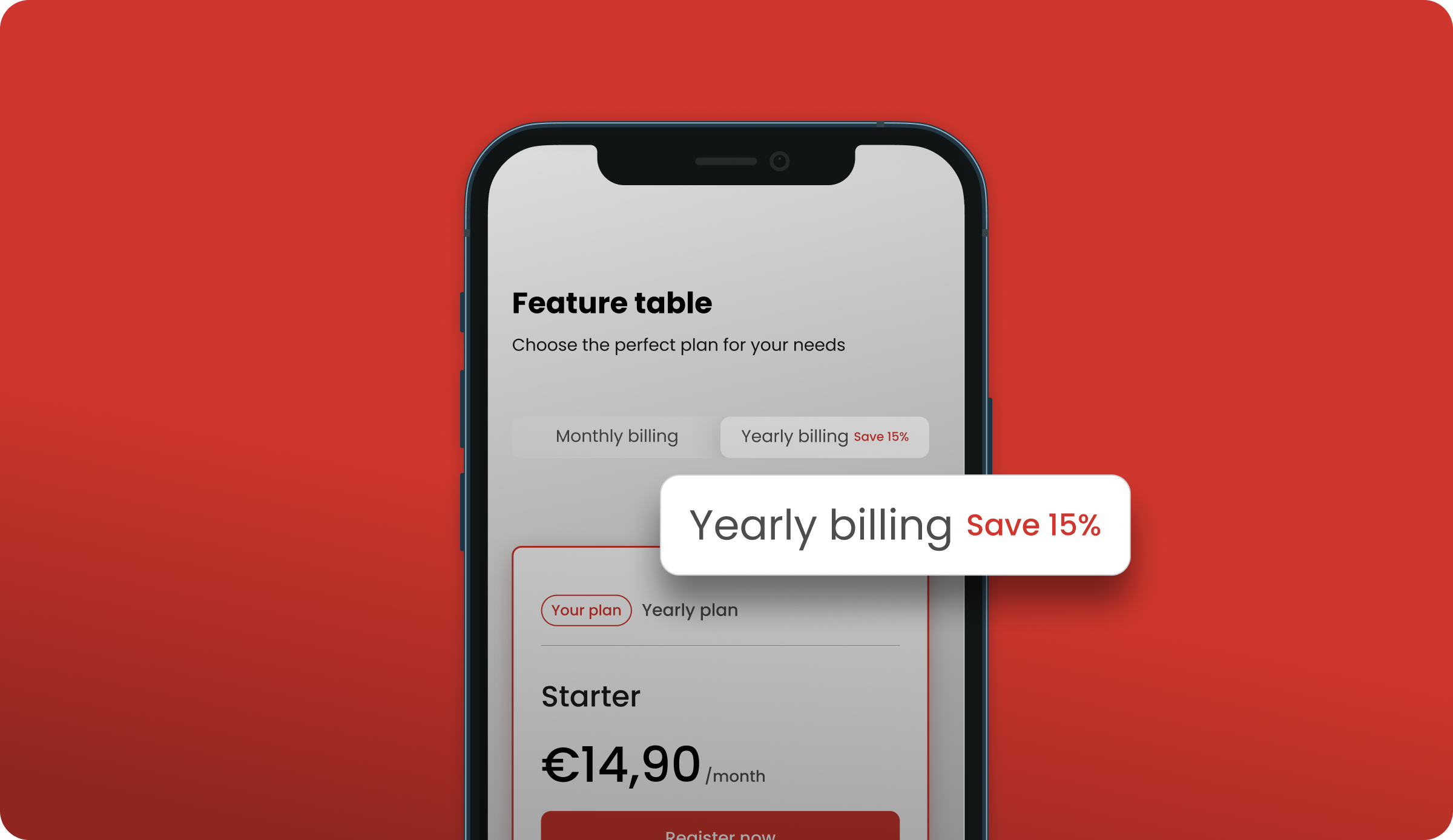
Encouraging long-term commitment with the yearly plans
To nudge users toward longer-term engagement, we introduced an annual subscription plan with a clearly displayed discount. This simple but powerful UI addition addressed 2 key pain points:
- Transparency: By clearly showing users how much they would save annually, we reduced decision fatigue and reinforced trust.
- Value perception: Users were more likely to commit once they understood the long-term savings.
From a business standpoint, the benefits were equally strong:
- Increased average revenue per user (ARPU)
- More predictable and stable income streams
- Reduced churn, as users committed for 12 months rather than reevaluating monthly
Using retention hooks
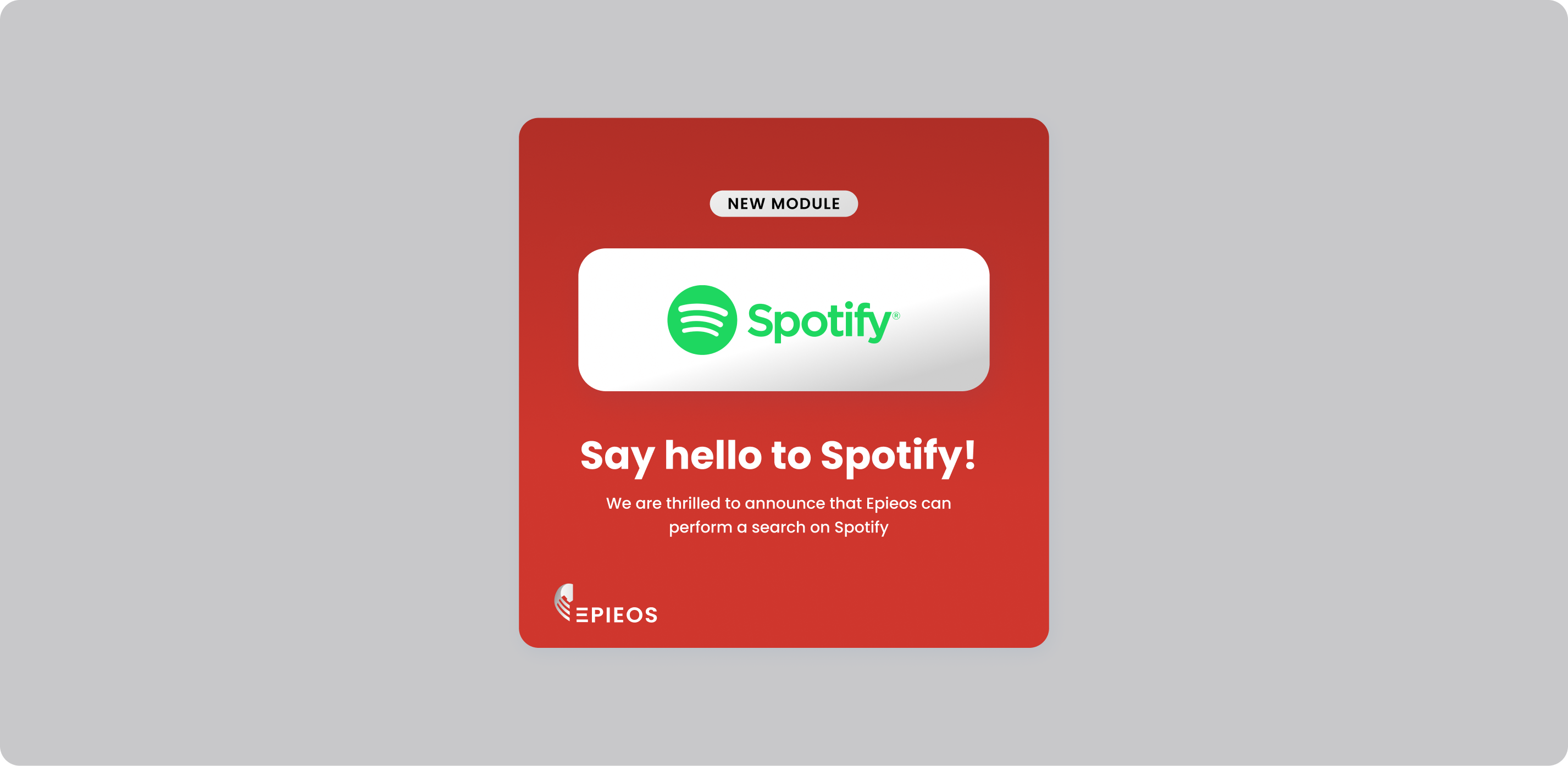
To support long-term user engagement, we adopted a strategy of releasing new modules every month.
From a design perspective, this required building a scalable interface that could grow without adding friction to the user experience.
Each release was communicated through our social media and via email to keep users informed and excited. By continuously addressing evolving needs and visibly delivering value, we helped boost retention and reinforced the product’s relevance over time.
Using nudges to prevent drop-offs
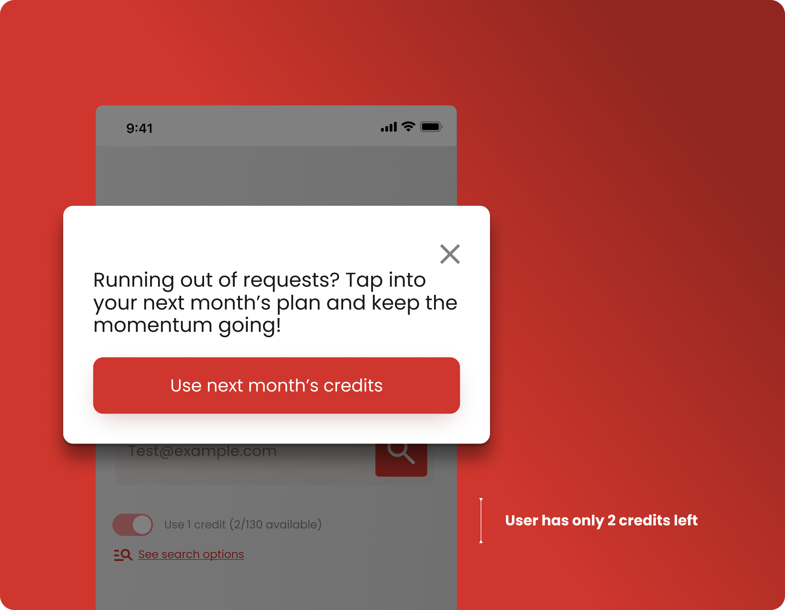
A major friction point identified in our research was users running out of monthly credits mid-search, often during critical tasks. To address this, we designed a proactive modal prompt that appears when credits are low. It offers the option to use next month’s credits.
Why it works for users:
- Prevents disruption at key moments
- Supports users in staying focused and productive
- Reinforces a sense of control, care and trust
Why it works for the business:
- Drives increased usage, which can lead to upsells
- Encourages organic upgrades to larger plans
By letting users continue without penalty, we removed a potential churn trigger and instead turned it into a moment of delight.
Making plan changes seamless
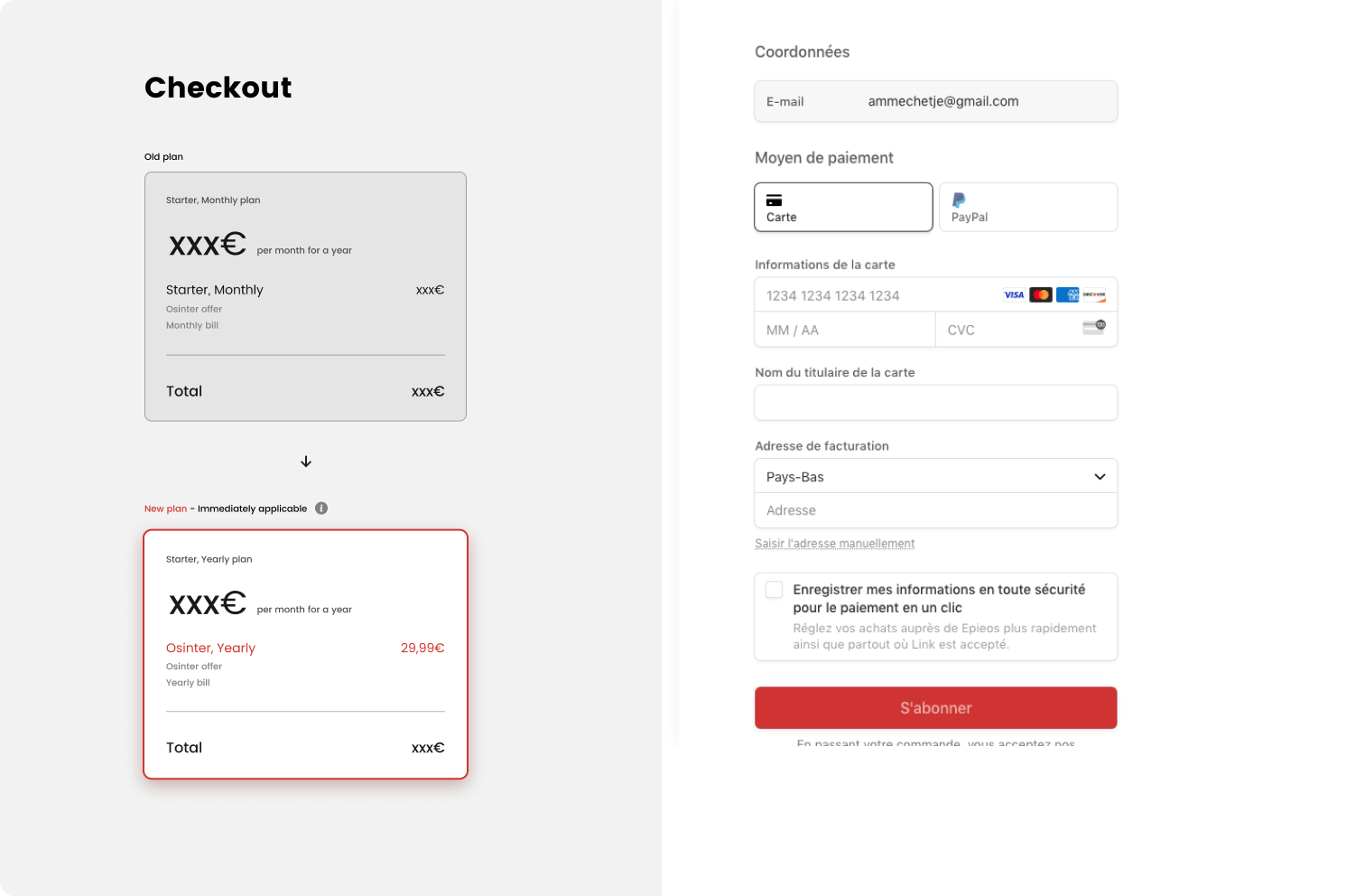
Changing a subscription plan can be a moment of uncertainty for users. To reduce hesitation and potential churn during this process, I redesigned the plan-switching screen to be as clear and confidence-inspiring as possible.
Key design decisions included:
- Comparison of the current vs. new plan
- A red border and “Immediately applicable” copy on the new plan to grab attention and make intent explicit
- Clear distinctions between monthly vs. yearly billing, including a full cost breakdown
- Tooltips and contextual copy to proactively answer common user questions
By making every detail transparent, we reduced user anxiety and cognitive load at a critical decision point and reinforced user trust during change.
📈 Our strategy to increase conversions
Improving conversions was about creating a journey that made it easy to get started and give users a frictionless first experience. Through thoughtful UX and product enhancements, we eliminated early friction and introduced subtle, well-timed nudges that encouraged users to explore premium plans while maintaining a sense of trust, control, and clarity.
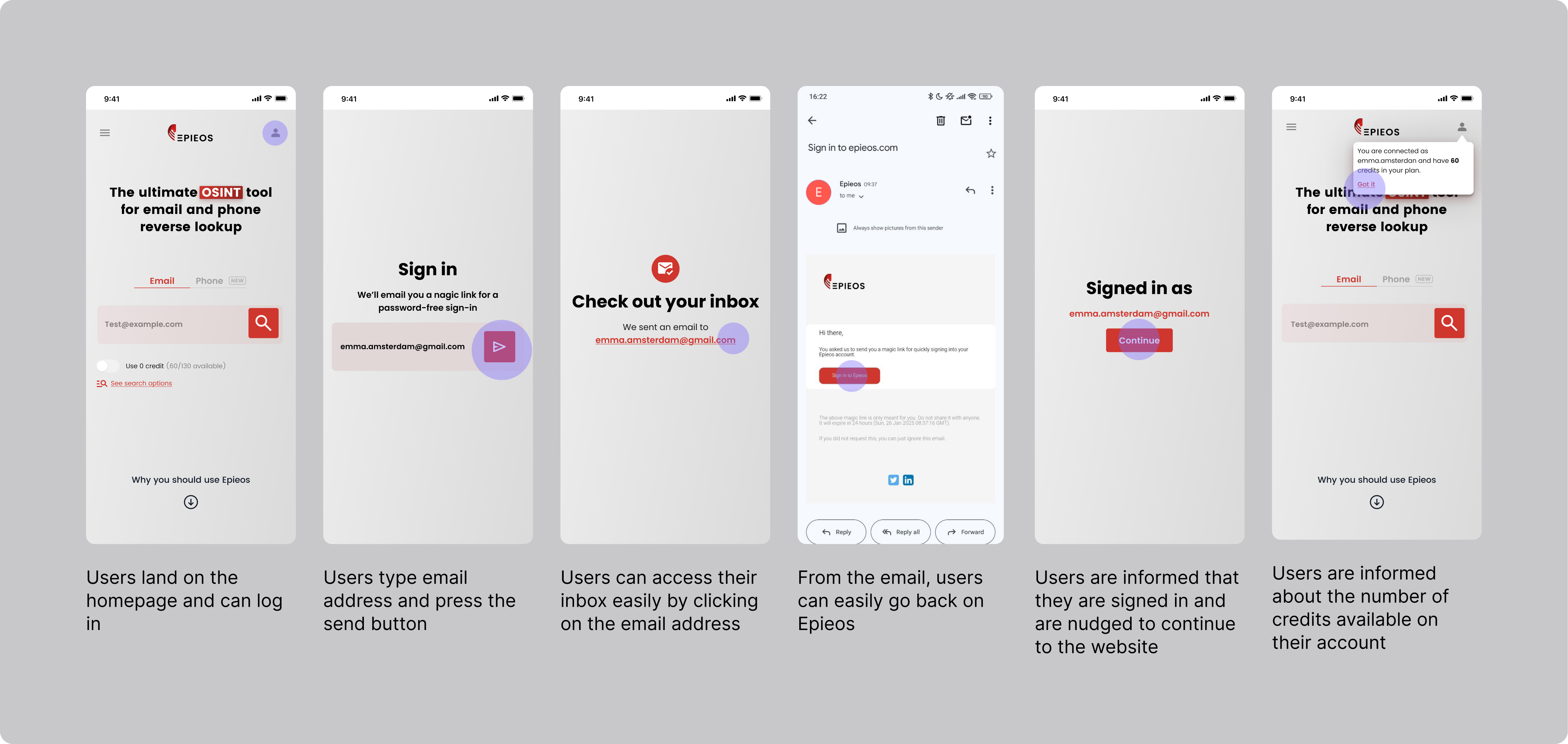
A seamless sign-up flow
We began by rethinking the onboarding experience: the very first step in the user journey. Before the redesign, drop-off rates during sign-up were high, and returning users often forgot their passwords.
To address this, we implemented magic link authentication, eliminating passwords entirely while maintaining security.
This change made it easier and faster for users to enter the product, lowering the barrier to entry and removing common sources of frustration, especially for those just testing the platform.
Nudging free plan users
For free users, the experience was carefully designed to encourage upgrades through subtle but effective limitations, without making them feel punished.
Key UX elements included:
- Blurred results after a few searches, showing just enough to create curiosity
- Terms and conditions validation to perform a search
- Captchas to signal access limits without blocking outright
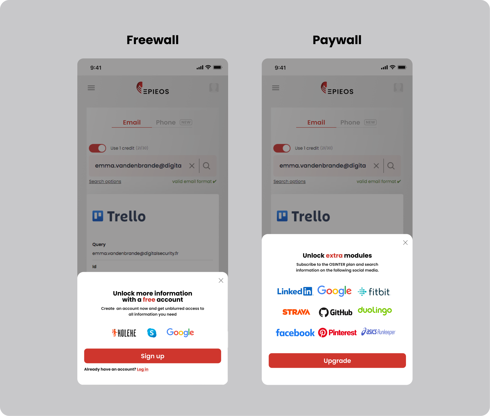
- Freewall that hinted at what could be unlocked with an account
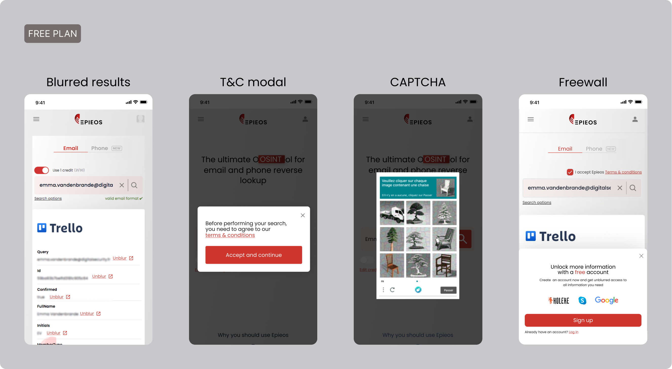
To further structure the conversion funnel, we designed a system that included both a Freewall and a Paywall.
- The Freewall offered limited access to core functionality allowing users without an account to explore Epieos without commitment.
- For users: This encouraged trust and curiosity.
- For the business: It served as a strong lead generator and list builder.
- The Paywall activated when users attempted to access extra modules.
- For users: This moment highlighted advanced value and offered a clear upgrade path.
- For the business: It created a scalable monetization model for premium features.
Together, this tiered system aligned with our business goals — acquire, engage, convert — while giving users control over how deeply they wanted to engage with the platform.
🔍 User tests & validation on Zoom
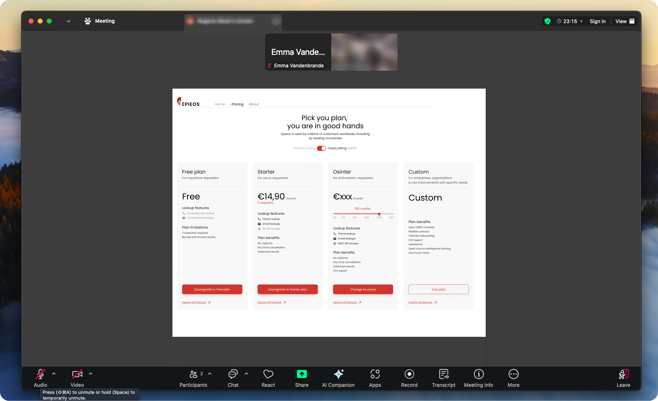
To ensure that our proposed pricing experience redesign met real user needs, we conducted a series of moderated user tests via Zoom. These sessions allowed us to validate our ideas, uncover usability issues, and gather qualitative feedback from a diverse group of existing Epieos users.
Research objectives:
- Understand how easily users could compare and select a plan.
- Test comprehension of plan differences and pricing.
- Observe interaction patterns with new CTAs, layout, and badges.
- Identify friction points or confusion in the decision-making process.
KPIs:
- Plan comprehension accuracy: % of users who can correctly explain the differences between plans
- Time to choose a plan: how long users take to make a decision
- Confidence in choice: self-reported score (Likert scale) on how confident users feel about their selected plan
- Number of pain points: count of moments where users show confusion or hesitation
Method:
- 7 moderated sessions (30–40 mins shadowing sessions and interviews) with casual users, power users and first-timers.
- Tasks included: “Choose a plan that best fits your needs” and “Find the current plan you’re on.”
- We asked follow-up questions to dig into user expectations, reactions to pricing and perceived value.
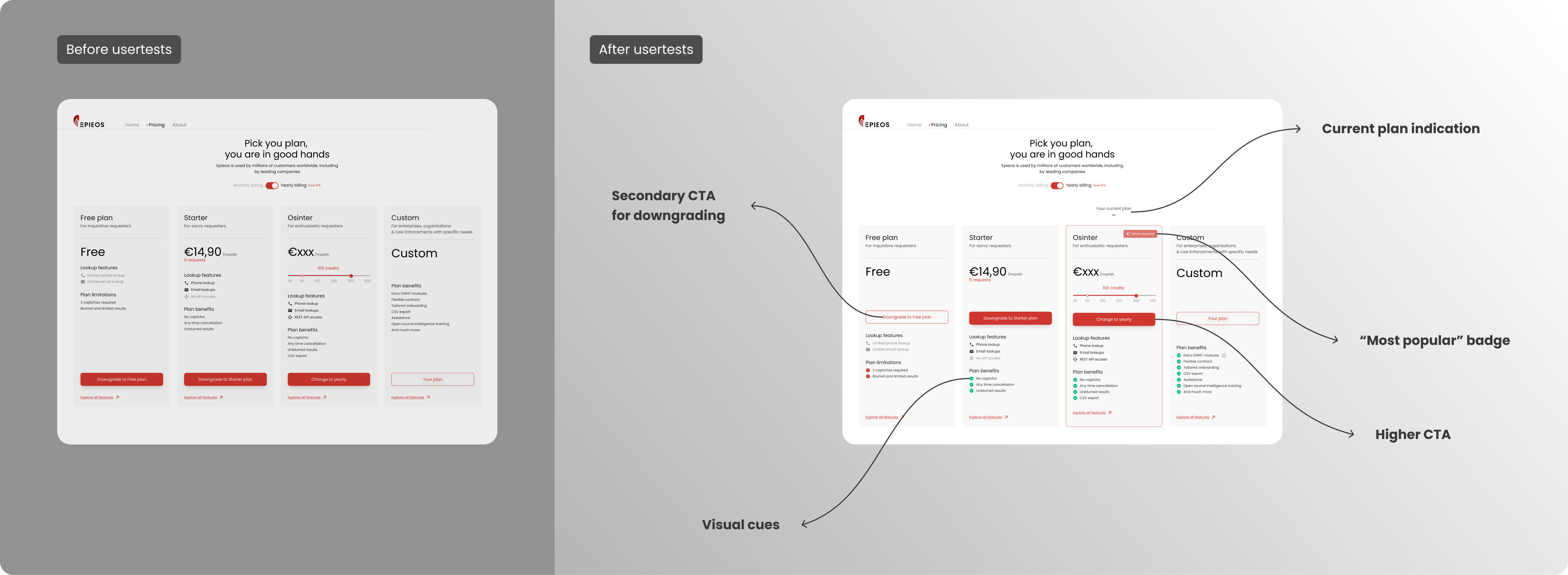
Key Insights from user tests:
- Users struggled with identifying their current plan
👉 We added a “Your current plan” label with subtle chevron icon to anchor users immediately.
- Downgrade options were missed
👉 We introduced a secondary CTA for downgrading, making it accessible but less visually dominant.
- Users didn't notice which plan was most popular
👉 We added a “Most Popular” badge to the Osinter plan to show it’s the best choice for most users. This helped build trust and made more people choose it, boosting sign-ups for our most profitable plan.
- CTAs and prices were too low and require scrolling
👉 We moved the primary CTAs and prices higher in each card to reduce scrolling and decision friction.
- Feature sets felt overwhelming or unclear
👉 Grouping plan elements into “Lookup features” and “Plan benefits” made comparisons more digestible.
🤝 Collaborating for success
This project was the result of close, ongoing collaboration between myself, the engineers and the CEO.
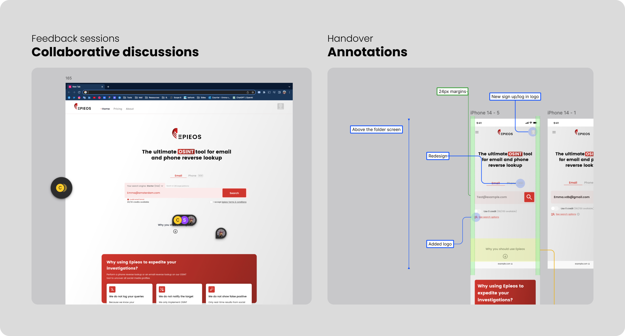
Working in an Agile environment enabled us to stay aligned, iterate quickly, and respond to new insights in real time. Regular sprint ceremonies, catch-ups, and feedback loops helped us uncover technical constraints early and keep our roadmap focused.
After the user tests, we came together as a team to review findings, ideate on potential solutions and prioritize the next set of design improvements. We used an impact/effort matrix to guide these decisions. By doing this, we ensure to tackle the highest-value changes first while staying mindful of development effort and constraints.
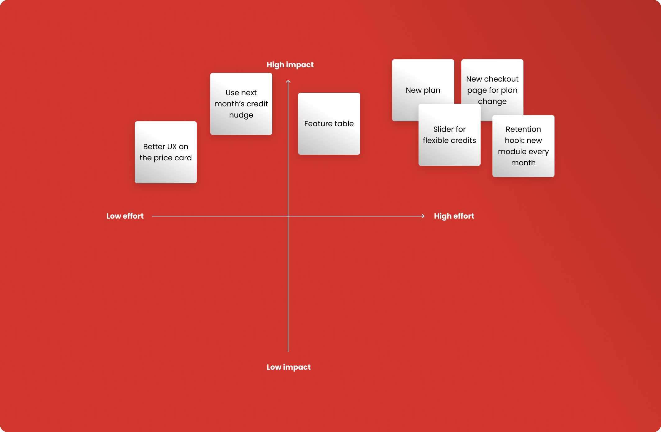
Design decisions were never made in isolation: each iteration was validated through discussion, ensuring that what we built struck the right balance between user value, technical feasibility, and business impact.
I also facilitated seamless handoffs by delivering detailed, annotated design files in Dev Mode, enabling engineers to work independently while keeping implementation consistent with the intended user experience.
👀 How we overcame challenges along the way
Given the fast-evolving nature of the OSINT industry, we often had to make strategic trade-offs to remain agile. This meant temporarily pausing the development of certain features in order to quickly address more pressing user needs or respond to emerging market trends.
On multiple occasions, we reprioritized our roadmap to stay ahead of competitors and seize timely opportunities, ensuring the product remained relevant, secure, and aligned with both user expectations and business goals.
👉 Looking ahead: continuous improvement and future enhancements
Feedback and iterations
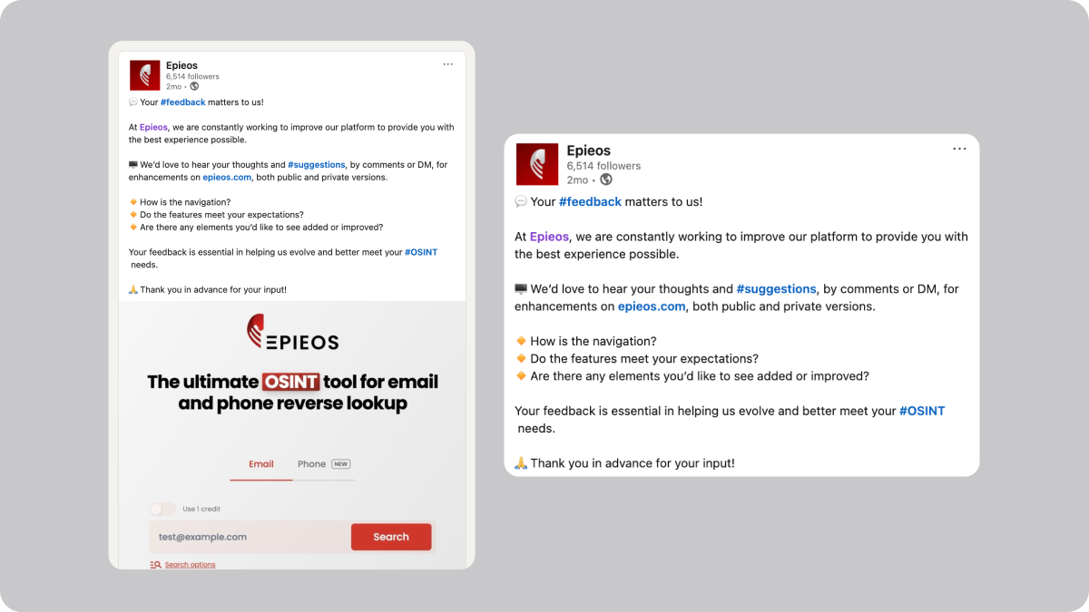
We continuously gather qualitative feedback from users through various channels, including online forums, social media platforms like Reddit, and in-person interactions at tradeshows. Additionally, we continuously monitor key metrics like bounce rate, visit duration, and page views per visit to track the impact of UX improvements.
💡 Final note
This case study reflects how thoughtful UX design can transform a complex OSINT platform into an accessible, scalable, and conversion-driven product.
From identifying friction points and increasing transparency to guiding users through upgrades with clarity and confidence, every design decision was rooted in real user needs and validated through close collaboration.
It also showcases my ability to:
- Lead product strategy through design
- Balance user and business needs
- Work cross-functionally in fast-paced environments
- Drive tangible impact through clear, user-centered solutions
All in all, this work contributed to laying the groundwork for future growth at Epieos and highlighted how thoughtful UX can support both user needs and business goals.